.png)

Gerd Bulthaup had to do some convincing before Aicher agreed to work for him. Photo: Bulthaup
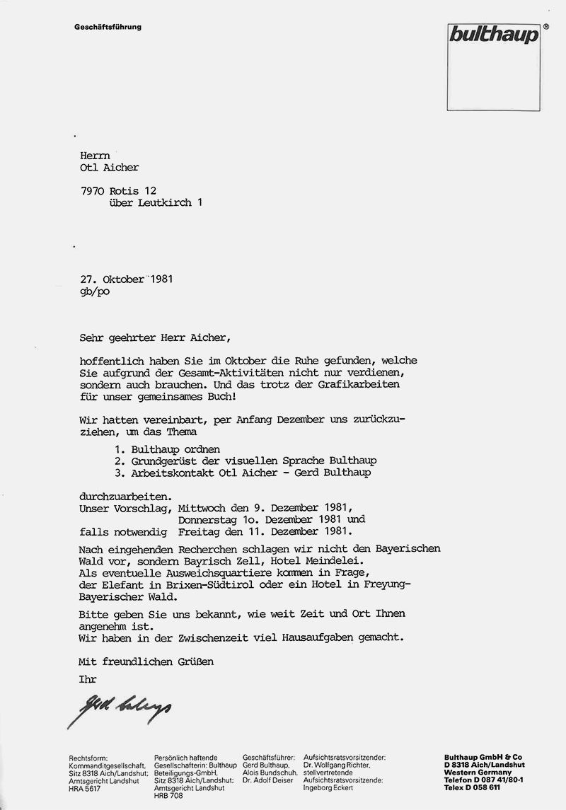
Letter from Bulthaup to Aicher. The letterhead still features the old logo. © HfG-Archiv / Museum Ulm
Gerd Bulthaup had to do some convincing before Aicher agreed to work for him. Photo: Bulthaup
Letter from Bulthaup to Aicher. The letterhead still features the old logo. © HfG-Archiv / Museum Ulm
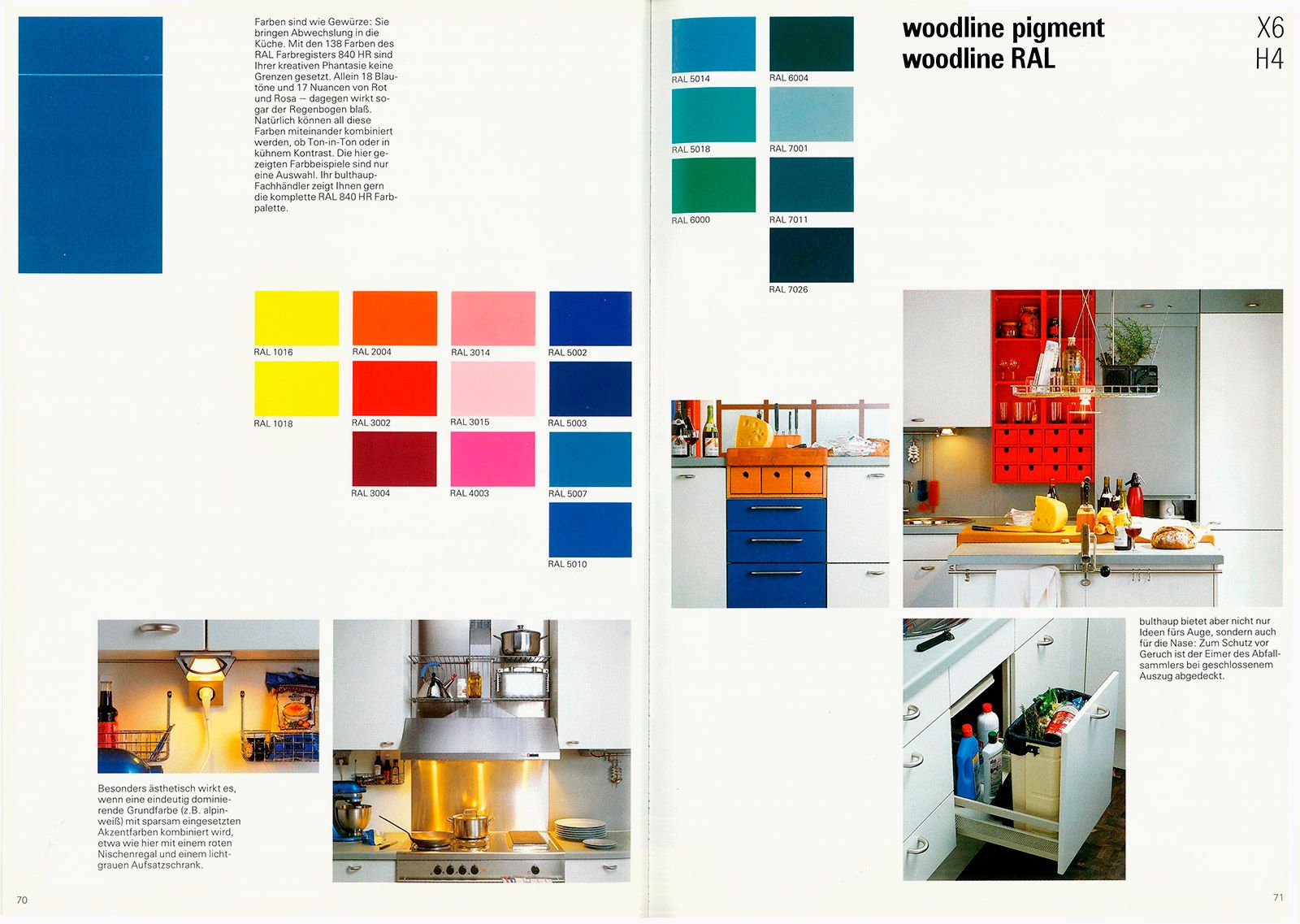
Spread from a Bulthaup catalogue (1988) explaining how to make careful but effective use of colour in the kitchen. Photo: Bulthaup
Aicher delegated a large part of the design work for the new corporate design, for posters, catalogues, brochures and other printed materials, to his colleague Hans Neudecker – which isn’t to say that Aicher didn’t get involved in the creation of the clear, ascetic, colour-quantised corporate design at crucial points. Incidentally, Neudecker continued to work for Bulthaup as an independent designer long after Aicher’s death, until 201o – around 30 years in total. It’s important not to forget the contributions he made to the company’s graphic identity. After all, Neudecker was in a position of responsibility for the corporate design right from the outset, starting in 1981. The wordmark was originally in Aicher’s Traffic typeface – the Rotis typeface that replaced it, lowercased and still used today, didn’t come out until 1988. Surprisingly, however, lowercasing the wordmark wasn’t actually Aicher’s or Neudecker’s idea at all: it already features in Bulthaup’s corporate design of the 1970s – even Gerd Bulthaup signed letters in lower case, as documents from the HfG archive show. Since 2003, other agencies, among them Baumann & Baumann for example, have developed contemporary interpretations based on the designs by Aicher and Neudecker, which have succeeded in making the leap into the present without forsaking the original visual identity. The continued use of Rotis as the corporate font is an important constant that builds a strong bridge between the past and today.
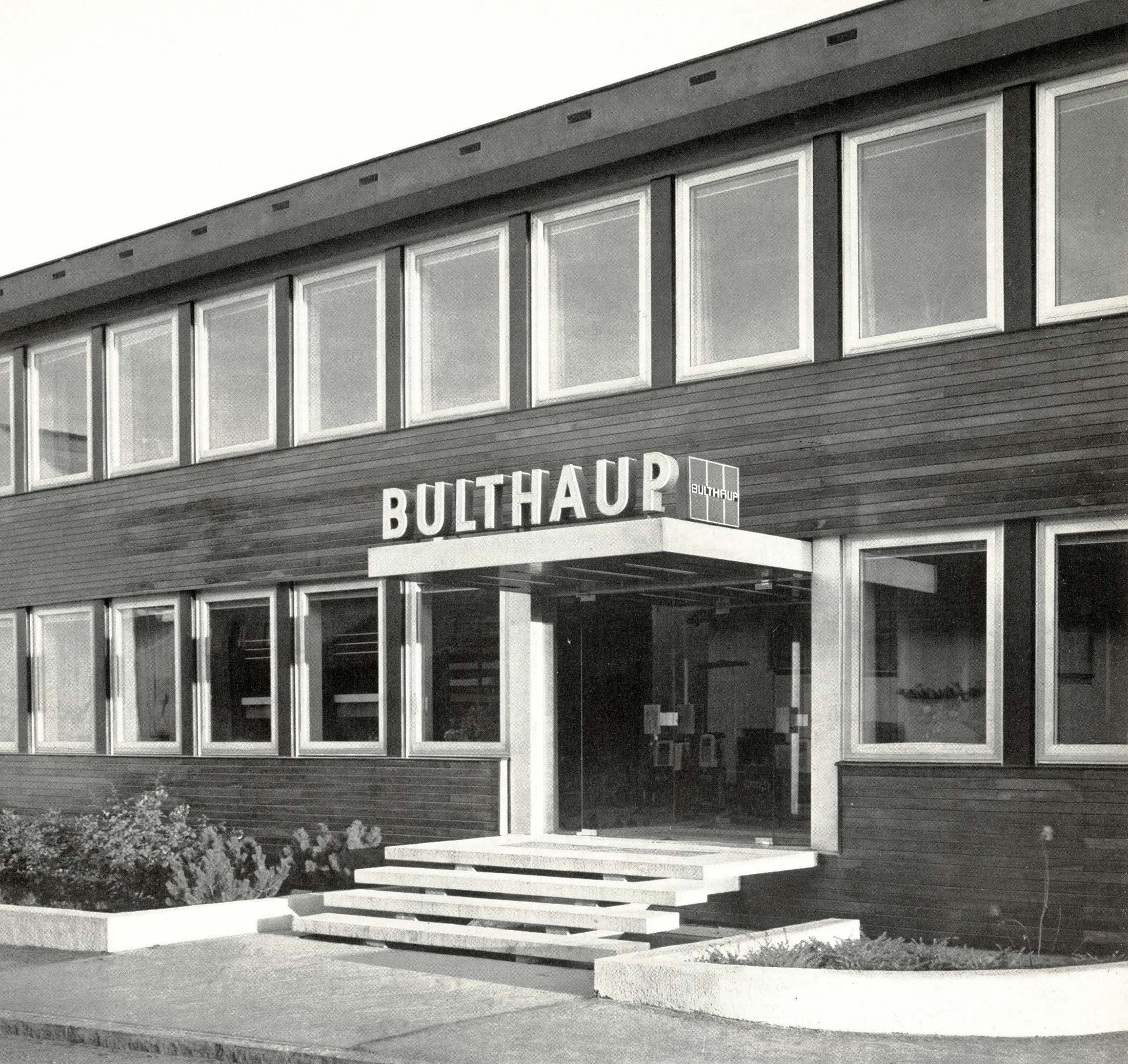
The earlier wordmark in upper case, flanked by the logo: Company entrance, 1960s, Photo: Bulthaup
The logo of the 1970s – i.e. prior to Aicher – already showed the company name in lower case, but bold and in italics, supplemented by a tagline. Photo: Bulthaup
The earlier wordmark in upper case, flanked by the logo: Company entrance, 1960s, Photo: Bulthaup
The logo of the 1970s – i.e. prior to Aicher – already showed the company name in lower case, but bold and in italics, supplemented by a tagline. Photo: Bulthaup
This sketch (Team Aicher) could be interpreted as the first departure from the italicisation of the company name. © HfG-Archiv / Museum Ulm

Sketch (Team Aicher) of the Bulthaup wordmark in three line thicknesses. © HfG-Archiv / Museum Ulm
This sketch (Team Aicher) could be interpreted as the first departure from the italicisation of the company name. © HfG-Archiv / Museum Ulm
Sketch (Team Aicher) of the Bulthaup wordmark in three line thicknesses. © HfG-Archiv / Museum Ulm
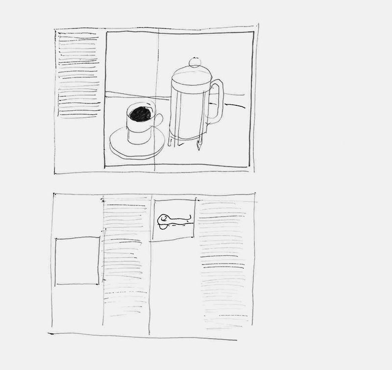
This draft layout, probably for Die Küche zum Kochen (The Kitchen for Cooking), already foreshadows the line drawings typical of Bulthaup books. © HfG-Archiv / Museum Ulm
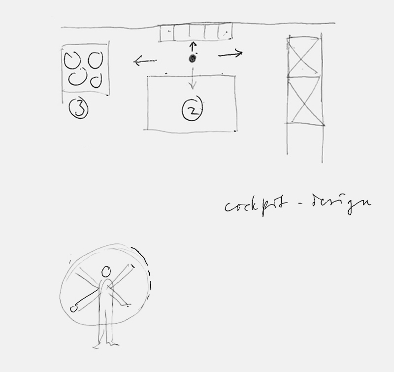
Sketch (Team Aicher): The cockpit as a metaphor for positioning objects and cooking utensils within easy reach of a central workstation. © HfG-Archiv / Museum Ulm
This draft layout, probably for Die Küche zum Kochen (The Kitchen for Cooking), already foreshadows the line drawings typical of Bulthaup books. © HfG-Archiv / Museum Ulm
Sketch (Team Aicher): The cockpit as a metaphor for positioning objects and cooking utensils within easy reach of a central workstation. © HfG-Archiv / Museum Ulm
It’s just that Aicher’s role was very different: he didn’t merely serve as corporate designer, but as an overarching consultant – and thus remains unique in his significance for Bulthaup. Marc Eckert couldn’t agree more: “Nowadays a lot of agencies want to pull a mask over a company’s face. It’s hard to find individuals like Aicher any more – real personalities who genuinely engage with a brand and have the dogmatic clarity it takes to rebuild it on the basis of the company’s heritage.”
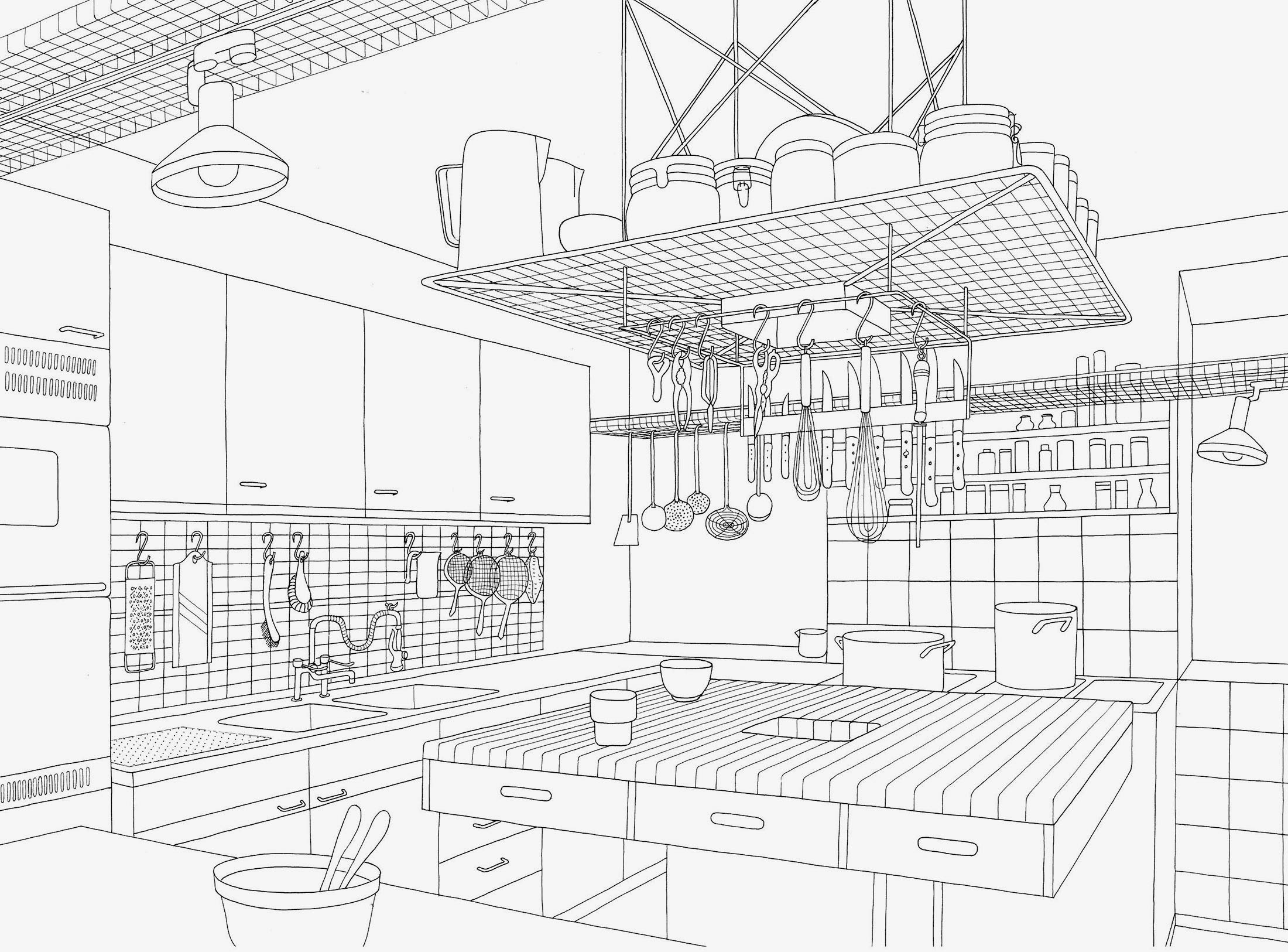
The line drawings (here: the Aicher kitchen in Rotis) were produced by employees Reinfriede Bettrich and Rosi Kapp according to Aicher’s specifications. © HfG-Archiv / Museum Ulm
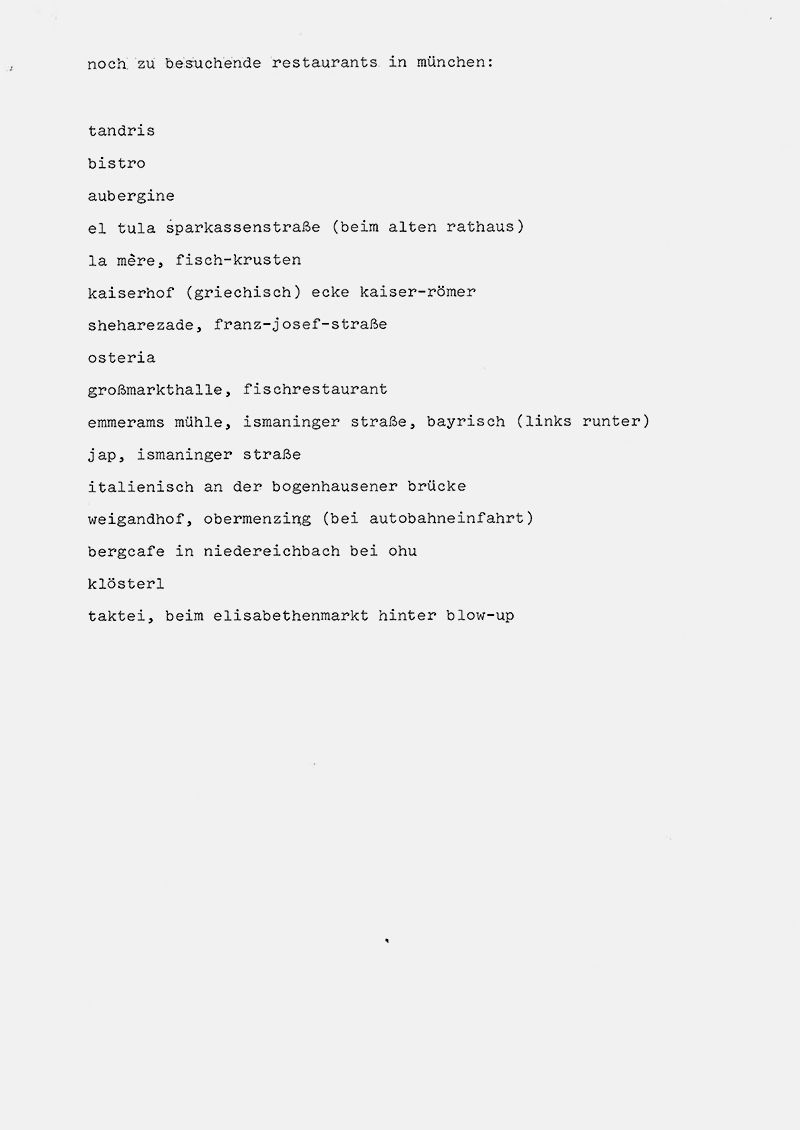
A taste for research: Aicher spent around 12 months researching leading restaurants and interviewing their chefs and guests. Seen here: his list of restaurants to visit in Munich. Photo: © HfG-Archiv / Museum Ulm
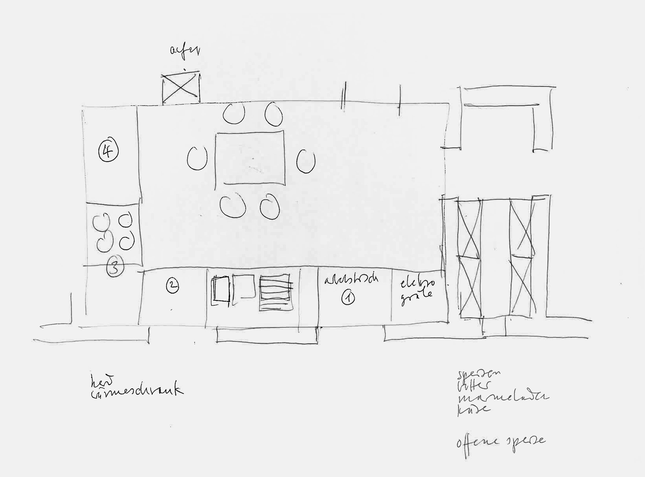
This sketch from Aicher’s office shows the layout of a dining room, complete with thoughtfully positioned functional elements and the seating arrangement. Photo: © HfG-Archiv / Museum Ulm
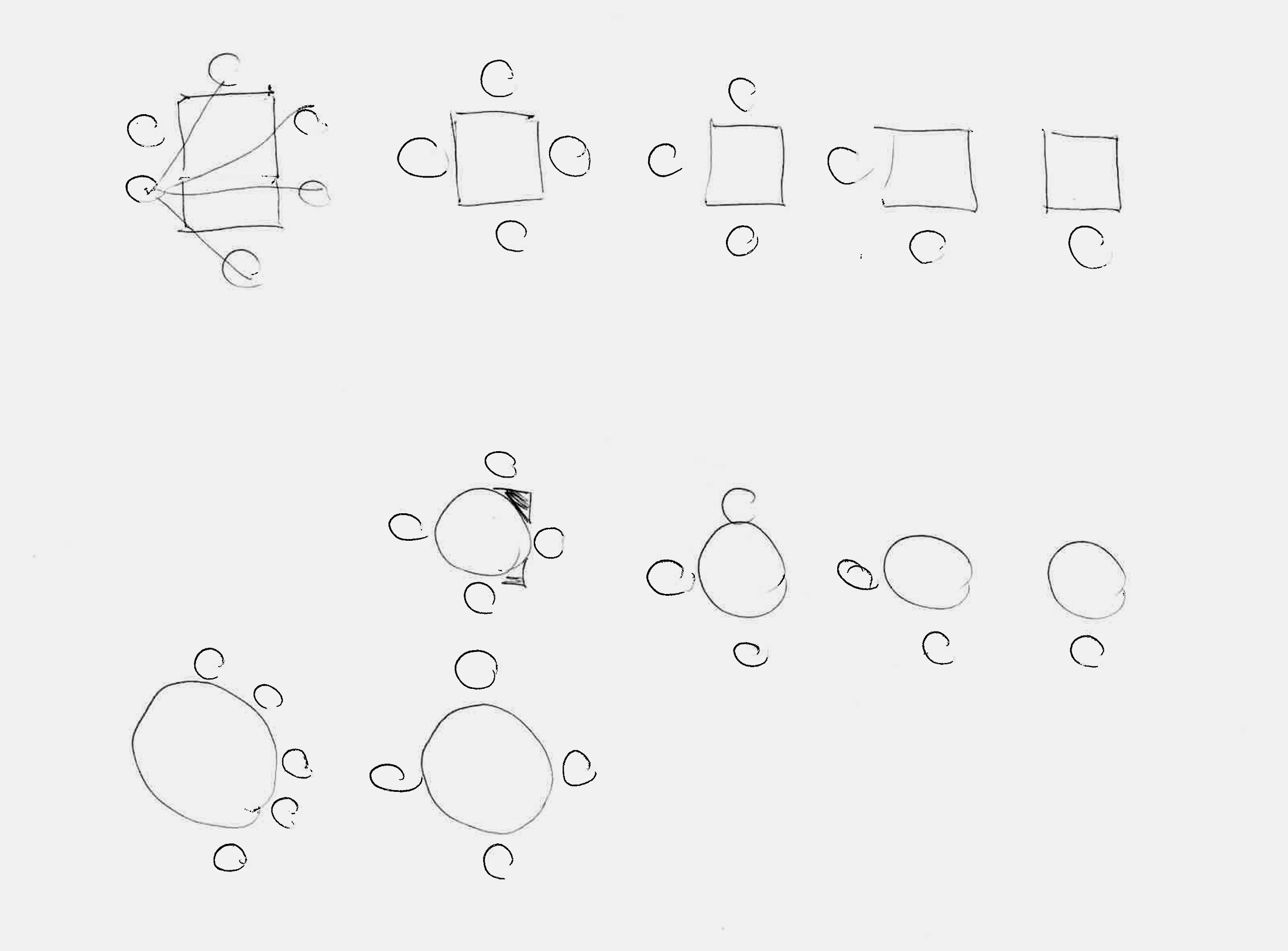
The shape of a table can have a major influence on how people interact when eating. Sketch: Team Aicher, © HfG-Archiv / Museum Ulm
This sketch from Aicher’s office shows the layout of a dining room, complete with thoughtfully positioned functional elements and the seating arrangement. Photo: © HfG-Archiv / Museum Ulm
The shape of a table can have a major influence on how people interact when eating. Sketch: Team Aicher, © HfG-Archiv / Museum Ulm
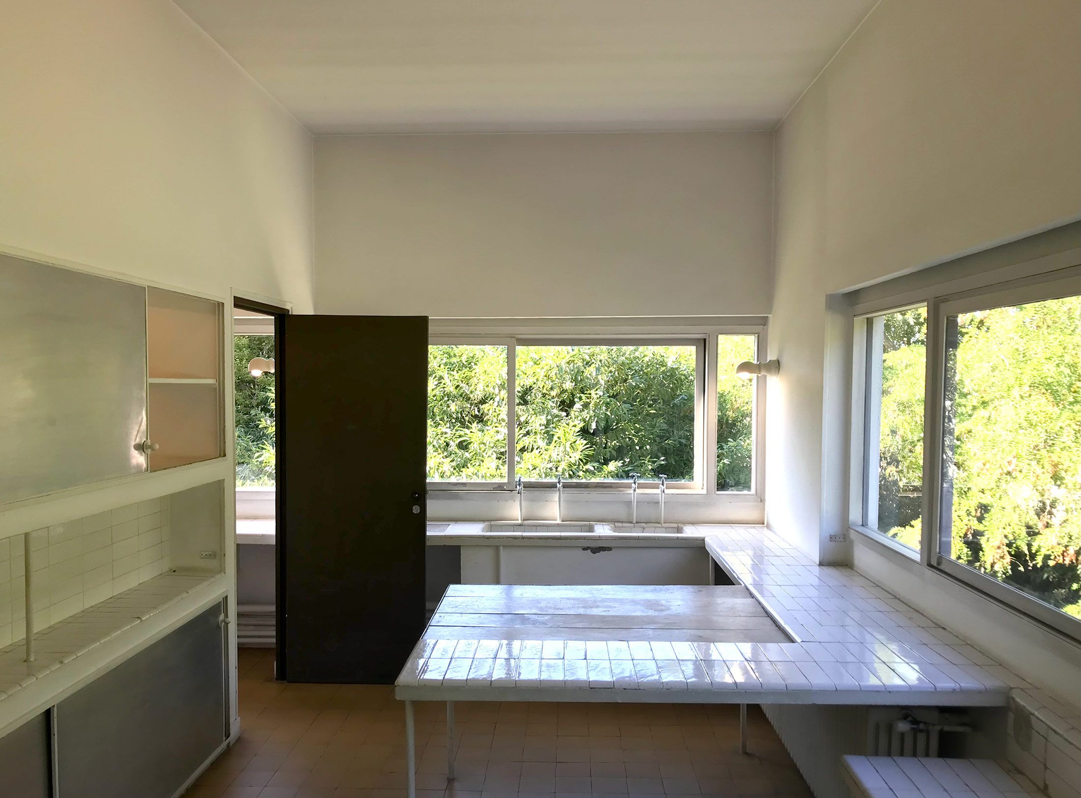
The Villa Savoye kitchen in Poissy, designed by Le Corbusier and Pierre Jeanneret in the late 1920s, already features a central worktable and ample storage space. Photo: Gerrit Terstiege
Rejected cover design in yellow (detail). © HfG-Archiv / Museum Ulm
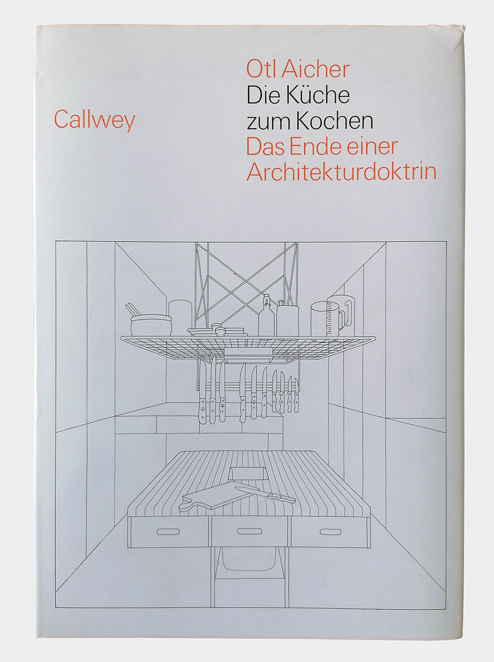
First edition, Callwey Verlag. Photo: S/O/G
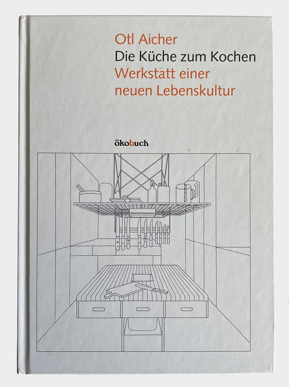
Latest edition with new subtitle, Ökobuch Verlag. Photo: Gerrit Terstiege
First edition, Callwey Verlag. Photo: S/O/G
Latest edition with new subtitle, Ökobuch Verlag. Photo: Gerrit Terstiege
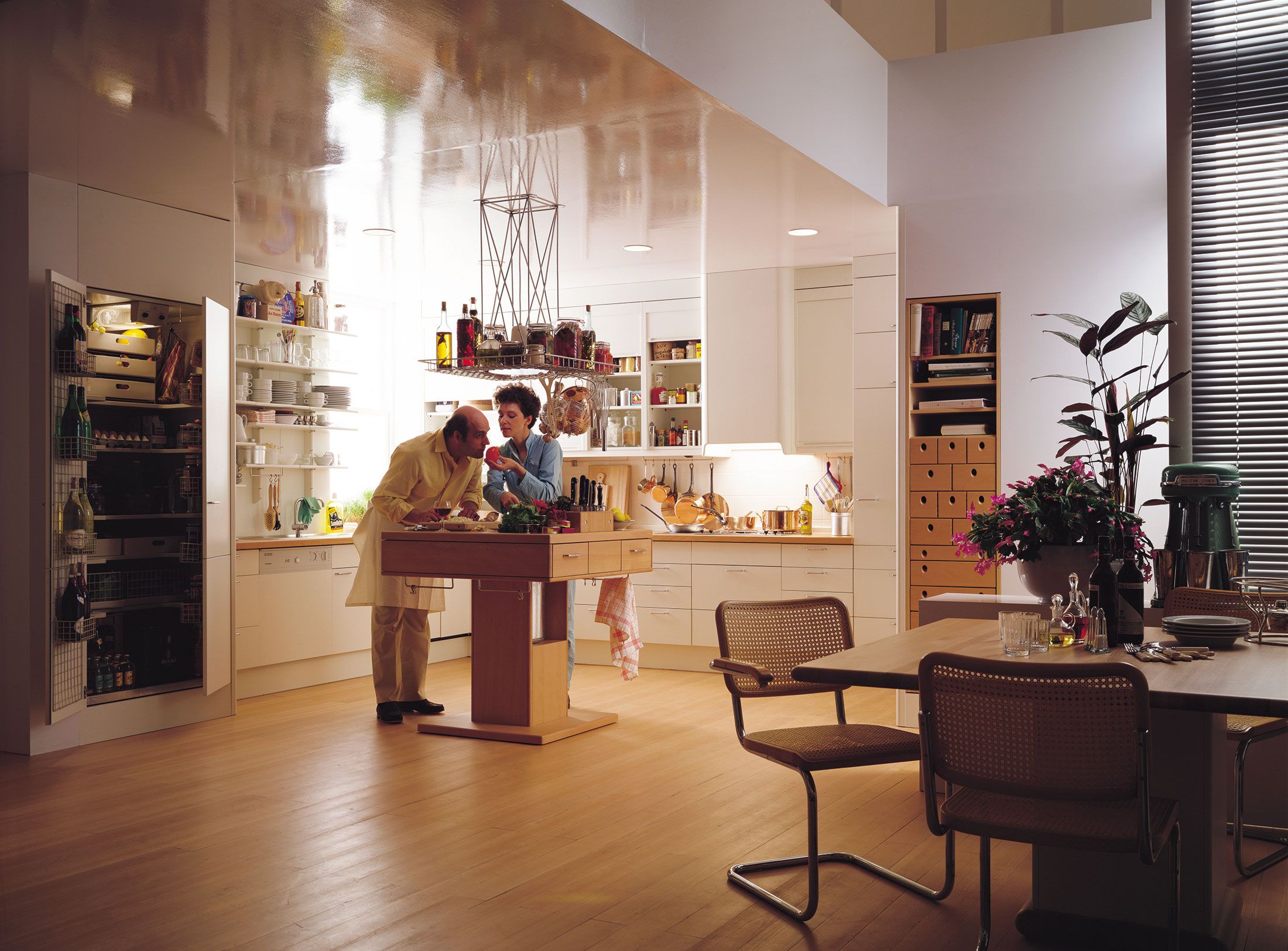
Reading Die Küche zum Kochen provides many insights into why this decision is so significant. The subtitle of the first edition, published by Callwey in 1983, translates as The End of an Architectural Doctrine. It thus proclaims a new beginning, based on positioning worktops and storage space for utensils not along the existing walls but wherever it makes the most sense. Above the table in Rotis, for instance, a square grid hangs from the ceiling, keeping everything needed to prepare food within easy reach. In the 1980s, Bulthaup turned Aicher’s idea into reality by producing this very same combination. How many people who started out as graphic designers have ever had an actual physical product manufactured? Not as a limited edition, but on a large scale? Apart from Aicher, not a single example springs to mind.
In a sense, the kitchen islands from Bulthaup’s current range can still be traced back to this idea of working together in the kitchen face to face. Today, rather than having their backs to the room, amateur cooks have much more freedom of movement; they can change position and engage in conversation. But even this innovative approach has a long tradition, as illustrated by a panorama of a commercial kitchen in Aicher’s book. It goes without saying that it is also featured in the form of an abstracted line drawing, produced according to Aicher’s specifications by his employees Rosi Kapp and Reinfriede Bettrich. It shows a historical commercial kitchen with more than 20 people, annotated by Aicher as follows: “In contrast to today’s practices, this restaurant kitchen in Paris from the grande cuisine era only has a few people working with their face to the wall. Even the people cleaning the dishes and cutlery on the right of the picture are working at a table, and the food is cooked and arranged on the plates at islands in the middle of the room. Working with your face turned to the wall deactivates your sense of sight and brings communication to a standstill.”
Today, the merging of the kitchen and living space and increasing flexibility have become reality, even extending to cabinets and technical units on casters. This too is a development that Aicher anticipated for Bulthaup in the form of an elongated, minimalist and understated kitchen module made of metal and supplemented by wheeled cabinets. Technical innovations such as hob extractors integrated into the cooktop and flexible, textile-covered hoses for fresh and waste water have led to basic kitchen functions being liberated from their fixed positions. Aicher foresaw the kitchen opening up to the room in this way as well. In his book he writes: “A really good kitchen overcomes the separation between living space and kitchen.” And elsewhere he says: “The kitchen is becoming the new focal point of the home. The cooker is a synonym for epicentre.” This perception of the kitchen as the centre of the home and life, as the driving force and basis for communication and togetherness, endures to this day. Or to put it another way: “The end of an architectural doctrine” was a new beginning as well.
Seen here in a catalogue from the late 1980s, the worktable with central disposal hole was produced by Bulthaup based on Aicher’s designs – and studies in his own kitchen. Photo: Bulthaup