.png)

 The most contentious decision about tabs since the soda got discontinued.
For a company that’s long been known for its “my way or the highway” philosophy when it comes to design, some of Apple’s latest interface choices have abandoned that approach in favor of the realization that, well, change is hard. So, instead of throwing its users into the deep end, Apple has started more commonly letting them continuing using an older interface if it suits them.
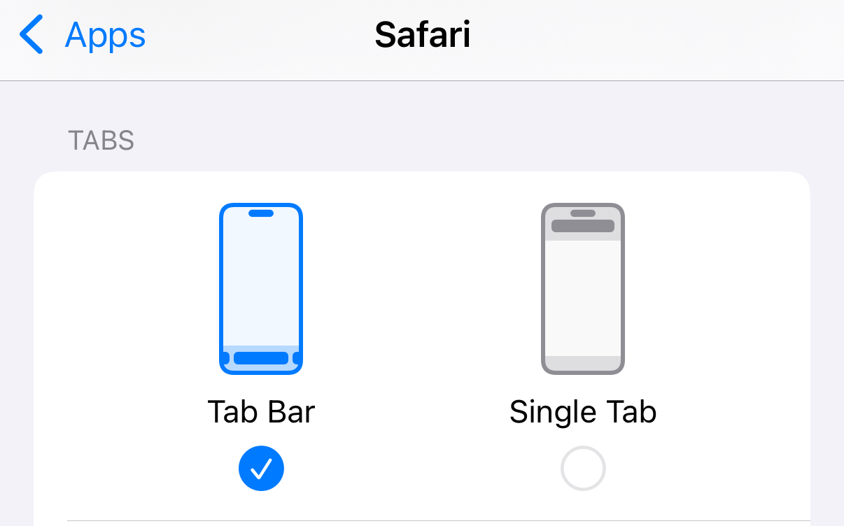
 That’s a categorical no.
This approach began most meaningfully with Safari, back when Apple first moved the location bar to the bottom in iOS 15. While it clearly thought the new location was superior—else, why move it?—it also realized that some users were perfectly happy with where it was.1 So it split the difference: in Settings, you could choose to use the bottom “tab bar” or the top “single tab” design.
More recently, we’ve seen this trend continue with a few of Apple’s other app redesigns. For example, the company added the Mail Categorization features in iOS 18 last year, followed earlier this year on macOS and iPadOS, but it also included an option—right within the Mail app—to swap back to the old List View mode. And, if my anecdotal evidence is any indication, a lot of users have.2
With this week’s announcements of Apple’s latest updates, there’s obviously a big redesign in play across the company’s platforms. But one thing that struck me was that Apple has gotten increasingly upfront with this approach: for example, the Phone app features a brand new unified designed, but even in the keynote itself, Apple was careful to present switching to this interface as “an option”—preemptively defusing the annoyance of users who might get annoyed.
 The new Phone app lets you keep your options open.
Similarly, the new version of Safari on iOS once again makes changes to the way the location bar is presented, getting rid of the previous toolbar in favor of a minimalist floating palette. Except that you can still switch back to the bottom or top address bars if you want.
So choice
So, what’s behind this move? Is Apple less confident of its design chops than it’s been in the past? Or is it simply a practical recognition that giving people the choice to stick with the familiar option makes its users happier?
Apple certainly hasn’t taken this approach with every single design choice it’s made. Take, for example, last year’s redesigned Photos app, which threw out the old toolbar model for a combined view. While the app evolved during beta period, it still eventually shipped in its much changed state. Until this year, anyway, when Apple once again added a (reduced) set of tabs.
 Tabs, you’re back! We hardly had time to miss you.
Similarly, Apple also showed off a new interface for the Camera app. The new design attempts to streamline what had become a slew of options, putting the most common ones front and center. It’ll be interesting to see how that’s received during the beta process—and whether Apple will end up making any concessions for those who find the new interface alienating, given that it’s probably one of the most important and most used apps on the phone.
Ch-ch-ch-ch-changes
One thing that I think might be at the root of all of this is a concession from Apple that becomes our devices—and our smartphones in particular—have become so critical to so many aspects of our lives they can’t simply be redesigned overnight. We depend on them so much that even small changes can be jarring, and drastic changes can be severely off-putting. This is one of the challenges of having a product that exists at the monumental scale of the iPhone.
But this approach isn’t without risks. By keeping the old interfaces around, does Apple end up committed to having it available…forever? That’s a problem too. Because if you always leave the safety net of the familiar, old interface, it becomes harder to convince people to move forward and try something new. And, as a result, those interfaces can become calcified, impervious to change even if there might be a better way.
[Dan Moren is the East Coast Bureau Chief of Six Colors. You can find him on Mastodon at @[email protected] or reach him by email at [email protected]. His latest novel, the sci-fi spy thriller The Armageddon Protocol, is out now.]
If you appreciate articles like this one, support us by becoming a Six Colors subscriber. Subscribers get access to an exclusive podcast, members-only stories, and a special community.