.png)

What are the stripes?
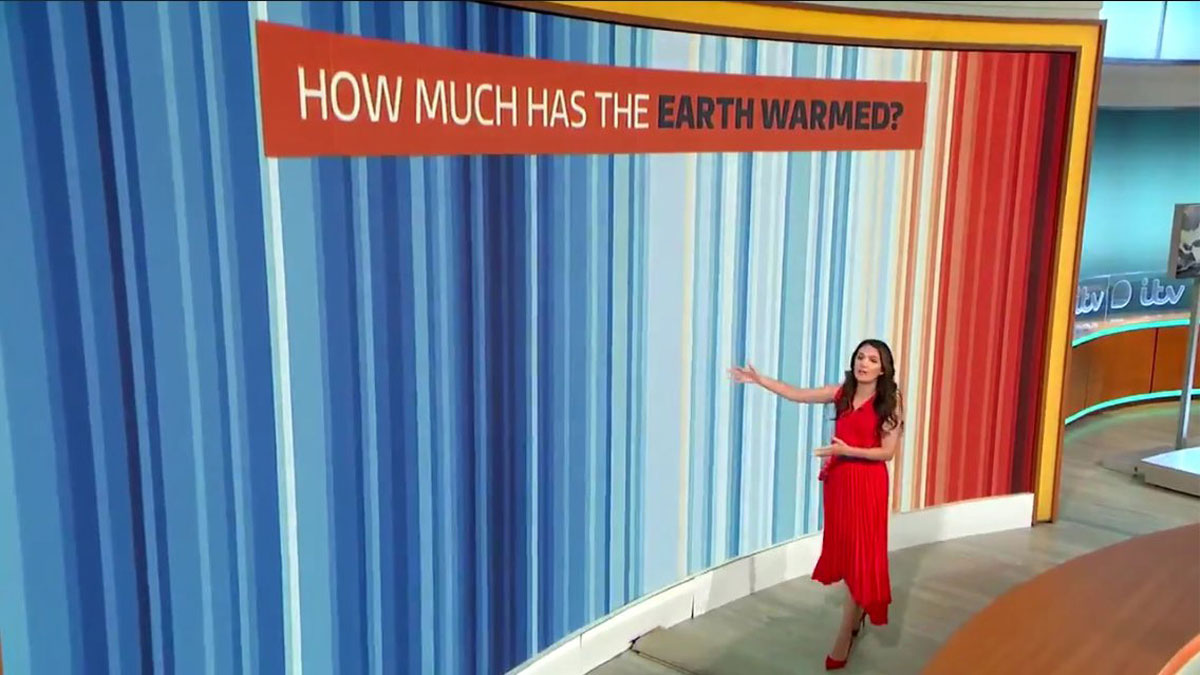
No words. No numbers. No graphs. Just a series of vertical coloured bars, showing the progressive heating of our planet in a single, striking image.
The climate stripes were created by Professor Ed Hawkins at the University of Reading in 2018.
They show clearly and vividly how global average temperatures have risen over nearly two centuries,

Start the conversation
The graphics also show how no corner of the globe is immune from the effects of global warming. Stripes images for more than 200 countries, states and cities are available to download for free from the showyourstripes.info website. People in every country can see how their home is heating and share the images, helping to start conversations about climate change.
How do they work?
Each stripe represents the average temperature for a single year, relative to the average temperature over the period from 1961 to 2010. Shades of blue indicate cooler-than-average years, while red shows years that were hotter than average. The stark band of deep red stripes on the right-hand side of the graphic shows the rapid heating of our planet in recent decades.
Global impact
The stripes are already having an impact. More than a million people downloaded graphics from the site within a week of its launch in 2019.
Television weather presenters, scientists and campaigners worldwide choose to wear and share the stripes on social media – using the hashtag #showyourstripes. The stripes have been embraced by organisations and communities to show their concern and commitment to address climate change. Many of these come together on ‘Show Your Stripes Day’, our annual call to for everyone to share the stripes and send a powerful message about our changing climate.
Previous images designed by Professor Ed Hawkins includes the animated 'climate spiral' of global temperature, which was used in the opening ceremony for the 2016 Olympic Games in Rio.
We're green in all sorts of ways

4th in the People & Planet University League 2024/25

The Times and Sunday Times, Good University Guide 2025, Sustainable University of the Year

Queen's Anniversary Prize for climate research and action

Winner of Outstanding Contribution to Sustainability Leadership, London Higher Award 2024

Winner of Outstanding Contribution to Environmental Leadership