.png)

As a bilingual and someone who works on a computer for like 8 hours a day, I’ve made some observations on various icon designs. One specific type of icon I noticed recently caught my attention and made me wonder: Is this good design or not?
Discord, the group chat app, has some features that divide users into different small chat groups, which are called servers, channels, and threads. Basically, you create or join a server about a specific topic or belonging to a certain organization, and this server consists of various channels for different communication purposes. Under a channel, you can start a thread if you find yourself constantly talking about the same stuff, which acts as a “sub-channel”.
The channel icon is pretty simple. It’s a hashtag. Generally, # means nothing so we can assign different meaning to it in different contexts. I don’t remember what the old thread icon looked like, but in a previous update, Discord changed the thread icon to an actual “thread” 🧵.
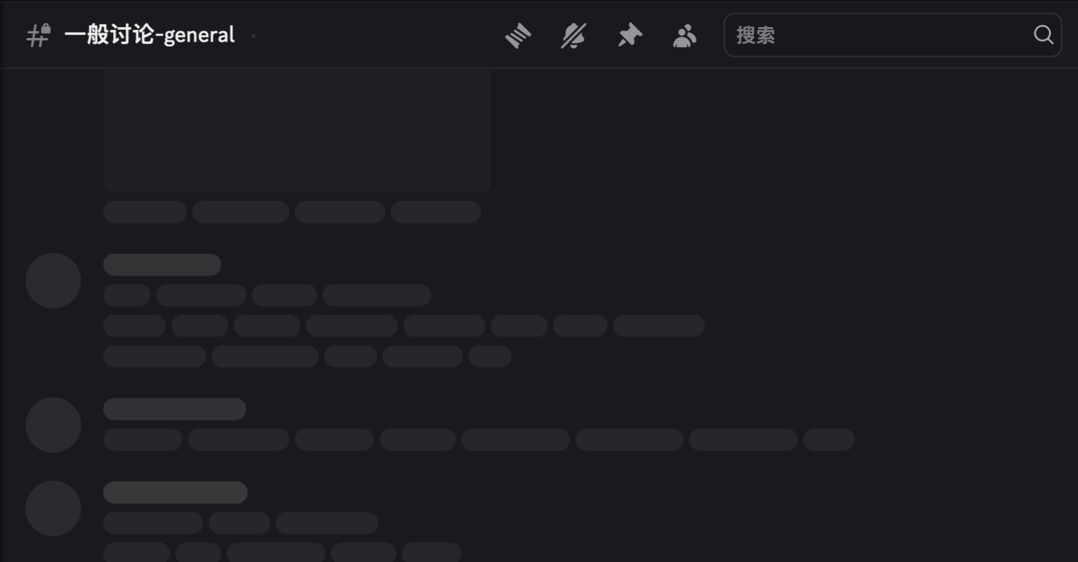
Icon on the top-left is for channel, the first one on the right is for thread.
This makes sense for English speakers. Thread can mean both things, a series of connected posts/chats or a long thin string you knit with. But for those who speak a different language, this can be very confusing.
My interface language is Chinese. The Chinese translation of “thread” is 子区, which simply means sub-channel. In Chinese, threads and sub-channels are completely unrelated. I also took a quick peek at the French version. Thread is called “fils” in French, meaning “son”, considering channels are parents of threads in a sense.
I believe many other languages have different names for threads, most likely not related to actual threads.
This is not the only case. In IntelliJ IDEA, a well-known Integrated Development Environment for Java, some icons are also pretty English-centric.
The icon for external libraries looks like a bar chart, but it was meant to be three books of different sizes, meaning “library”. In Chinese, a library in software context is called 库, meaning a warehouse, a storage unit, or a garage. It has nothing to do with books or actual libraries.
In Java, we call a well-encapsulated class a Bean, most likely referred to coffee beans since java is actually a kind of coffee. As you can see, the icon for Beans is actual coffee beans. Though we don’t really have a translated name for Beans in Chinese,1 many programmers who are not familiar with the language don’t think about real beans when they use the term, so it’s hard to connect the dots.
Threads, libraries, and beans have multiple interpretations, referring to an abstract concept in computer world and an actual object existing in real world. While it seems like smart design to use physical objects to represent abstract concepts, this may not always resonate across languages.
Let’s take a look at another interesting example.
Like thread, “pin” means both things, an action to attach an item to a fixed position, and a pointy device used for fastening objects together. So, is the icon 📌 (push-pin) a bad choice? Actually, no. You see, the reason why people made that metaphor is because pinning an item on graphic interface resembles pinning a piece of paper on a board in real life. We’ve all used or seen a push-pin before, so it makes sense even without languages. However, when we are knitting with threads, it looked nothing like a conversation!
When it comes to icon design, it’s important to think about what images pop into people’s mind when they see the icon, not the name they call it.
While it’s hard to come up with a solid design for some actions or concepts that does not exist physically, it’s no excuse to create a confusing icon. An icon is a form of information. We all prefer no information at all than one we don’t understand or demands too much unnecessary effort to make sense of.2
Icons are just like words, conveying a certain meaning. Good icons should be simple and straightforward, which we read like children’s books, no efforts required. For example, if you want an icon for “read”, just draw an open book; if you are looking for “help”, a question mark would be better than a raised hand.
If we see systems of icons as languages, we can solve certain problems with linguistics methods. When we talk about languages, we might use the term “context”. Words mean differently when context changes, and so do icons. A magnifying glass can mean “zoom in” when you’re dealing with pictures, but it can mean “search” if you’re working with a content management system. Context is the model we adopt to solve ambiguity.
The tricky part is: how do we design an icon for abstract concepts? There’s nothing in real life we can pick from.
If we learn from languages, we can see that people create new names for these concepts, typically with metaphor, association, and combination.
- Metaphor: The word “tree”, in computer science, refers to a data structure type that represents a hierarchical tree structure with a set of connected nodes. We call it “tree” because it looks like an upside-down tree.
- Association: The word “bookmark” means something you put between pages as a reminder of your reading progress. You can also say that you “marked” a page. The piece of paper or metal used for that is associated with a mark because of its purpose. So we call that piece by the name of “mark”.
- Combination: The word “offspring” means “descendants”, which consists of “off” and “spring”, meaning “people who spring off someone”. We combined two words and created a new one.
We can do all of that with icons.
Let’s take a look at GitHub’s menu bar for example.
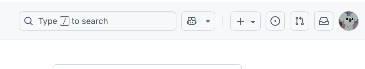
Start from the right. The first icon is for “notifications”, or “inbox” more accurately. The whole concept of “inbox” comes from real inbox trays in the office, where people put in files they need to process later. We associate the interface where we receive messages with a physical container, just like a real inbox tray. It’s pretty intuitive that GitHub picked a inbox tray icon for notifications. If you want to find works that needs to be done, you go for the inbox tray.
The second one is for “Pull Requests”. If you understand how Git and GitHub works, you know “Pull Request” is how developers propose changes to an open-source codebase, which works by requesting to merge one updated branch to the main branch. The icon represents “merge”. The left side of the icon represents the branch accepting the merge, the right represents the branch to be merged, and the arrow represents the action of merging. The icon was created by combining meaningful dots, lines and arrows together.
As for metaphor, the pin icon I mentioned before is a good example.
Designers should look beyond the English language. After all, the rest of the world doesn’t compare a series of conversation to a knitting thread!
Though icons should be independent from languages, they themselves form a system resembling human languages. If we see icons as words with confined meanings, we might be able to create better designed icons.
![Sora: The All AI TikTok Clone. Will Slop End Creativity? [by Casey Neistat]](https://www.youtube.com/img/desktop/supported_browsers/chrome.png)