.png)

Some highlights and lowlights.
I think of presentation slides as having 3 main jobs:
- Emphasize key points, so people remember
- Break up complex concepts, so people learn
- Entertain, so people pay attention
This calls for slides that are mostly images or very short phrases. A minority of slides justify designing something to match the vibe or illustrate a point – a diagram, for example. This can mean going back and forth between Keynote and, say, Figma, but it’s worth the effort.
This year I’ve been spending a lot of time in Figma, so when I was recently asked to speak at an event I thought, “Why not try Figma Slides?” Figma Slides launched a year back, and graduated from beta in March. I’ve used Keynote for almost 20 years now – it seemed like time for me to finally upgrade my presentation tool.
So I gave it a whirl.
Pretty quickly, I liked building slides right in Figma. The Grid view made it easy for me to structure my ideas. Features like Auto Layout and Components made building slides that adapt to different text and images a snap.
For example, a key point in my talk was that selecting a JavaScript framework can be overwhelming. It was easy to build a quick visual of this right in the deck.
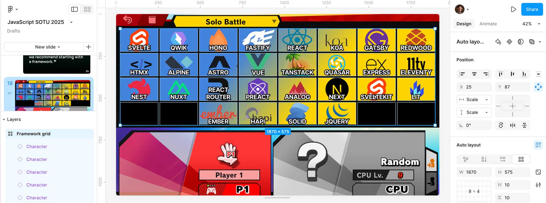 Components and Auto Layout made this 10x faster to build in Figma than Keynote.
Admittedly, Figma Slides is missing some Keynote features that I think of as pretty essential.
For example, Keynote has long had a toggle to “Autosize Text”, which will set an object’s font size to just big enough to fill its container. There’s no way to do this in Figma’s auto layout because Figma only wants to support layouts that CSS Grid can implement. That constraint makes sense when designing for the web, but shows how hard it is to expand a design tool to other domains.
Another odd omission is that you can’t easily create a slide where items (e.g. bullets, sections of a diagram) appear with each click. The closest you can do is to split them into different layers, add a “Fade” animation of 1 millisecond on each, then reorder the animation order to match the order they appear on the slide since it will default to the order the layers were created. 🥴
I’m not a fan of bullet-laden decks, but sometimes you just want to make 4 words appear one by one, okay?
Whining aside, building in Figma Slides got me excited. It was powerful, it was fun, and it gave me hope that Figma would successfully make the transition from single-product company about to be acquired by Adobe, to multi-product company ready to IPO.
Then I made a fatal mistake: I tried to actually give the presentation.

I’ve given enough talks that I know to do at least one rehearsal with representative conditions: on an external display, clicker in hand, cued by the presenter view. I know to make sure it works offline, save a backup copy of the deck, and so on.
It was during this dry run I noticed some bad omens:
- You can “Save Local Copy” of the presentation, but that doesn’t allow you to present it locally.
- Just because you have a presentation open and loaded, doesn’t mean you can present it. If you are offline when you actually click Present, it will barf.
- Once you are presenting, you can click to “download” the presentation to be available offline – but be careful not to close the tab or it will undownload!
- When you do click Present, you will not get a full-screen audience view, nor a keyboard shortcut to swap which display the audience can see. You just get a pop-up window you need to manually drag to the projector – hope it’s somewhere intuitive! – then maximize it. At a pro event you can do this with the AV crew, but at a meetup this is just visible to the audience.
- Make sure you then move your mouse to the edge of the screen. Otherwise, it will stay there on top of your slides like it’s 1999.
- Even beyond this, the functionality around managing Present and the Audience view is just a little… flaky?
Figma will decide when your presentation is over.
This all made me uneasy, so I practiced the flow more often than usual. I made sure I clicked the right things to make it work offline. Then, I went to go present.
At the venue, I immediatley noticed something once the slides were up on their giant 40 foot display: I needed to click twice to advance each slide. Odd, but I’m an adult. I can click twice for each slide.
Unfortunately, halfway into my talk I noticed a much bigger problem.
The animations – which I had used only on my most complex slides, which needed to be explained in parts – weren’t advancing at all. Even if I clicked twice, the audience display would continue to show a blank slide.
 Looking at my clicker in desperation: the exact moment I realized that I’d been hoisted on my own petard.
After some exploratory clicking, I found that once all the builds on a blank slide had been triggered, it would then jump to the next slide. At that point, you could click back to show the fully built skipped slide.
So that’s what I did: on a slide with 7 builds, I would dutifully click 14 times to get Figma through to the next slide, then then click back, and attempt to explain all seven parts at once.
I stumbled through. The audience was gracious – thankfully it was only 100 people and they were friendly. But it stung a little.
A silver lining was that the core point of my talk was that boring technology is underrated. Watching me struggle with Figma Slides helped prove the point. Here lies Allen, murdered by not-boring technology.
While I was able to reproduce the animation bug the next day, I haven’t been able to since restarting Figma. Their forums have stories of other similar bugs, none quite the same. So maybe it’s fixed.
Even if this specific bug is fixed, though, I get the strong impression that Figma doesn’t treat presenting Slides as mission-critical. A team that uses Figma Slides at meetups or conferences wouldn’t let clicking Present offline just vomit “Error -106”.
While Keynote is old, and pasting things in from other design tools feels janky, the OG still benefits from Apple institutionally giving a shit about giving a presentation to an audience. You can tell they feel it should be bulletproof.
So, in the end, I learned the lesson I was trying to teach. Boring technology is good, actually.
Here’s to Keynote: it works. 🍻