.png)

Amazon Web Services (AWS) provides a vast library of solutions to everyday business problems. In this series, we critique the architecture diagrams included in these solutions and attempt to expand and improve on them. Read the previous entries here and here.
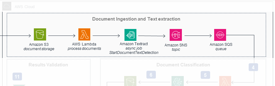
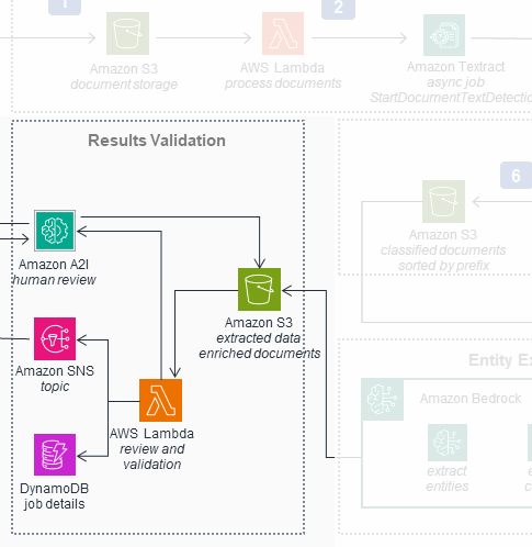
Below is the architecture diagram for AWS’s Intelligent Document Processing sample solution. It comes directly from the linked repository. The system is a serverless, AI-driven application for classifying and extracting information from loan application documents.
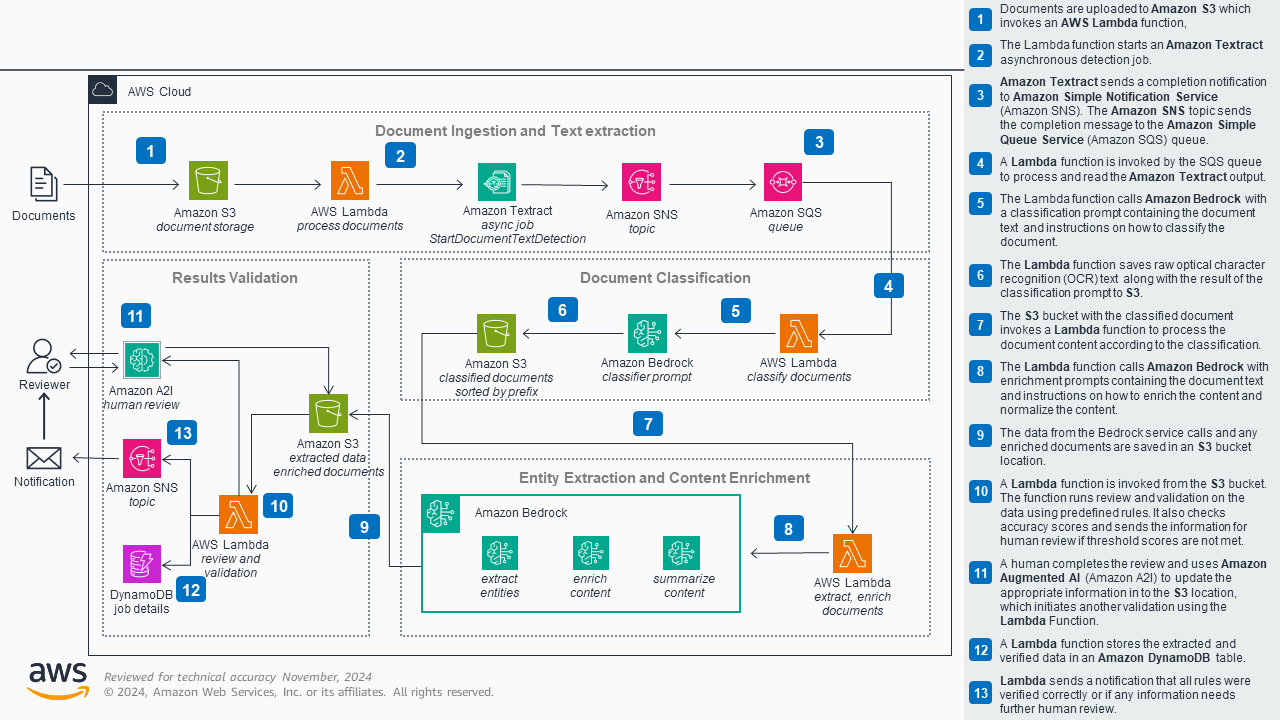
The original diagram. Click to enlarge. Credit: Amazon Web Services
This diagram appears reasonable at first glance. It shows the system resources and the steps between them. The arrows aren’t labeled (usually a major anti-pattern in diagramming), but most of them are numbered and explained in the sidebar in some detail.
As is so often the case, however, first impressions can be deceiving. Beyond a few minor omissions and simplifications, there are unfortunately significant discrepancies between the diagram and the actual implementation it purportedly depicts. These include substantial inaccuracies in how the system operates and even outright fabrications in functionality.
The consequences of these problems are not insignificant. Experienced developers familiar with the technologies (such as Lambda and S3) may be able to “see past” the issues and take away some valuable insights about the system. However, they are also more likely to want to know the finer details of the system that are either missing or wrong in the diagram.
The situation is arguably worse for inexperienced developers. While the omission of details is somewhat advantageous for them, they are also much more easily misled by the diagram’s core inaccuracies.
Like in the previous articles in this series, here we’ll attempt to improve this diagram by fixing those inaccuracies and adding relevant details. The goal is to transform the diagram into a rich, valuable source of information that helps both experienced and inexperienced developers understand the system it depicts.
The problem in brief
This diagram’s biggest and most significant issue is that it misrepresents how the system works at a fundamental level. The diagram depicts the system as if it were an assembly line: data flows neatly from one resource to the next. Except for the final part in the bottom left (though more on this later), it’s as if each resource takes input from its predecessor, augments that input, and then passes it along to the following resource:
The original diagram depicts the system as an assembly line
To be sure, this is sometimes what is happening in the actual system. For example, the top line of the diagram, the ingestion and extraction workflow, is mostly accurate (as discussed below). But as a rule, this depiction isn’t correct, and the diagram is depriving viewers of critical knowledge of the intricate back-and-forth control flow of the system.
Making matters worse, each resource is the same size, which doesn’t help the viewer understand the relative importance of each resource or its role in the system. Some resources also appear twice as two separate boxes, giving the false impression they are distinct resources when they are in fact the same.
Again, developers experienced with these technologies will know there is more going on in the actual system than the diagram shows. Inexperienced developers, however, might be severely misled.
The solution: sequence diagrams
We’ll attempt to improve this diagram with the above in mind. Our goal is to make a diagram that is both accurate and detailed. The new diagram will ideally be valuable both as an introduction to the system and as a comprehensive reference. To these ends, we will show the detailed back-and-forth interactions between resources that occur in the actual system. We’ll also try to clean up other issues, such as poor resource labels, duplicated resources, and outright fabricated steps.
To allow for the additional detail, we’ll start by converting the diagram format from a “numbered steps” diagram to a more traditional kind of diagram: the sequence diagram. Here is how it looks when zoomed out to show as much of the system as possible:
Like in the original, we’ll split this diagram into four workflows, each centered around a lambda function. Because the new diagram has too much detail to fit on the screen at once, we’ll use Ilograph to zoom in on each workflow:
Zooming in on individual workflows
Sequence diagrams were introduced in 1995 as part of the Unified Modelling Language (UML). They were designed specifically for showing complex, detailed interactions, and are therefore an ideal choice for our use case. Sequence diagrams are read top-to-bottom as control (and data) passes between resources. The elongated resources allow for many more steps to be shown compared to the small square resources in the original.
We’ll now go through each workflow in detail to show what has changed between the old and updated diagrams.
Original
The first workflow of the original diagram
Updated
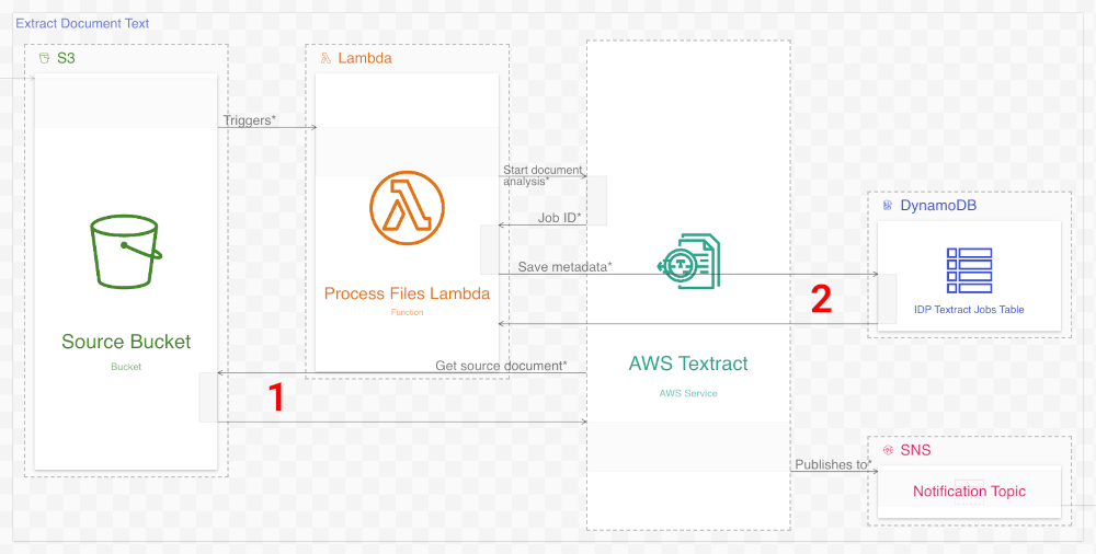
As mentioned earlier, the first workflow in the original diagram is mostly accurate. In the system, as in the diagram, S3 triggers a lambda call, which in turn calls AWS Textract. Textract, in turn, does indeed notify SNS when it is complete.
The changes we make in the new diagram are correspondingly modest. In the system, Textract retrieves the document data from the Source bucket in S3, so we add that step here (1). Also added is a step showing the lambda saving metadata to DynamoDB (2). Future steps read this metadata, so including it here is essential.
In addition to adding steps, we update some resource names for clarity and/or to align with the resource names in the actual system. We also add more detailed descriptions to each step, which appear on mouse-over (or, on mobile, on tap). We’ll tacitly make these kinds of enhancements in future workflows.
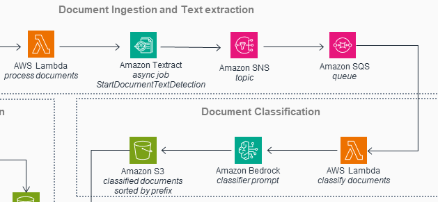
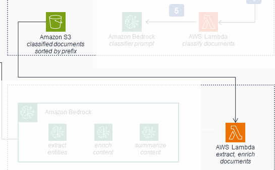
Workflow 2: Document Classification
Original
The second workflow of the original diagram
Updated
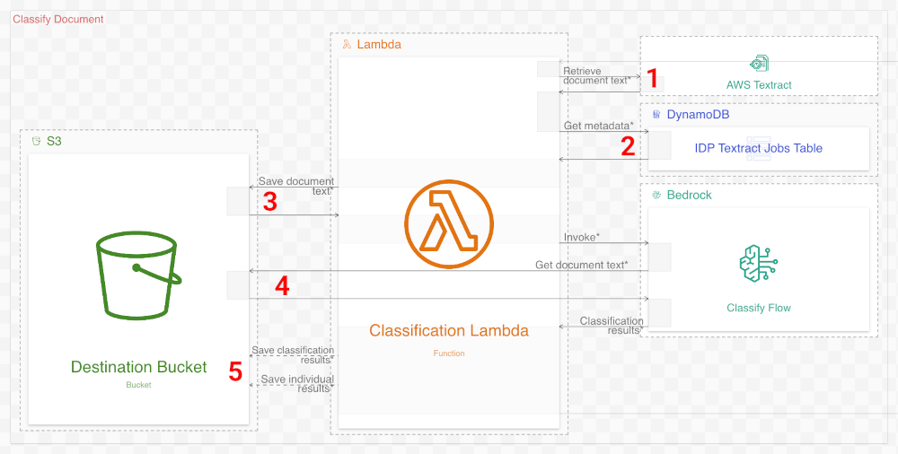
The second workflow in the original diagram is unfortunately not as good as the first. The mere three-step process it depicts belies the complexity of the actual system. There are also a few inaccuracies. The new diagram attempts to remediate these issues as follows:
- (Added step) The Classification Lambda function retrieves the results of the previous workflow from Textract.
- (Added step) The lambda function also retrieves metadata that the previous workflow saved to DynamoDB.
- (Added step) The lambda function saves the raw Textract results to the Destination S3 bucket.
- (Correction) The original diagram misexplains that the lambda function passes the Textract results to the Bedrock flow. In reality, the flow retrieves this data from S3.
- (Correction) The lambda function, not the Bedrock flow, saves the results to S3.
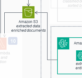
The original diagram also misexplains that the S3 bucket is responsible for calling the lambda (Analysis Lambda) in the following workflow:
This connection isn't present in the actual solution
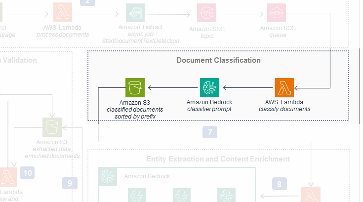
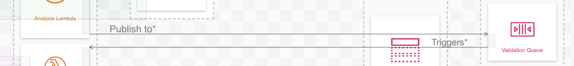
In reality, the Classification Lambda function enqueues a message on an SQS queue (Analyze Queue), which in turn invokes Analysis Lambda. Though not visible in our new diagram when zoomed into a workflow, this interaction is visible when zoomed out:
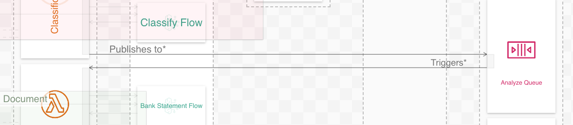
Classification Lambda publishes to SQS, which triggers Analysis Lambda
Workflow 3: Document Analysis
Original
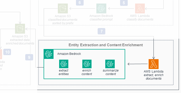
The third workflow of the original diagram
Updated
The third workflow in the original diagram accurately depicts Analysis Lambda invoking Bedrock. However, instead of invoking three Bedrock flows, only a single flow is actually invoked. We fix this in the new diagram and add steps to show the Bedrock flow retrieving the document from S3 (1) and Analysis Lambda saving the results to S3 (2).
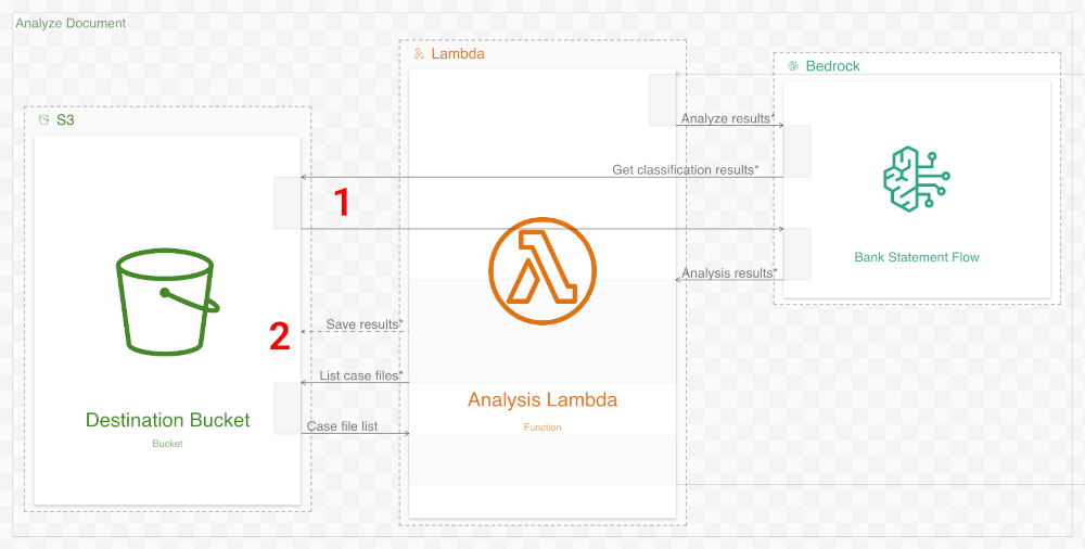
Like in the previous section, the original diagram misrepresents how control passes from this workflow to the following workflow. The original diagram shows the following workflow triggered by Bedrock pushing data to S3:
This connection is also not present in the solution
In reality, Bedrock does not save data to S3 (Analysis Lambda does this). Similarly to the previous section, S3 does not trigger the control flow. Instead, control passes between these workflows by way of an SQS queue (Validate Queue). This interaction is again visible when zoomed out:
Analysis Lambda publishes to SQS, which triggers Validate Lambda
Workflow 4: Document Validation
Original
The fourth and final workflow of the original diagram
Updated
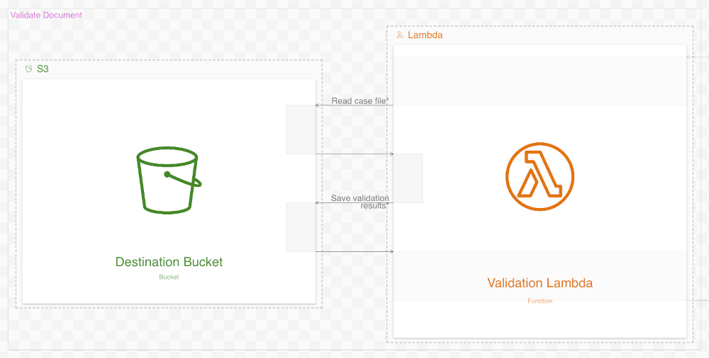
The fourth, and final, workflow in the original diagram is a doozy. It shows a scramble of resources invoking each other, sometimes cyclically, as the document is validated. It includes resources not previously referenced, like AWS A2I.
The fourth workflow in the new diagram, you no doubt have noticed, is much simpler. Almost all of its steps are gone. The new diagram depicts the Validate Lambda function simply reading the previous results from the Destination S3 bucket and then writing validation results to the same bucket. What happened?
The new diagram is simpler because it reflects the system’s actual behavior. Our goal is to create a detailed and accurate diagram, with the system’s source code as our source of truth. This source code does only these simple things (contra the original diagram), and so this is what our new diagram depicts.
Whether this is “correct” or not is more nuanced.
A matter of perspective
The original and new diagrams ended up substantially different. In this article, we say our new diagram is “fixed” or “improved”, but the truth is that the new and old diagrams have different goals. Decisions on what to include or omit, like in Workflow 4 above, depend on these goals.
The new diagram’s primary goals were accuracy and precision: we wanted a diagram that accurately depicted what the system did in high detail. As stated previously, such a diagram would be most useful for onboarding and as reference material.
The original diagram’s primary goals aren’t the same. Its overall goal, to be blunt, is marketing. It exists primarily to show how a system using AWS services (especially Bedrock and Textract) could look. Most people who will view this diagram won’t work on the system it depicts, so accuracy and completeness are deprioritized in favor of simplicity and readability.
This doesn’t make the original diagram wrong, but there are potentially adverse consequences. Being so prominent (as an official AWS guidance resource), developers will naturally look to it as a good example or even “best practice” of system diagramming. Unfortunately, this isn’t the case. The original diagram, as constituted, is suitable for marketing, but would be bad as an internal reference. Be aware of these differences in goals, and always make sure your own goals are clear when creating diagrams of your systems.
Click here to view the diagram used throughout this article.Questions or comments? Please reach out to me on LinkedIn or by email at [email protected].