.png)

It’s official: Taylor has entered her data visualization era.
Today, the pop icon and global superstar dropped The Life of a Showgirl, her 12th studio album. And in the lead-up to this monumental event, a group of Swifties here at Grafana Labs had a thought: what better way to celebrate than with a Grafana dashboard?
From there, the group got to work and used Grafana Assistant — an AI-powered agent in Grafana Cloud that helps you query and build dashboards faster using natural language — to create one of the most dazzling dashboards we’ve seen to date.
So go grab your favorite cardigan and settle in, because in this post, we dive into a new Grafana Cloud dashboard that helps you track career milestones, analyze album vibes (is Lover really more danceable than 1989?!), and visualize all the eras of the one and only Taylor Swift.
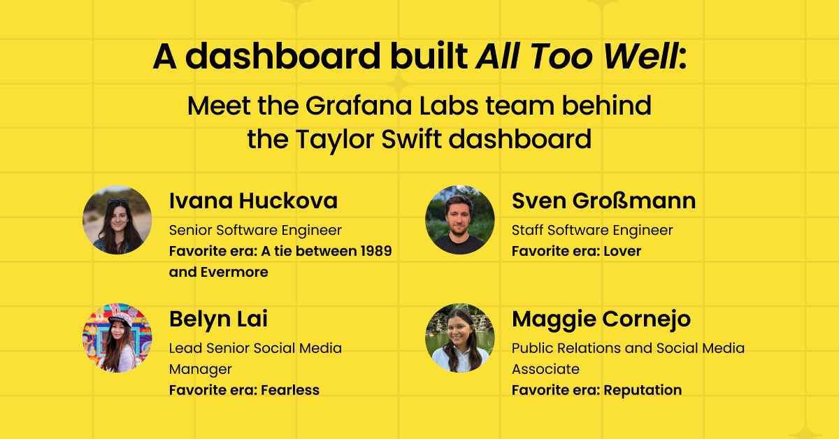
First, a quick look at our dashboard creators (and why they chose Assistant)
One of the reasons Grafana Assistant is so powerful is that it enables a wide range of users, observability experts and novices alike, to more easily navigate to the right places in Grafana and build beautiful dashboards.
This is exactly why the team of Grafanistas shown below — Ivana, Sven, Belyn, and Maggie — chose Grafana Assistant for this Taylor-themed project: to ensure ease of use and that they’d all be empowered to contribute and create, regardless of their roles or experience levels with Grafana.
If you’re interested in learning more about Assistant, and how our own engineering and product teams are using it to debug, query, and build faster, check out this blog post.
Are You Ready For It? A tour of the Taylor Swift dashboard
The team used Assistant to build virtually every component of their Swift-acular dashboard, ranging from simple text panels to dynamic, data-driven charts. The process was highly iterative; they often started with an auto-generated dashboard and then refined it using natural language.
The end result is a vibrant dashboard consisting of four distinct tabs, each offering a unique view into Taylor’s prolific career.
Tab 1: Profile and career stats 🏆
The first tab is designed to feel like an introduction to Taylor (every Swiftie has to start somewhere, right?). Using an array of static text panels, it offers a high-level snapshot of her career milestones — including a timeline of her eras and how many times she’s won a Grammy — along with some fun facts about her personal life. All of the text and data seen in these panels was generated by the built-in knowledge of Grafana Assistant’s LLM.
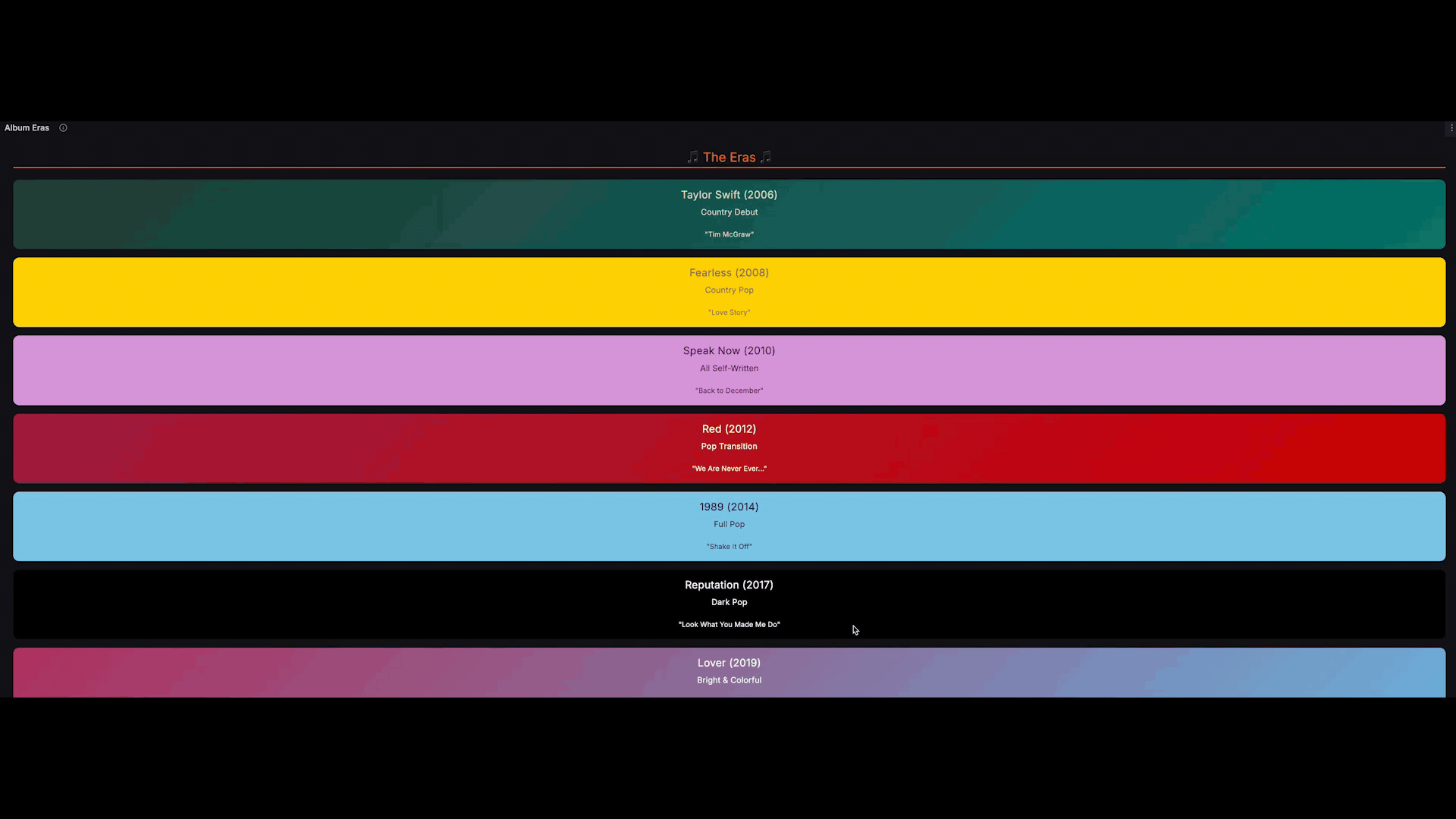
In the lead-up to The Life of a Showgirl release, this tab also included a live countdown to the Oct. 3 release date, created using Grafana’s clock panel.
Tab 2: Musical characteristics and song analysis 🎵
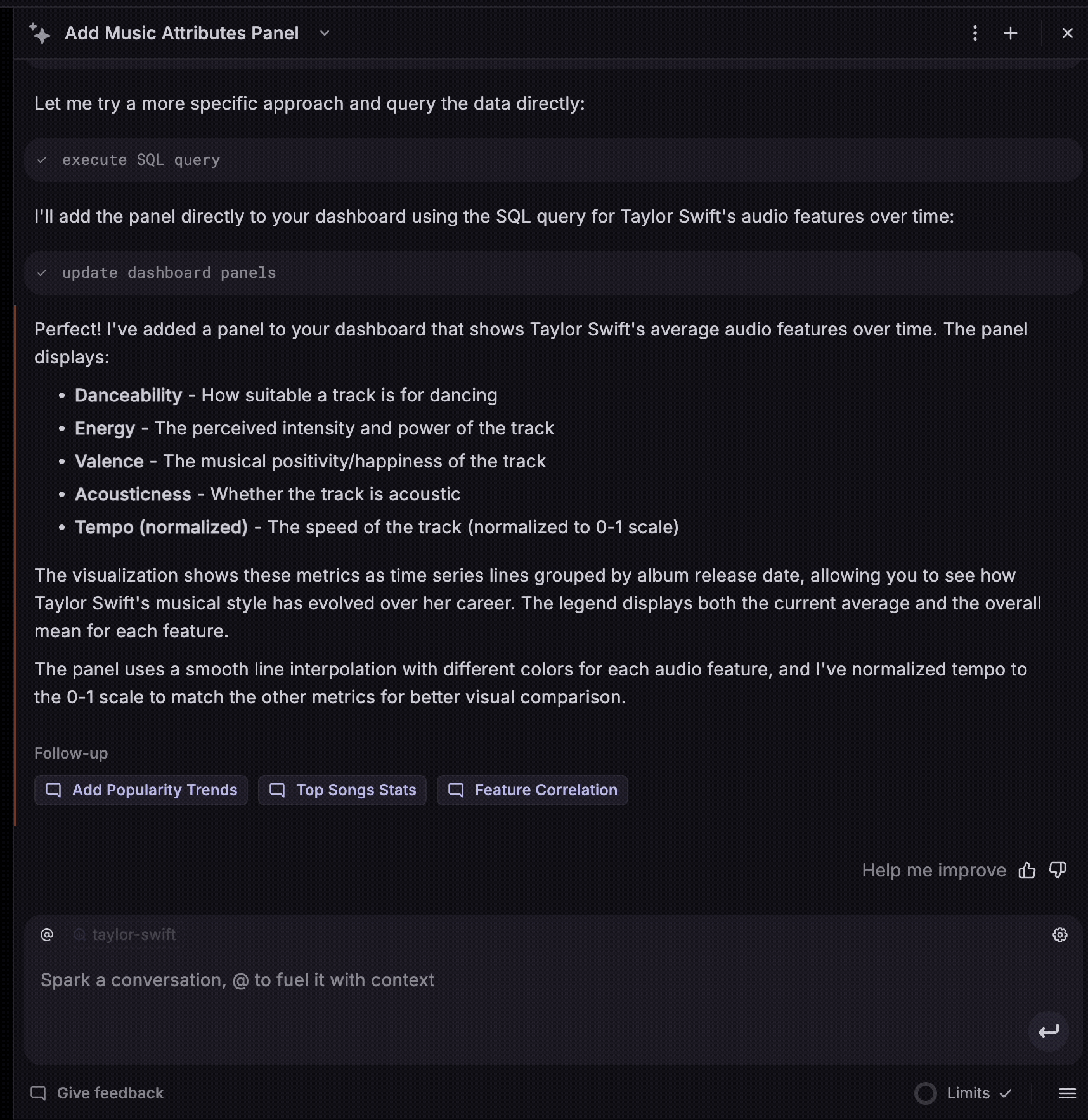
The second tab of the dashboard dives deeper into the music itself, using Google BigQuery as the data source. The team imported a Kaggle data set that’s built off a Spotify API to visualize key details and characteristics of Taylor’s end-to-end discography (including her re-recorded songs, of course). Some of these characteristics include danceability, energy, and acousticness.
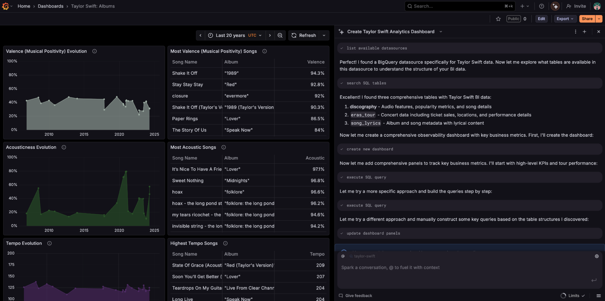
The resulting panels help you visually track the evolution of Taylor’s musical style over the years, surfacing insights that are bound to spark discussion (and no doubt some debate) among fans. Some of the these insights include:
- “I Think He Knows” (Lover) is the most danceable track
- “Shake It Off” (1989) is the track with the most valence (aka, conveys the most positivity)
- “Haunted” (Speak Now) is the most energetic
Fun fact: the panels in this tab (and throughout much of the dashboard) follow the same color scheme that’s often used to denote Swift’s different albums and eras. Midnights blue, anyone?
Tab 3: Eras Tour analytics 🎤
The friendship bracelets. The bodysuits. That iconic bridge from Cruel Summer. The Eras Tour was epic in oh-so-many ways, and our team of Grafanistas knew their dashboard had to rep it.
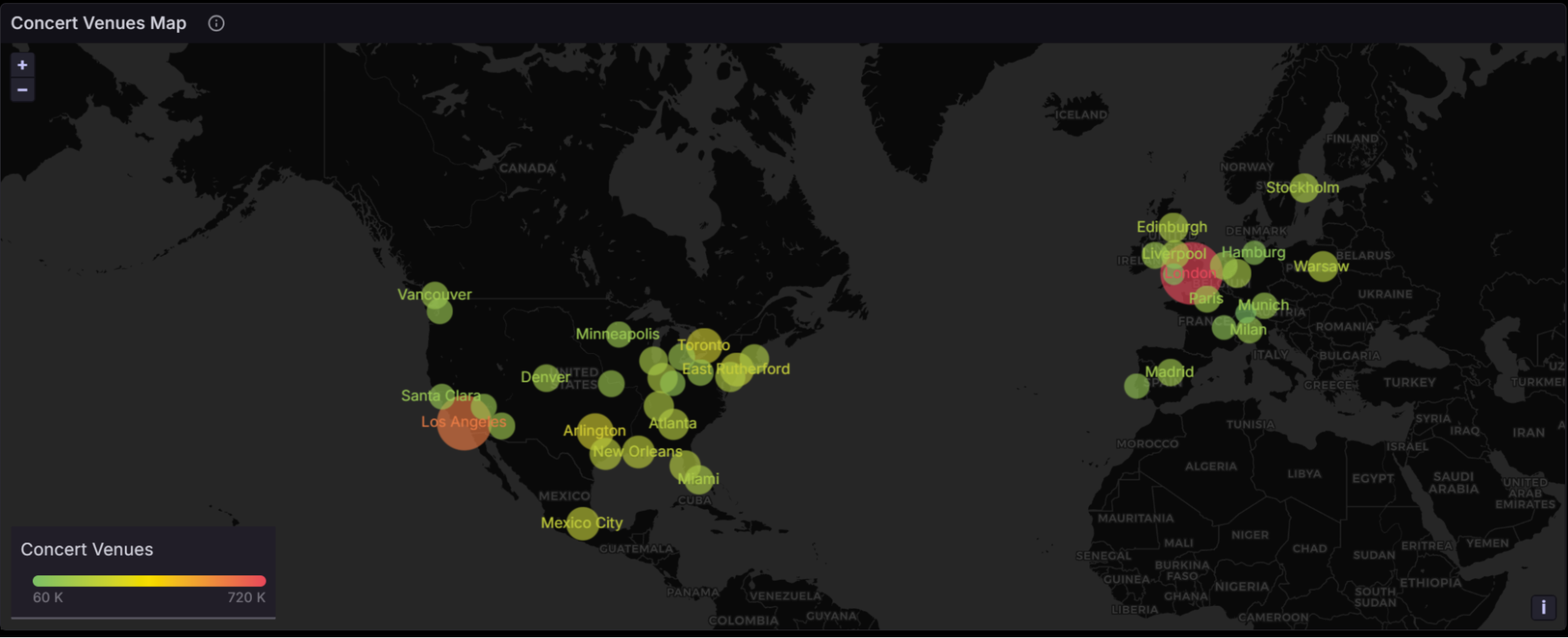
That’s why they built the third tab, which uses data to convey the incredible reach and impact of Taylor’s recent global tour. Like the Musical characteristics and song analysis tab, this one uses BigQuery and a Kaggle data set behind the scenes. Some of its highlights include:
- A geomap panel (shown above) that plots every tour stop by latitude and longitude, complete with attendance numbers.
- A ranking of the top cities by attendance.
- Lists of opening acts for each show.
- A pie chart and tables breaking down surprise performances.
Tab 4: The Life of a Showgirl ✨
Since Taylor’s new album inspired this project, the fourth and final tab is dedicated, of course, to The Life of a Showgirl.
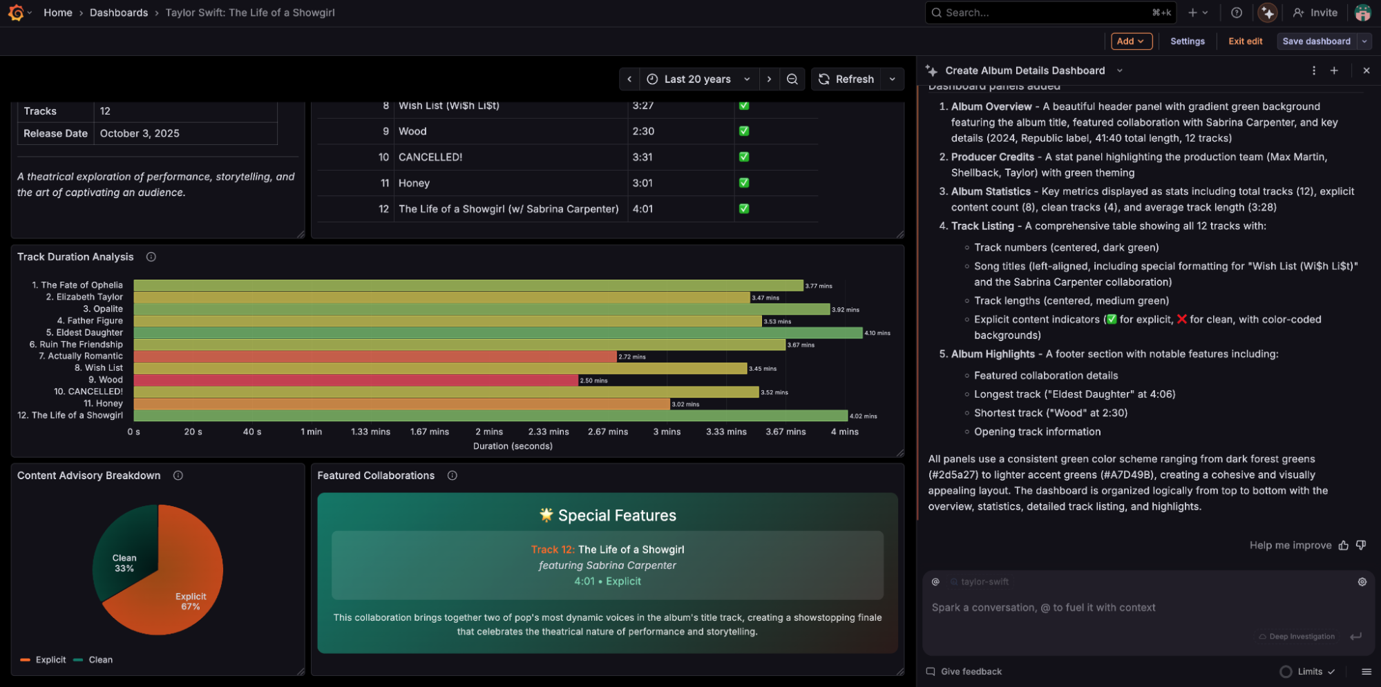
This tab provides a visual overview of the album, including a track listing and duration analysis, stats about the production team, and special features, like the Sabrina Carpenter collab.
Bonus: A Grafana Assistant “Easter egg”
In the Swiftie-verse, an “Easter egg” refers to a hidden clue or detail that Taylor plants in her work to suggest something big (like a new album) is coming. Naturally, the Grafana Labs masterminds behind our new dashboard created a little Easter egg of their own.
When you open Grafana Assistant in Grafana Cloud, you can type the name of a certain song (see above) into the chatbox, and the UI will give you a delightful little shake… shake… shake. (Don’t have a Grafana Cloud account yet? You can sign up for a free one today and start exploring with Assistant.)
Build the dashboards of your Wildest Dreams
To all the Swifties out there, happy The Life of a Showgirl release day.
We hope you’ll explore this new dashboard to track Taylor’s career milestones, musical evolution, and more. And if you haven’t already, give Grafana Assistant a try. The new AI-powered agent makes it easier and faster to build dashboards in Grafana Cloud — whether you’re monitoring system uptime or the world’s biggest pop star.
Grafana Cloud is the easiest way to get started with metrics, logs, traces, dashboards, and more. We have a generous forever-free tier and plans for every use case. Sign up for free now!