.png)
 4 hours ago
1
4 hours ago
1

In software interface design, what’s the opposite of consistency? Inconsistency, right?
This is a derogatory term, and fair enough—if we don’t actively work to keep our interfaces consistent, our products become an unusable, unlearnable mishmash. Consistent designs are “learn once, apply anywhere.”
Sometimes, though, we sacrifice consistency for a higher purpose. When we do it intentionally, we can call that contextual design or contextuality—tailoring software to specific users and their situations.
That is, the best products aren’t necessarily perfectly tidy. On websites, signup buttons look nothing like login buttons—signup buttons are generally much more prominent. This user-centric design stems from the need for new users to have obvious signposts.
Consistency and contextuality are often opposing forces, like yin and yang. Consistency is the yin—a passive design, not sticking out among the other elements. Contextuality is yang—active, targeted. Like the white spot in the dark half of the yin-yang symbol, the best interfaces often have a touch of contextuality mixed into an overall consistent design.

Engineers often debate the balance between consistency and contextuality. I’ll go through a few examples. Then I’ll talk about why people bring biases to these arguments. Finally, I’ll give a few tips for navigating the tradeoffs.
Here are a few examples of consistent interfaces that evolved to become more contextual as the products matured.
Password forms hide our passwords as we type to prevent prying eyes from seeing our passwords even though it increases typing mistakes. Today, we accept this tradeoff as given, but technically, this is “inconsistent” with other text fields which display what’s typed in the clear. In the early years of computing, this pattern wasn’t standard. The divergence between passwords and other text fields is a sign of maturity, not incoherence.
Windows 8’s start screen, when activated, completely took over your monitor’s screen. This design works well for touchscreen tablet users, and Microsoft aimed for Windows 8 to be used in the emerging tablet market and to work consistently across both desktop and tablet form factors.
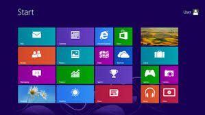
However, laptop and desktop users found it jarring, partly because they lost all visual context and the ability to interact with the rest of the operating system while it was open. Windows 8 sold a fraction of the units that Windows 7 did. In response to the blowback, Microsoft adopted a more contextual design for Windows 10, relegating the full-screen start menu to “tablet mode.”
Before 2021, Spotify defaulted to shuffling both albums and playlists when people clicked the Play button. Adele famously complained, noting that this took power out of artists’ hands to carefully craft the track orderings and track-to-track transitions in their albums. Spotify agreed—they stopped the default shuffling of albums while maintaining the behavior for playlists, where it made much more sense.

For products to become delightful, engineering teams must occasionally be willing to break with consistency. To do this tastefully, we need to move past our biases, one way or the other, and think through designs on a case-by-case basis.
Start with biases.
Engineers or product managers on a feature crew building a feature may be biased toward contextuality, especially if they’ve been thinking of their users. They could create a design that’s perfect for a given situation in isolation, but lack the complete knowledge of the product surface to make it fit.
New engineers may also be unfamiliar with the existing codebase, unaware of the implementation and maintainability constraints they will face with their bespoke design.
One of a tech lead’s jobs is to advocate for interface consistency in the face of this, but they, too, may have a bias.
Tech leads often know the most about the existing product and, when reviewing designs, can easily spot divergences from how other parts of the product work. They also understand how novel designs will increase codebase complexity. This instinct will serve them well, but consider:
They know way more about their product surface than a typical user. Users don’t survey the whole product in detail and build a diagram of all the interactions in their heads, spotting inconsistencies. Whereas it’s the tech lead’s job to do just that.
They want to keep the product simple enough for them to keep in their heads and maintain across many features.
They’re familiar with the current design and may even be attached to it, potentially overlooking usability gaps.
They juggle many balls, and may not be as deeply familiar with the feature being built or the specific needs of the users.
Biases are a good starting point, but for key design decisions, we need to do better.
To achieve the appropriate balance of yin and yang, begin by being aware of your own biases and use that as motivation to explore the other side. Then, think about users.
Stay aware of the target audiences and their sizes.
With the Windows start menu, while some users indeed use hybrid devices that can swap between tablet and laptop mode, most users do not. Consistency within a single audience segment matters more than consistency across segments.
Sketch user scenarios that illustrate the tradeoffs.
When deciding whether shuffling should be the default for Spotify albums, bring up the scenarios of shuffling Broadway musicals and albums with tracks that bleed into one another. For passwords, consider “over-the-shoulder” moments or entering passwords when projecting presentations.
Consider two designs, one that’s maximally consistent and one that’s more contextual. Test them side by side against the scenarios to see if the contextual design provides enough user value to justify lowering consistency. Often, the designs get blended, mostly staying consistent except where it really matters.
Password fields in forms should be aligned and styled just like the other text fields, except for the one wrinkle that they hide their input. Spotify albums and playlists should adhere to the same design language, with any differences based on their fundamental properties.
Be aware when consistency is holding you back. Overfocusing on consistency can slow down innovation or cause you to repeat past mistakes. If you can’t come up with a good, consistent design, loosen a constraint and see what you can come up with.
If your product is young and scaling, almost all of your users are in the future and will have never experienced the old interface. Don’t be too precious about what came before.
Consider making an interface temporarily inconsistent and improving consistency later. Windows 8 did this, leaving antique Control Panel menus mixed into the more modern design. This was annoying for some users, but insisting on getting absolutely everything in the sprawling OS before releasing would have meant stasis. They likely used telemetry to determine the most common interactions to convert first.
Thanks for reading! I’m back! I took a few months off from the blog to meet the deadlines for my forthcoming book, The Product-Minded Engineer. Now that it’s mostly wrapped up, I plan to post more. What topics would interest you?