.png)

 I’m used to environmentalists and futurists writing about The Limits to Growth. I’m less used to seeing investment writers mention research that’s linked to The Limits of Growth. But that’s what Joachim Klement did in his daily newsletter recently.
Of course, anyone who writes about Limits of Growth has to do all the usual disclaimers first. This is because the combination of the words “limits” and “growth” in the title produced a lot of critical responses, on a range from straight-up hatchet jobs which misrepresented the book, to people who didn’t appear to understand the systems dynamics model that sat behind it.
(I edited a special edition of the APF newsletter Compass that looked back at Limits to Growth. There’s an article in there by Ugo Bardi that goes into the detail of the history of the assault on Limits when it was published.)
Standard run
Klement puts it this way:
Here is what the model actually predicted. The scientists at the MIT modelled three scenarios [actually 13, including these three–AC]: business as usual (what was then called ‘standard run’), a technologically enhanced world where technological progress eliminates most limits to growth, and a stabilised world where our economies shift to a sustainable (i.e. non-resource consuming) model by the turn of the century.
The trouble with the ‘standard run’ is that its 50-60 year outcomes weren’t that good. They suggest that global industrial output will start to decline in the mid-2020s (checks calendar), and that global population will start to decline in the mid-2030s.
In the 2010s, Graham Turner looked at the standard run against out-turn data, as Klement reminds us, and found it a good fit. Gaya Herrington updated this research in the early 202s—as per my Just Two Things piece linked here—and it was a still a good fit.
Recalibrating the model
Now another group of scientists have gone back to the original World3 model and recalibrated it against the best fit data, which is what has prompted Klement’s article. ‘Recalibration of limits to growth: An update of the World3 model’, by Nebel et al, is published open access in the Journal of Industrial Ecology.
The point of doing this is—as they say in their abstract—is
to better match empirical data on world development.
For assurance, the article goes into detail about their method and their approach, including access to the Python scripts they have used, which have been posted on Github. As they explain:
Since the model was calibrated with the limited capabilities in terms of computing power and data processing in 1972, it seems interesting to what extent a recalibration of the model is possible and what are the effects of such a recalibration. The data situation has improved enormously since then.
Overshoot and collapse
What this means is that the recalibrated model reflects the best available current data.
Klement explains the approach this way:
If the recalibrated model deviates significantly from the forecasts of the 1970s, we have made progress. And given the accuracy of the original model, we can also take some comfort that any progress we made is likely to be real and we have truly extended economic growth further into the future.
And the outcomes of this recalibration? Well, they’re not good. Again from the abstract to the article:
This improved parameter set results in a World3 simulation that shows the same overshoot and collapse mode in the coming decade as the original business as usual scenario of the LtG standard run. [My emphasis]
Industrial production decline
It is worth spelling out the dimensions of this overshoot and collapse. As it happens, there are some handy charts both in Joachim Klement’s article and in the original paper. I’ve reproduced Klement’s versions here because they are easier to read, but the originals are downloadable from the original article.
The first chart is for industrial production, where the recalibrated version tracks the original to the centimetre, pretty much. Does this matter? Klement does the usual wave towards the fact that we live in a much more services-based economy than we did even when the Limits team did the original study.
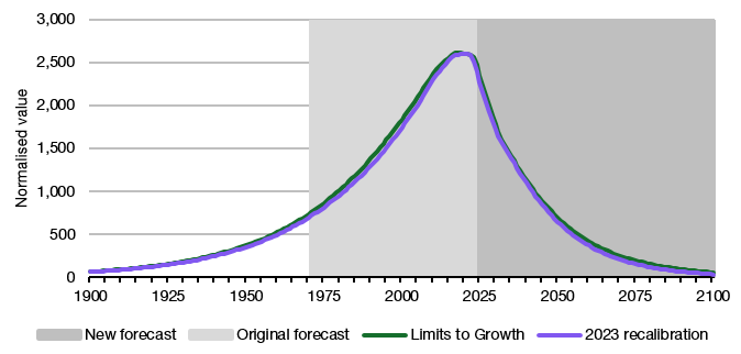
(Source: Nebel et al, 2023, adapted Klement)
Peaking food production
I’m not completely convinced of this. As David Mindell observes in The New Lunar Society (I have a review in the works), industrial production has significant multiplier effects on other economic activity, even if this is largely overlooked by economics [p33]. The updated population diagram also follows closely the decline in the mid-2030s that is seen in the Limits base case projection.
On food production, it
also seems to be peaking right about now indicating that despite continuous growth in the global population, we are experiencing declining global food production.
Delaying the peak
So it’s possible to imagine that one of the reasons why population starts to decline is because there isn’t enough food to go around. It’s also possible to imagine that the higher peak, and faster overshoot, is a result of the intensification of agriculture and food production, which is about the application of technology. As one of the Limits’ authors, Dennis Meadows, always insisted when asked, technology can delay a peak, but the crash comes harder when it comes.
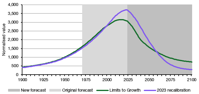
(Source: Nebel et al, 2023, adapted Klement)
The third chart here is for ‘persistent pollution’, which is a modelling shorthand for a range of externalities including CO2 emissions. Here, on the face of it, we have beaten the model: ‘persistent pollution’ is currently much lower than the World3 standard run. But given that it climbs much higher, and hangs around for much longer, it actually just seems that with better data it turns out that initial effects were less severe but the delays in the system were much greater than the original model assumed.
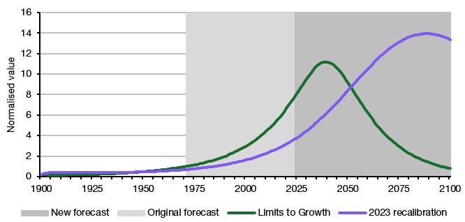
(Source: Nebel et al, 2023, adapted Klement)
Downhill from here
The last chart assembles something from the data that wasn’t done in the original Limits to Growth work because the concept hadn’t been developed. But it is possible to assemble a Human Development Index from the data, and reference it against the original model and the revised version. It doesn’t come out well.
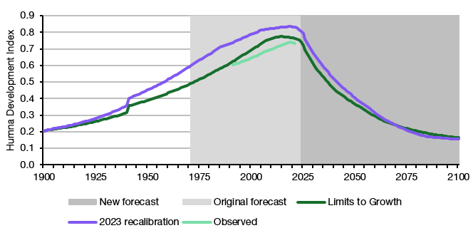
(Source: Nebel et al, 2023, adapted Klement)
On this last chart, Klement is most depressed, and I think with good reason:
If [this chart] is true, it says that today is peak human civilisation, from now on we are going backward on a global level in terms of human development and quality of life, While some countries will continue to improve, other countries and the planet as a whole will start to go backward, ultimately dropping back to similar levels of human development and quality of life as in 1900 by the end of this century.
Tipping point
The overall conclusion by the article’s authors is:
[T]he model results clearly indicate the imminent end of the exponential growth curve. The excessive consumption of resources by industry and industrial agriculture to feed a growing world population is depleting reserves to the point where the system is no longer sustainable. Pollution lags behind industrial growth and does not peak until the end of the century. Peaks are followed by sharp declines in several characteristics.
They also note that the cause of this turning point is resources, not ‘pollution’:
This interconnected collapse… occurring between 2024 and 2030 is caused by resource depletion, not pollution.
They also have an interesting caveat. This is that the way the World3 model works is a through a set of connections that exist within an environment of growth. In an environment of decline, they are likely to reconfigure themselves in different ways. That doesn’t mean that there won’t be a decline—just that the current lines in the model that describe it may not follow quite the same patterns.
But one final note from me. Economists get over-excited when anyone mentions ‘degrowth’, and fellow-travellers such as the Tony Blair Institute treat climate policy as if it is some kind of typical 1990s political discussion. The point is that we’re going to get degrowth whether we think it’s a good idea or not. The data here is, in effect, about the tipping point at the end of a 200-to-250-year exponential curve, at least in the richer parts of the world. The only question is whether we manage degrowth or just let it happen to us. This isn’t a neutral question. I know which one of these is worse.
—
A version of this article was also published on my Just Two Things Newsletter.