.png)

So, in r/Indonesia, there’s this thing called the Daily Chat Thread (DCT) — a recurring post where members of the subreddit can smalltalk about anything and everything.
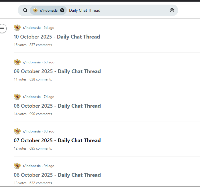
It’s a clever social feature that solves a common subreddit problem: you often want to talk about something, but the topic isn’t big enough to justify a full post. This little innovation significantly improves user engagement across the community.
I’ve always liked this kind of thread, and for the past several days, I’ve found myself hanging out there quite often.
One night, during the October 14, 2025 edition of the r/Indonesia DCT, a certain redditor posted this:
“Maybe this time I’ll make a script to map out which users are in the same circle with whom, who has fought with whom, who used to date whom, and who’s hung out together. Then I’ll update my LinkedIn skills with data processing and visualization.”
That was an interesting coding prompt.
Alright, I thought — let’s actually do it.
The plan was straightforward.
Download the entire thread data using the Reddit API.
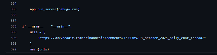
In this Python script, you can enter any Reddit thread URL.
Cache the downloaded data locally.
Because some threads can get quite large, it doesn’t make sense to re-download everything each time you run an analysis. Once the data is saved locally, subsequent runs will reuse the cached data instead of calling the Reddit API again.
Perform graph analysis.
Each Reddit user becomes a node, and each interaction (reply) becomes an edge.
Defining Metrics
I defined a few key metrics to quantify user behavior in the thread:
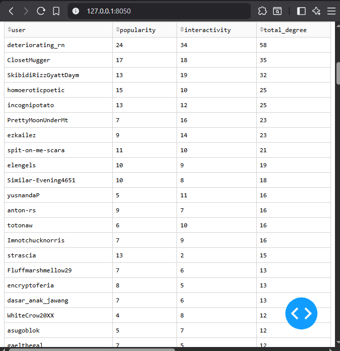
Popularity — measured as the in-degree of a node. Every reply a user receives increases their popularity score.
Interactivity — measured as the out-degree. Every reply a user sends increases their interactivity score.
Total Degree — simply the sum of popularity and interactivity, representing overall participation.
Building the Graph
Then comes the visualization.
In the resulting graph, users positioned near the center tend to represent the most active discussions of the day. The closer a user is to the center, the more socially engaged they were — the “center of attention,” in a way. Users on the outskirts of the visualization had little to no interaction.
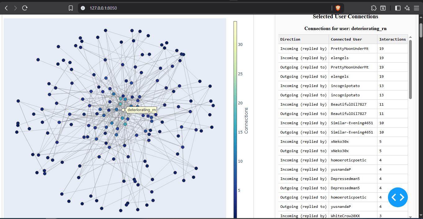
To capture the closeness between users, I introduced a graph weight based on the depth of their interaction chain. Two users who replied back and forth multiple times will be positioned closer together. This weight-based graph layout helps reveal hidden social circles that naturally emerge within the conversation.
Interactive Exploration
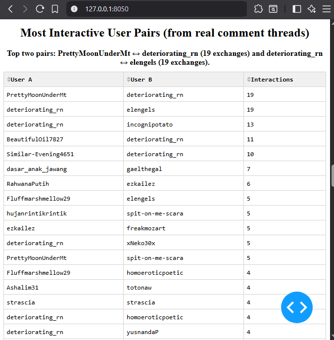
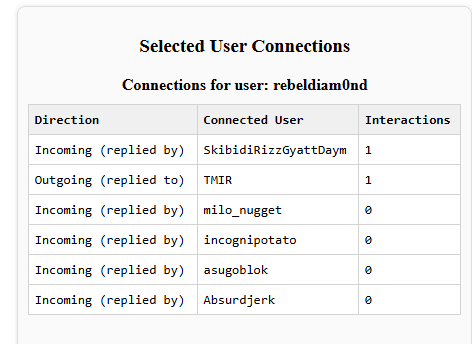
The visualization isn’t static. You can click on any node to explore its details — who the user interacted with, and how strong each connection was. Connections are sorted by their interaction depth, giving a rough idea of who’s socially closest to whom.
In some cases, you might notice that a user has “zero” interaction values. That usually represents one-sided interactions, where User A replied to User B, but User B never responded.
Implementation
The full source code is available here.
You’ll only need to modify two parts:
At the top of the script, insert your Reddit API credentials.
At the bottom, specify the target Reddit thread URL you want to analyze.
Run the script, and you’ll get an interactive dashboard showing the evolving social web of a Reddit thread — where every comment becomes a connection and every discussion forms a cluster.