.png)

I gave a talk at the 2025 Tracing Summit last month titled “Perfetto: The Swiss Army Knife of Linux Client/Embedded Tracing”. My goal in this talk was to show how Linux kernel, systems and embedded developers can use Perfetto when debugging and root-causing performance issues in their respective domains. Even though the Perfetto UI is primarily built for viewing Android or Chrome traces, it is a flexible tool and can be used in many other ways!
The talk was recorded and is available on YouTube. Taking inspiration from Simon Willison, this post is an annotated presentation containing my slides and detailed notes on them. The talk also has a lot of UI demos: for these, I’ll have a screenshot but also a link to the relevant part of the video (videos are unbeatable for UI!).
First, what is Perfetto? Perfetto is fundamentally a suite of tools: it’s not just one thing but a bunch of different tools working together to help you debug and root-cause problems. This diagram shows how everything fits together, with the core parts of the Perfetto project in the center.
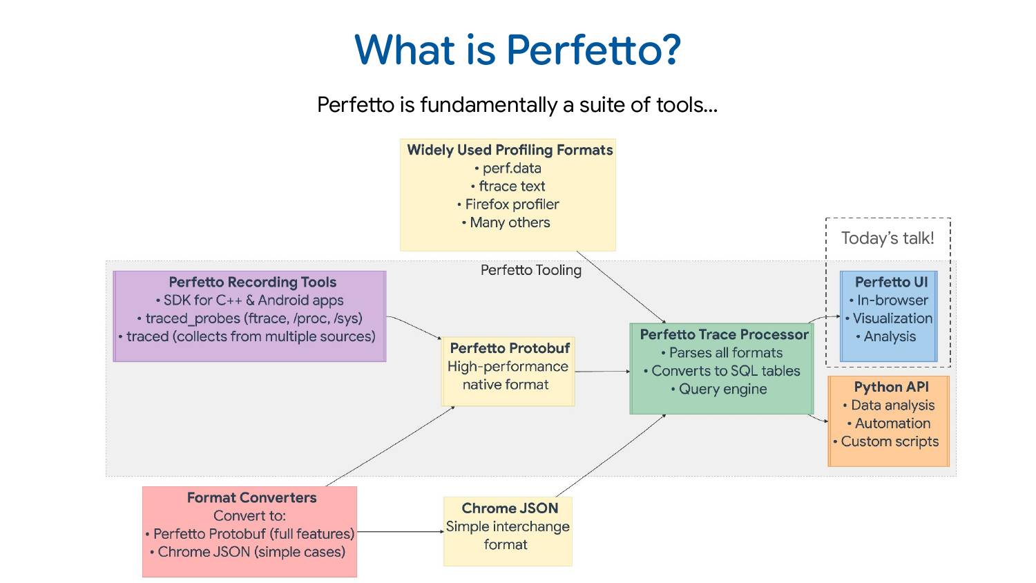
The recording tools for Perfetto consist of 1) an SDK for C++ apps 2) a daemon that can collect data from ftrace, /proc, /sys, and various kernel interfaces 3) another daemon that amalgamates trace data from multiple processes into a single trace file. These tools all speak the Perfetto protobuf format, a high-performance trace format designed to be very efficient to write but not to analyze or consume directly.
That’s where the trace processor comes in. It’s a C++ library that parses the protobuf format, but also a bunch of other widely used trace formats. It exposes this data via an SQL query interface to any embedding program including Perfetto UI (which is what most of this talk is about) and also to the Python API if you want to do ad-hoc scripting or analysis in Python.
There are also very common tracing/profiling formats used by the Linux community: perf.data, ftrace text format, Firefox profiler format, and many others. Perfetto supports quite a few of those directly. There’s also the Chrome JSON format (AKA the Trace Event Format) which is a simpler interchange format. It’s not the most efficient to read or write, but it does the job for a lot of use cases.
Often people write converters. They have their own tracing format, maybe proprietary, maybe open source but something we don’t know about, and it’s very common that people convert to one of the formats we understand, most commonly our protobuf or Chrome JSON formats.
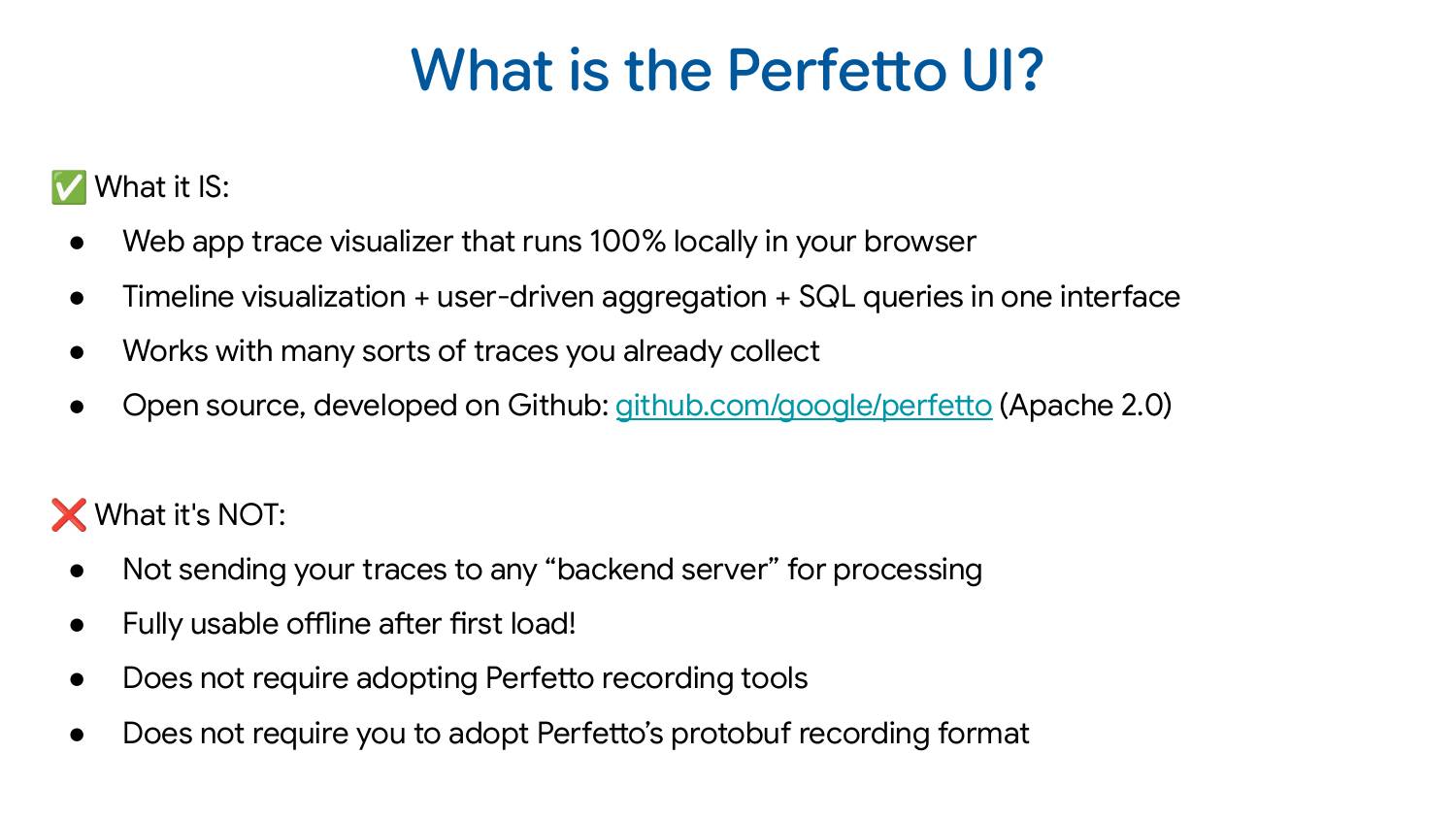
The Perfetto UI is fundamentally a web-based trace visualizer, combining timeline visualization, user-driven selection/aggregation, and SQL queries all in one interface. Because it has the trace processor as a backend, it works with a bunch of different trace formats.
It’s very important to note that even though the Perfetto UI is web-based, everything happens inside your browser and trace data never leaves your system. You can even build it and host it yourself on any static server: we’ve made it extremely easy to do so!
At the start of 2025, we actually moved our whole development to GitHub. In the past, we used to develop on Android and GitHub was just a mirror. That’s no longer the case, GitHub is actually where we develop and take pull requests.
Most of this talk, I’m going to spend actually showing you how you can use the Perfetto UI to debug performance issues on Linux. I don’t want to show you an Android trace which needs a lot of context about how the Android system works and so you think, “oh, that was cool, but I didn’t really understand what was happening.”
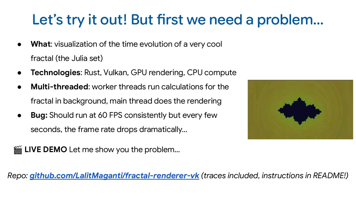
So to make this talk more approachable, I wrote a straightforward demo program you can look at yourself! So it’s obviously not a production system but I’ve tried to make it as representative of the sort of issues we use Perfetto for every day.
It’s a Rust program which generates a Julia set and visualizes it over time. The technologies I used: Vulkan, GPU rendering and also multi-threaded CPU computation. So how it works is that computation of various parameters is happening on background threads, and then that’s being passed to the main thread for rendering.
And then, for demonstration purposes, there is a performance bug; rendering should run at 60 FPS, but every so often, the frame rate drops dramatically. Here’s what that looks like:

The code is on GitHub and if you’re interested in following along. The traces are there as well - you don’t have to collect the traces yourself, but you can if you want. All the instructions and information is in the README.
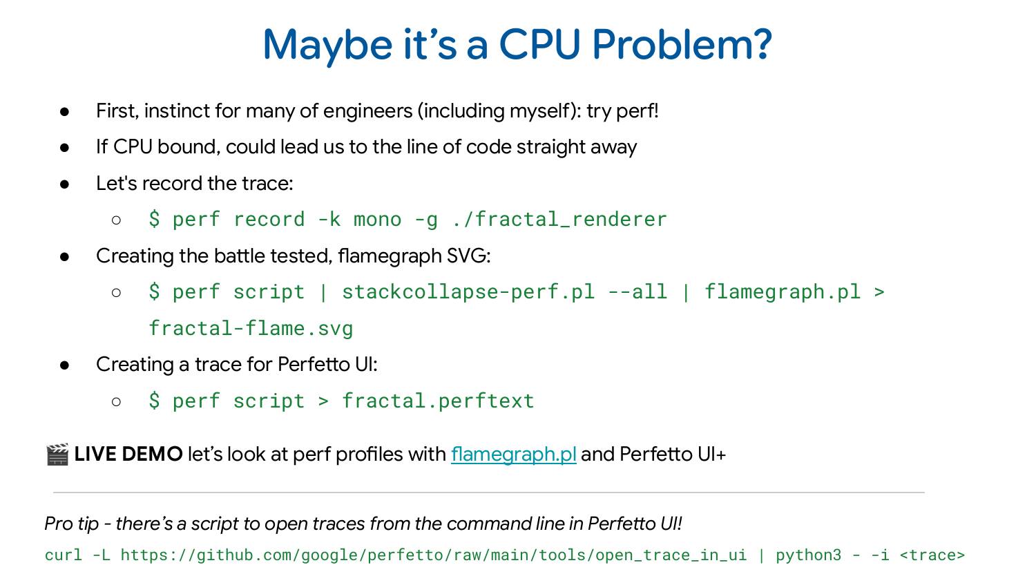
So the first suspicion we may have is that maybe it’s some CPU problem. A lot of engineers I know would reach for perf immediately whenever they see a problem like this. The main reason is that if perf can capture the problem, they can go straight to the line of code without needing to spend time debugging using more complex approaches.
You can record a perf profile with perf record -k mono -g ./fractal_renderer. The standard post-processing step which I think a lot of people do would be to generate an SVG flame graph out of this with perf script | stack-collapse-perf.pl --all | flamegraph.pl > fractal-frame.svg. Here’s how that looks like for our perf profile:

See also the interactive version of the profile
The flame graph shows the thread names at the bottom, and then stacked above are the call stacks of what the program is doing. The width represents how much time is spent in each function. In this case, the worker threads are spending most of their time in cos and sin operations, doing math computation. Exactly what you’d expect for this type of program. Aside: Interestingly demangling didn’t seem to work for Rust out of the box which I find a bit unusual but I didn’t dig too much into why this was.
Looking at this, nothing really stands out. There’s no smoking gun that immediately reveals the problem. But here’s the fundamental limitation: the flame graph aggregates data across the entire trace, losing the time dimension. The performance problem we’re seeing happens every 2-3 seconds - brief drops in an otherwise normally functioning program.
The flame graph shows me the aggregate, dominated by the correct behavior, making it nearly impossible to spot those occasional problematic moments. So how do I find the places where it’s doing the wrong thing?
Well, that’s maybe where Perfetto can help you out a little bit! The thing I find lots of people don’t know is that perf actually preserves timestamp information about when samples were taken: many tools drop this information but Perfetto is pretty good at showing that to you. I just need post-process the trace with perf script > fractal.perftext to generate a text version of the profile which we can then open in the Perfetto UI
My demo talking through how to open the perf profile and navigate it starts at 9:11 in the video.
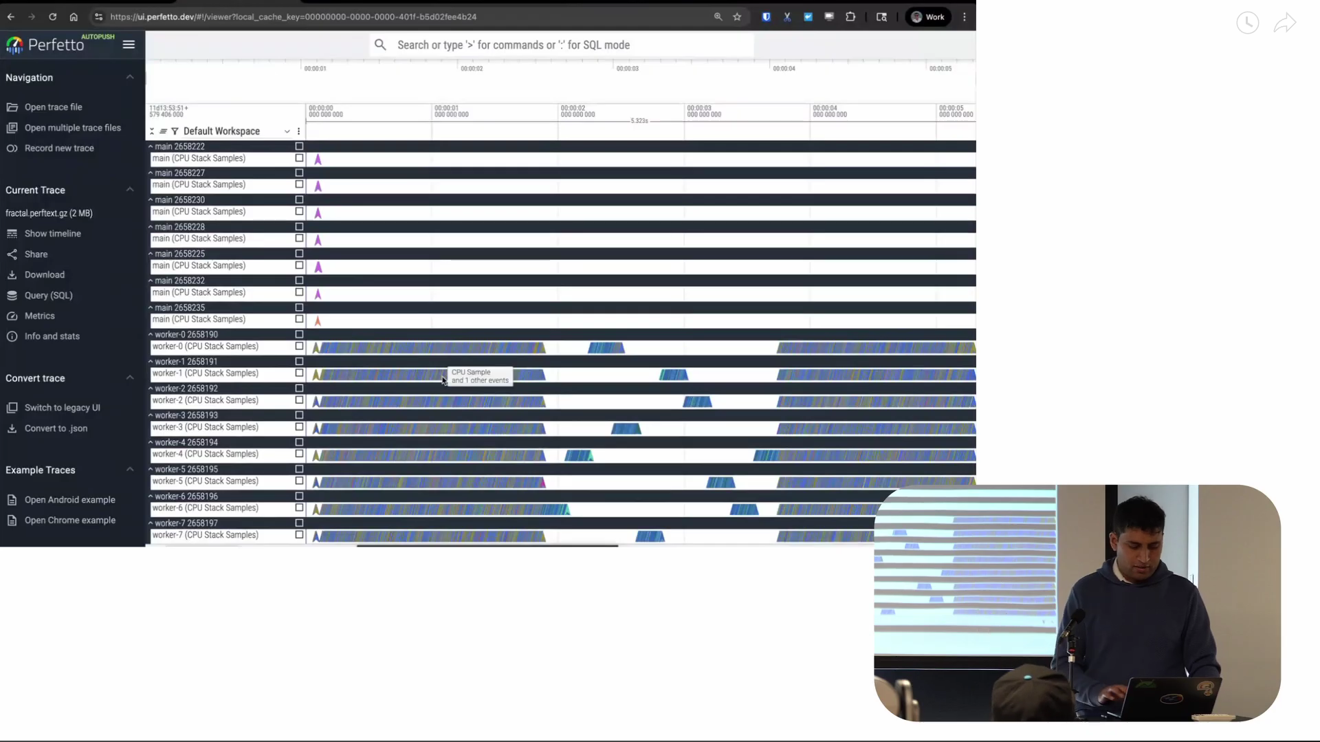
Screenshot from 9:50 in the video
The x-axis of what you’re seeing is time. And every horizontal line represents a thread: we call these lanes “tracks”. And each of the small arrowheads on the tracks are CPU samples for the associated thread.
The behavior of the worker threads over time is really interesting. Most of the lifetime of the program, it’s doing continuous computation, basically. And then there’s this period of time in the middle where there’s this very interesting staircase pattern where it seems like only one thread is running at any one time: we’ll want to keep a note of this as this is quite important.
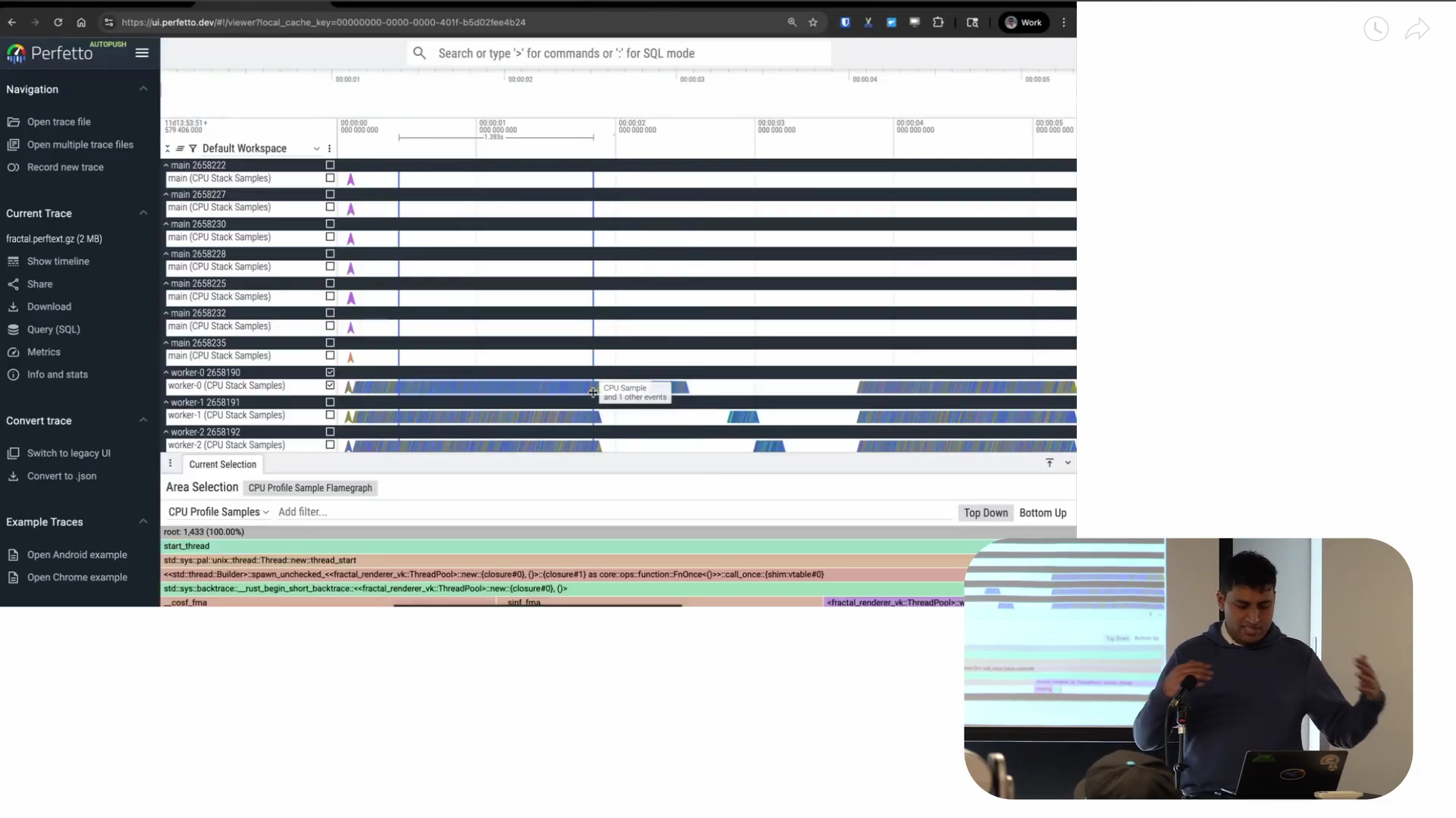
Screenshot from 10:37 in the video
One very cool thing about Perfetto is that it allows me to quickly generate visualizations of whatever I’m selecting on the timeline. We call this “area selection” and it’s where I drag my mouse and select a region both horizontally and vertically. This is on one track but even across multiple tracks. So in the timeline it shows me the selection I’m making at the top, plus a flame graph at the bottom representing the aggregation of the samples in just that time period.
The key advantage is that I can look at individual regions of time interactively. You can also do this with flamegraph.pl but you need to pre-filter the data to what you’re looking for. This assumes you already know what the problem is before you find it. I always find that a bit counterintuitive. I prefer this view where I can see everything first, then decide “I want to look at this specific part in more detail.” That’s what Perfetto lets me do.
Screenshot from 12:31 in the video
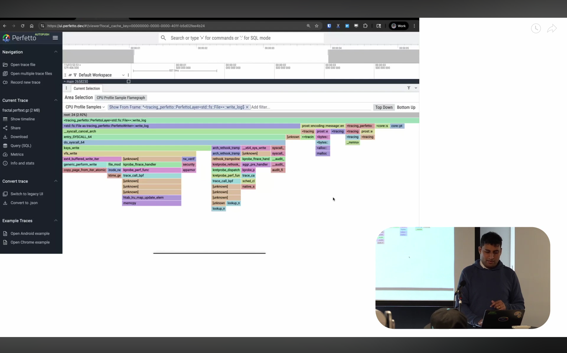
So now on to the flame graph itself: in the last year, I spent a bunch of time on improving the flame graph visualization in Perfetto UI. At Google, we have an internal tool called pprof (related to but not the same as the open-source one), and I’ve always loved the visualization it has. So I worked to make Perfetto’s flame graph look and behave very similarly.
There are a bunch of features here. You can zoom in like most flame graph, but you can also say “I only want to look at the stack starting from this point” — it gets rid of everything above and starts fresh from there. If I don’t want to see a particular function like sin, I can just hide the frame and it gets merged into its parent. The search is regex-based so I can also just type the specific things I’m interested in: it’s pretty powerful.
There’s also something I don’t think I’ve seen in other visualizers (I might be wrong, please do correct me!): what I call “bottom up” view. Imagine you take all the leaves across your entire program and visualize who’s calling into them. If you have a leaf function that’s called everywhere in your program but reached from many different places, it’ll be split across your flame chart. This is the inverse — you’re looking at the leaves and asking “who is calling me?” This is particularly useful when you’re trying to optimize very low-level functions that are always at the leaf level — things like memcpy or hashmap operations.
So our main takeaway is that our worker threads all had gaps in their CPU execution in a staircase pattern. This means the threads weren’t actually on the CPU and that’s usually a sign that they’re sleeping.
But sleeping on what? Locks? Disk? Network? What exactly is happening? To answer that, I need a scheduler trace to show me the wake-up patterns, who’s being scheduled when, what type of sleep threads are in, that sort of thing.
We recently added support for trace-cmd’s text format in Perfetto (aside: there’s an open issue to support the binary format too!). For this demo, I’m collecting sched_switch and sched_waking events with sudo trace-cmd record -e sched:sched_switch -e sched:sched_waking -C mono ./fractal-renderer-vk and we can open it in the UI once we do trace-cmd report -N > fractal.sched.
The demo showing off scheduler traces starts at 15:16 in the video.
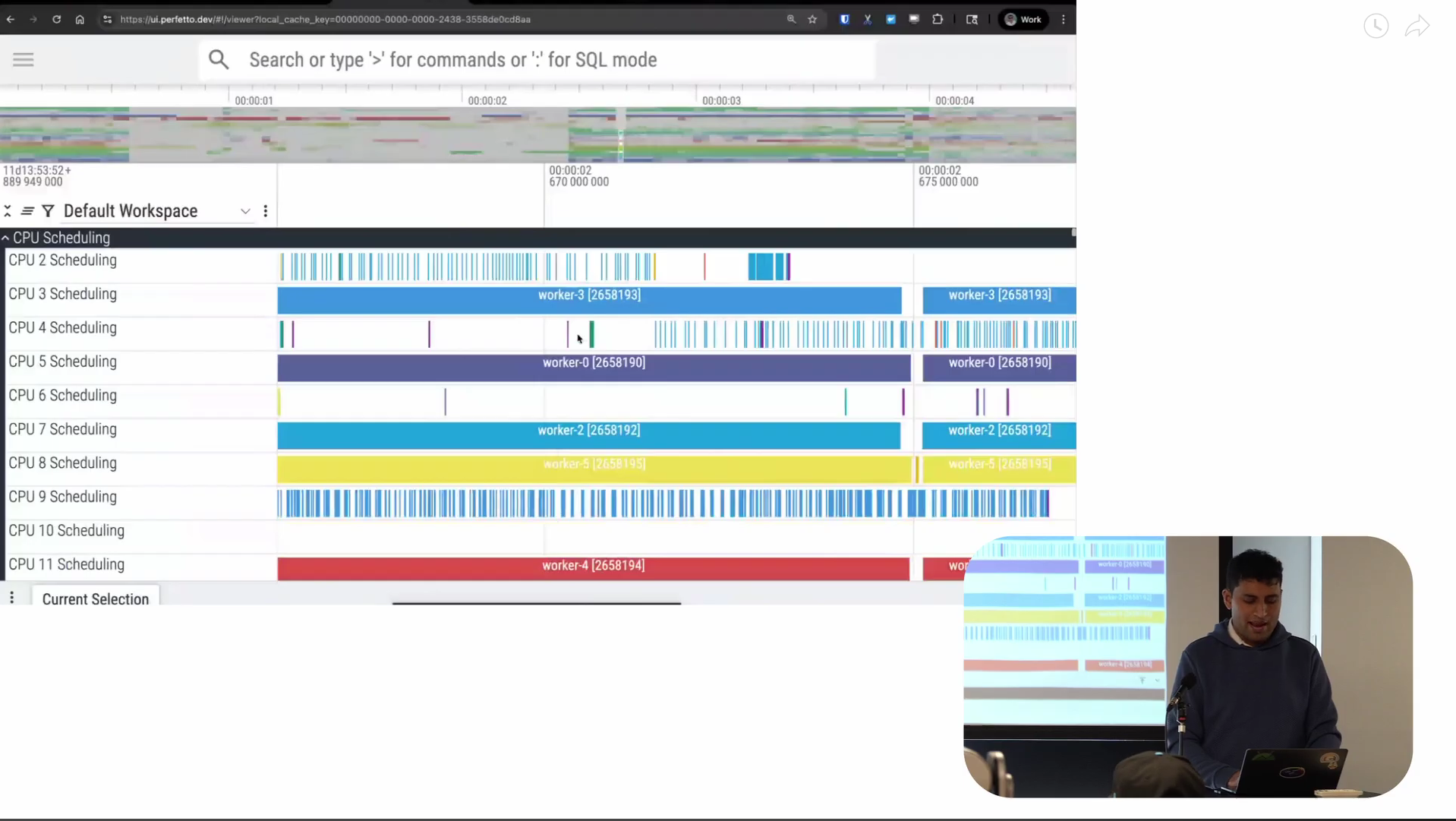
Screenshot from 15:49 in the video
So this is what a scheduler trace looks like. Again as before, the x-axis is time. At the top of the trace, you’ve got the CPU scheduling tracks. For each CPU, they tell us what was scheduled on that CPU at each point in time. The white regions are where there’s nothing scheduled. As I zoom in, you start to see information like the name of the thread that’s scheduled, the TID of the thread, and so on. This is the CPU view of things, looking at it from a CPU perspective.
Screenshot from 16:48 in the video
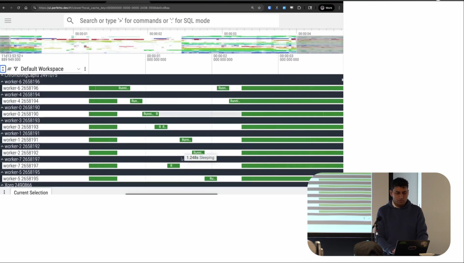
There’s also a thread perspective on scheduling: what we call this “thread state”. This shows the scheduling state of each thread at every point in time. Dark green represents the thread running, light green represents runnable (the thread is on the runqueue so it’s eligible to run, but the scheduler hasn’t actually let it run yet), and white represents interruptible sleep (S sleep). There are also orange regions for uninterruptible sleep (D sleep), though that doesn’t show up much in this trace.
You can again see a very clear staircase-like pattern. Again, only one thread seems to be running at any one time. You’re maybe getting the sense of what the problem might be at this point.
Screenshot from 17:43 in the video
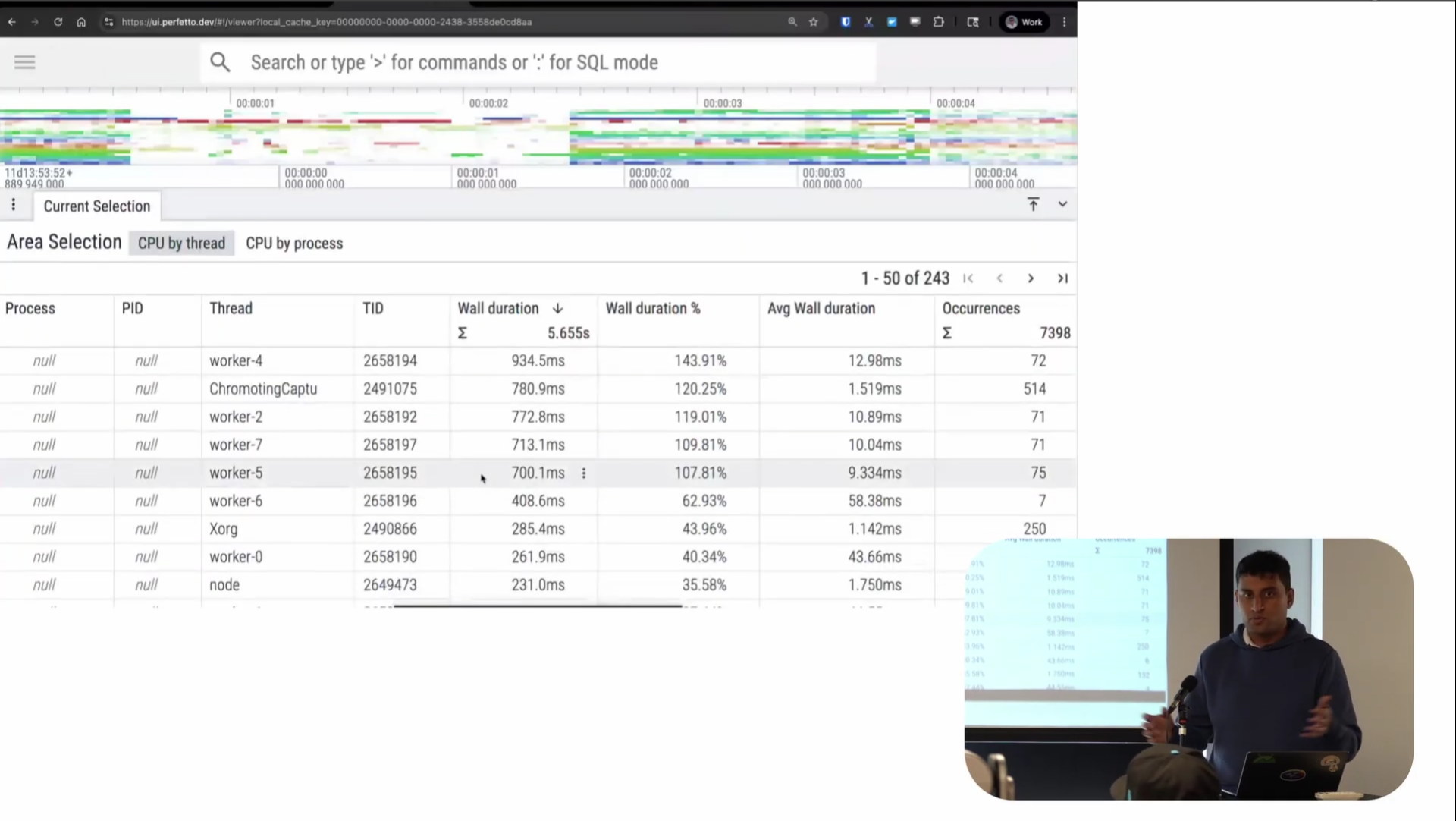
Like with the perf visualization, you can do area selections here too. I can select a region on a CPU and get tables showing time spent by each thread (shown in the screenshot above). I can also do this for thread state, you can also see that runnable time is basically negligible compared to running and sleeping, which is where most of the time is being spent.
Screenshot from 18:12 in the video
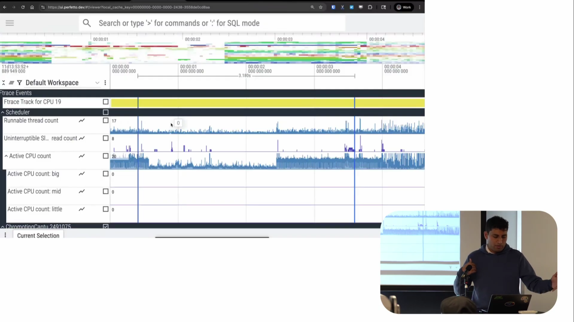
There are also scheduler-specific visualizations like run queue length and active CPU count. You can see in the problematic region, the active CPU count also went down, which makes sense.
So the scheduler trace shows when threads are sleeping, but it’s not telling us why. What was the program doing in that region? What code was it running? The sequential pattern suggests some sort of serialization—something is causing only one thread to run at a time. But we need application-level visibility.
Since this program was written in Rust, I just used the off-the-shelf tracing and tracing-perfetto crates; I did have to make some small modifications to tracing-perfetto that I’m hoping to upstream. These output a Perfetto trace without needing to use the Perfetto SDK. These libraries are also maintained by others: we don’t have any hand in them.
All I needed to do was integrate these into my program and then add a command line switch to write out the collected trace to a file. So I just do ./fractal_renderer --trace fractal.pftrace
My demo for app tracing starts at 19:37 in the video.
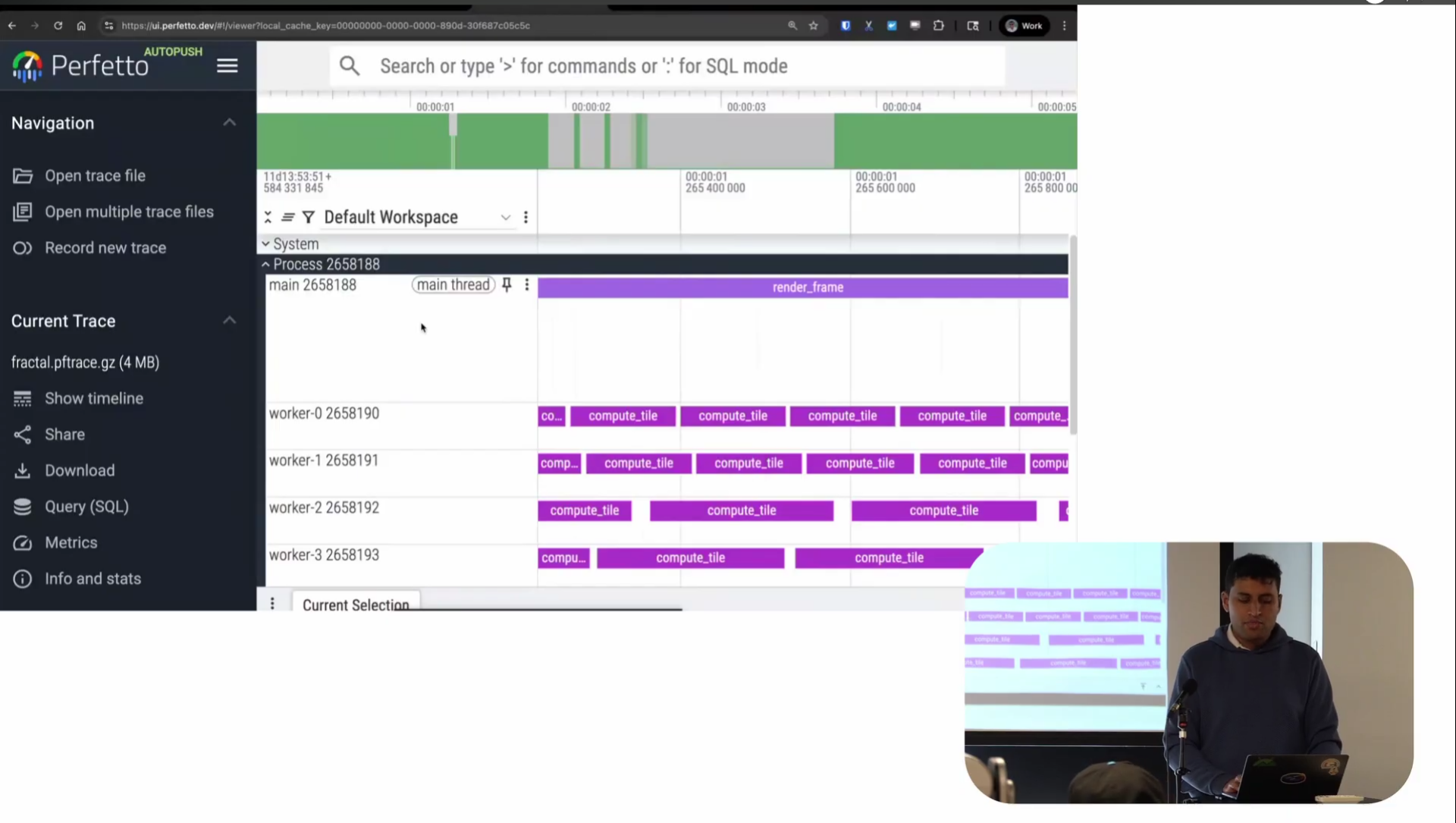
Screenshot from 20:06 in the video
Looking at the app trace: as before x-axis is time and each of the tracks represents a thread. Instead of scheduling activity or CPU stack samples, this time the tracks is userspace instrumentation of the program itself. Each of these rectangles is a named period of time representing what the program was doing at that time.
There are lots of different names for these in the tracing world (e.g. spans, intervals) but we call these “slices”. The main thread is rendering frames as you would expect and the workers are each computing tiles of that frame, which eventually feed back to the main thread and sync to the GPU.
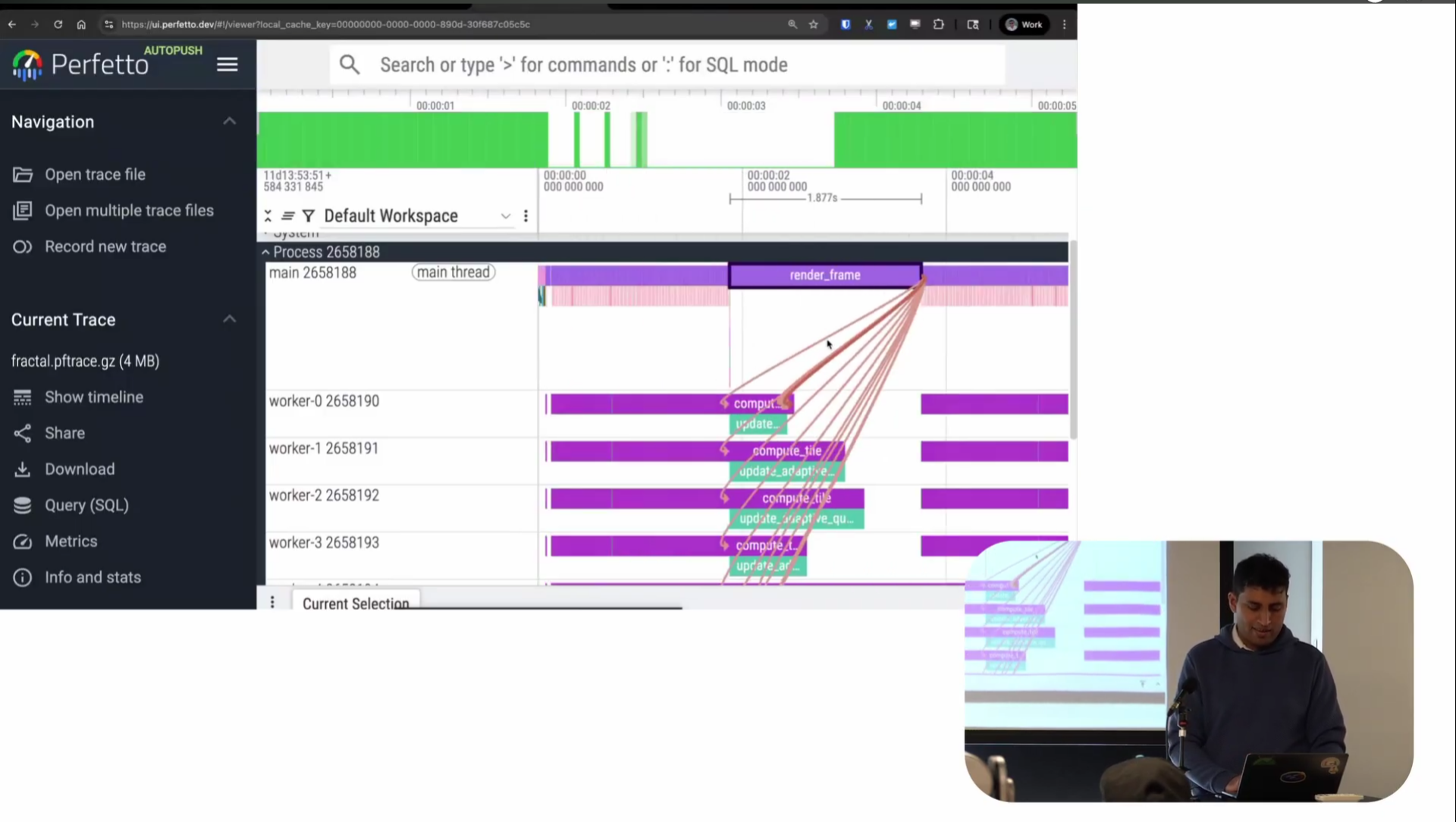
Screenshot from 23:42 in the video
There’s also this thing called flows, which shows the causal links between different pieces. Render frame is calling into all these places and causing them to happen. It’s sort of similar to wakeup graphs but for user space: basically, this is what caused me to start running this function.
Screenshot from 23:51 in the video
So you can see very clearly there’s a normal region and then a region where things are taking 1.8 seconds: almost certainly the cause of the frame drops.
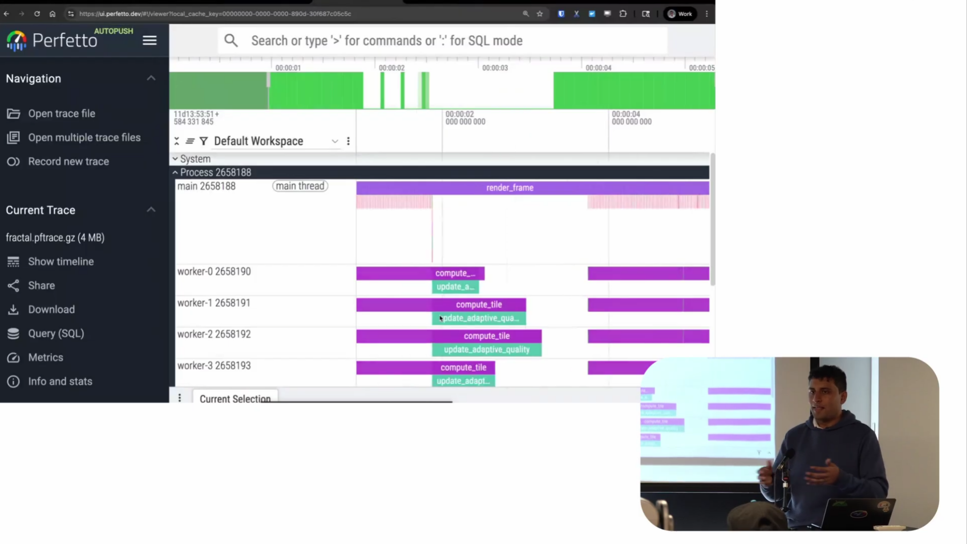
And if we look at the slice in question, it seems to be doing something called “update adaptive quality.” Basically, I wrote some code to dynamically change the rendering quality based on frame rate. If I’m running faster, I can render at higher quality. If I’m running slower, I can do lower quality. That’s what this adaptive quality thing is supposed to do.
But clearly something has gone wrong. I’m causing frame drops because of updates to adaptive quality. A little bit ironic, to say the least. Now we know what the program is actually doing during that time span.
So now we’ve looked at three different sources of debugging data separately. In perf, we got told there are few or no CPU samples and weird staircase patterns. In ftrace, we saw only one worker seems to be active and the rest are sleeping in interruptible sleep. And in app tracing, we see it’s because of adaptive quality updates that workers are working on, and they shouldn’t be doing it this way.
Obviously, the theory is that it’s all the same problem. But we can confirm this theory with a very new (and still experimental) feature of the UI: trace merging.
Note: as this part of Perfetto is still experimental, if you want to try it yourself, you need to go to plugins and enable the “MultiTraceOpen” plugin. Also, unlike I what say in the talk, you do not need to be on Autopush as all the features I showed in my talk are now available in Stable.
The demo showing off merged traces starts at 24:32 in the video.
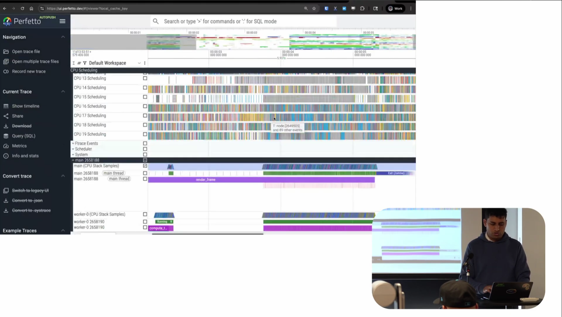
Screenshot from 25:44 in the video
This is now the merged trace file containing all the different information. You can see the CPU scheduling tracks like we had in the scheduler trace, the stack samples like we had in the perf trace, and the app instrumentation, all beside each other on one timeline. You can very clearly see the adaptive quality update running, then this period where it ran, and then it was done. It’s very cool to be able to see the pattern of how my program is sleeping and where and what it was running on one timeline.
The thing is, you’ve always been able to do this with Perfetto if you collect a Perfetto trace with all of these integrated. The new capability is that this is now being brought to traces you didn’t collect with Perfetto. Collect it with whatever you like, and we’ll still manage to do this visualization. That’s the new capability we have.
Screenshot from 29:58 in the video
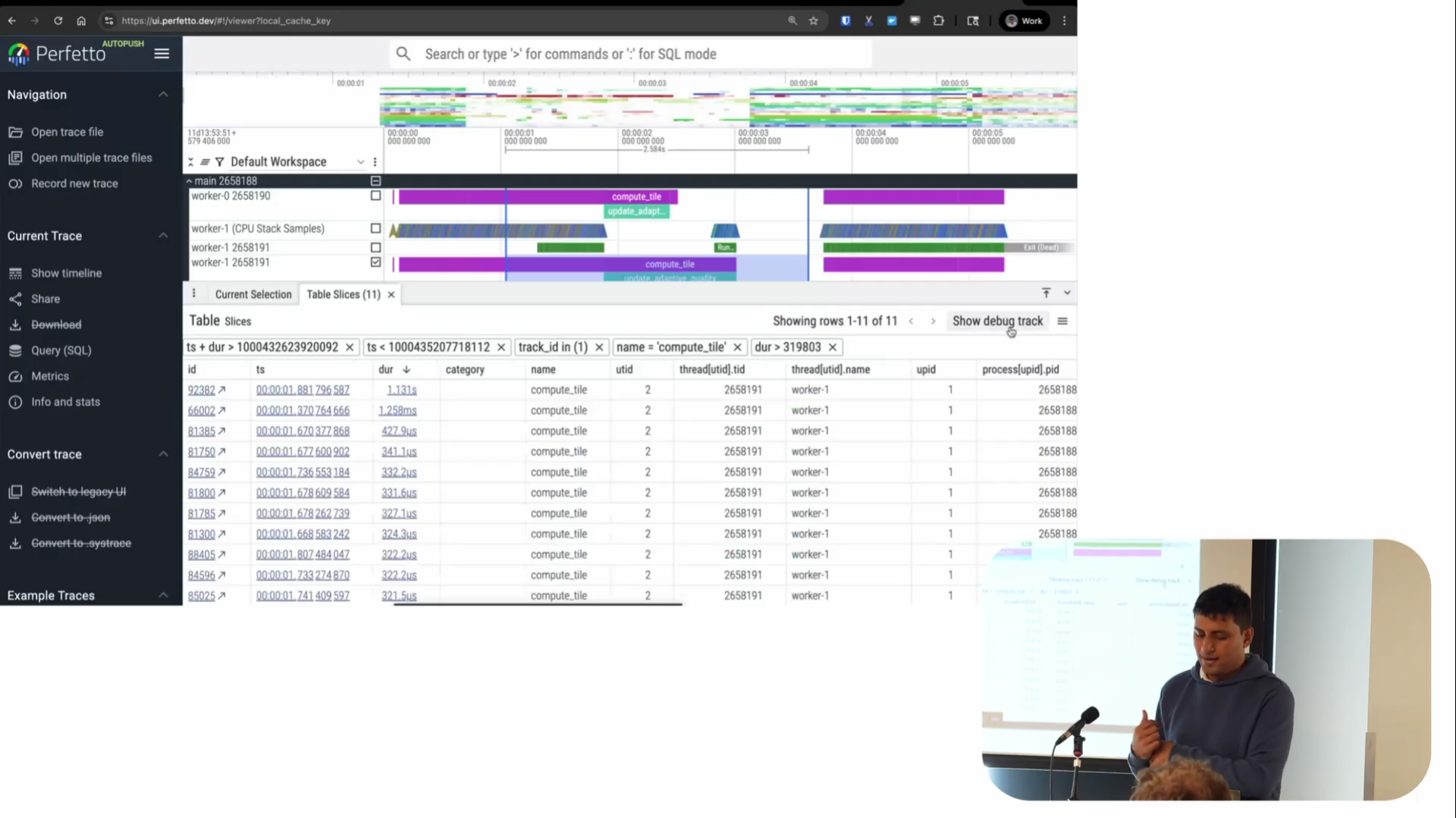
There’s also a query interface which we’ve been building out recently and there are some pretty powerful things you can do with these tables. As well as the flat tables of data, there’s also a more dynamic pivot table and if I click the arrow on the left, I can get into a detailed filter table, similar to a spreadsheet but optimize for things people want to do on traces.
For example, by doing an area select, I can first get a list of all the events that happened during a time region. Then using the table I can filter for things - say I only care about slices longer than some duration, like 319 microseconds for whatever reason. I can click and add a filter for things greater than this.
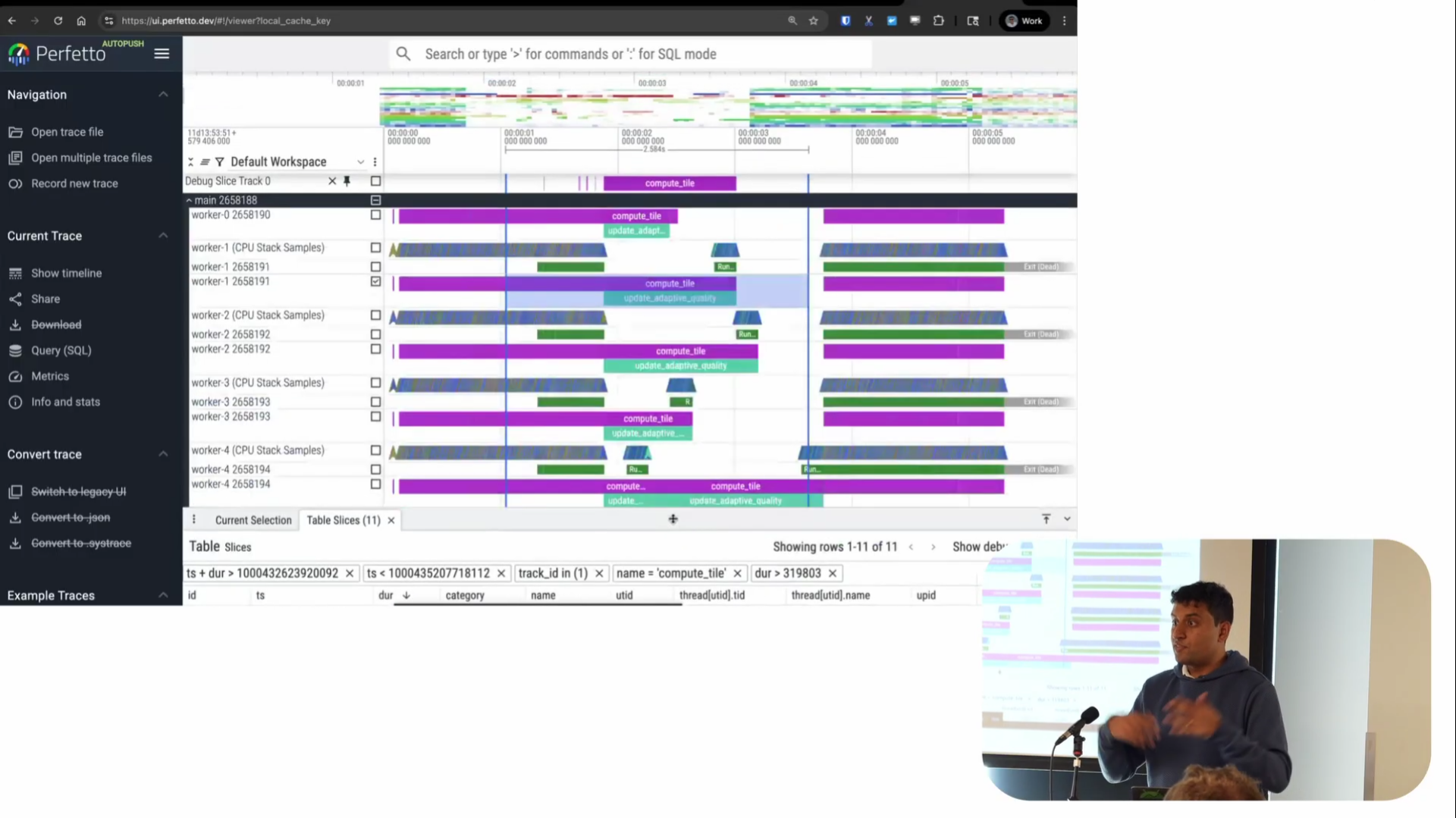
Screenshot from 30:11 in the video
There’s also a feature called “Show Debug Track” that’s also very powerful. The table shows rows with timestamped duration information, and this feature lets you visualize that data as a track on the timeline. It adds a track at the top showing the regions of time where these events happened—in this case, where ComputeTile took longer than a certain threshold.
This is particularly useful for correlation analysis. For example, in Android, we’re often looking at system A and trying to understand its effect on system B. We find all the places where one thing is slow, then look for correlations. Being able to see a track in the UI where you can quickly have context and say “oh, during this period of time, this other thing was happening” is invaluable. It’s probably one of our most-used features.
You can also copy the SQL query from these tables and start doing your own aggregations on top of it. This eases the burden of starting with a completely blank canvas. Instead of wondering “where do I even start querying my data? What tables is my data in?”, the UI gives you a starting query that you can build on without needing to write something from scratch.
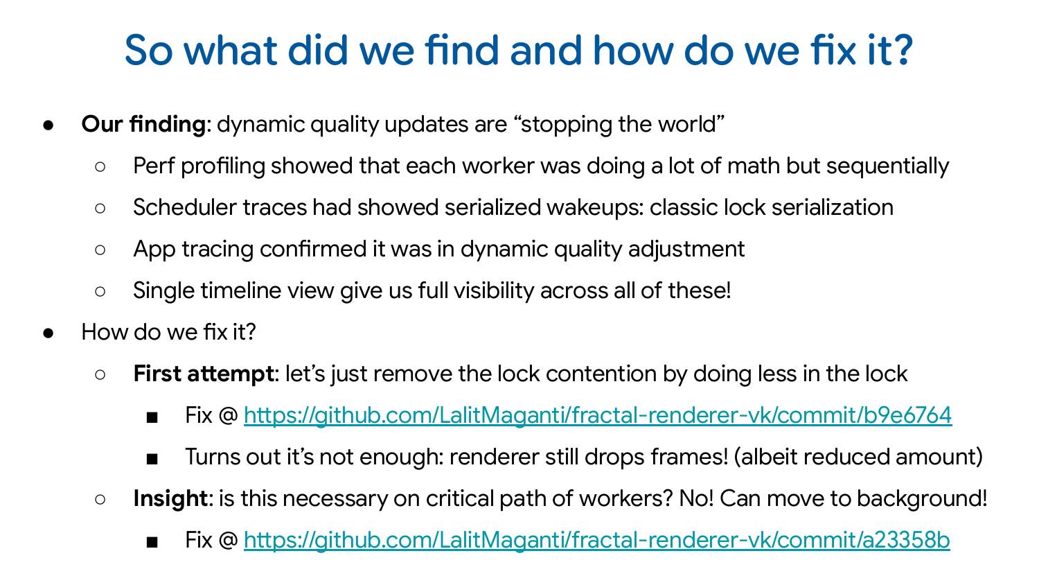
So the dynamic quality updates were stopping the world. Perf profiling showed the problem, scheduler traces found the sleeping pattern, app tracing confirmed it was the quality adjustment code, and the single timeline view let me see everything happening at once.
Interestingly, I tried to fix this by removing the lock contention—which I thought was the bug I had introduced. But it turns out I shouldn’t have been doing this code in the workers in the first place. Even after removing the lock contention, just the CPU activity of doing that work was enough to cause frame drops. The right solution was to move it to a background thread. As part of debugging this for the demo, I discovered something even better that I could be doing.
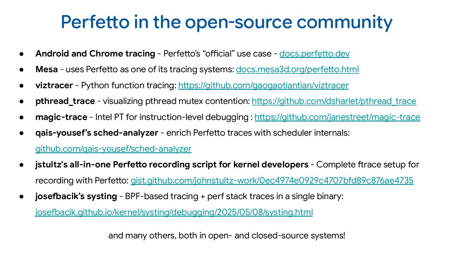
Android and Chrome are our bread and butter—that’s what we officially support as a team, and why Google staffs us. But there are many other interesting uses.
Mesa uses Perfetto as one of its tracing systems. One thing I could have shown is collecting a Mesa trace alongside all the other traces we looked at—you can actually see what the GPU is doing at the same time, which would have been very cool, but I just didn’t have time.
VizTracer is function tracing for Python, similar to uftrace, but you don’t have to recompile anything or do anything special.
pthread_trace is for visualizing pthread mutex contention. The author has a very efficient way of doing this and writes protobuf using heavy use of constexpr to make it very low overhead. It’s a very interesting project.
magic-trace uses Intel Processor Trace for function-level tracing at the processor level with lower overhead. They wrote a converter from that to the Perfetto format so you can visualize that data in Perfetto.
Qais Yousef’s sched-analyzer enriches Perfetto traces with scheduler internals. It’s a very cool project that I find particularly interesting.
John Stultz’s all-in-one Perfetto recording script for kernel developers addresses a common complaint: “Perfetto is so complicated, I don’t know what events I want to record.” He just wrote a script that configures everything for you.
Finally, Josef Bacik’s systing is a bit experimental but fascinating. He re-implemented tracing daemons on top of BPF instead of Perfetto’s native implementation, combining BPF-based tracing with perf stack traces in a single binary. He has a blog post explaining why. I thought it was a fascinating use of Perfetto.
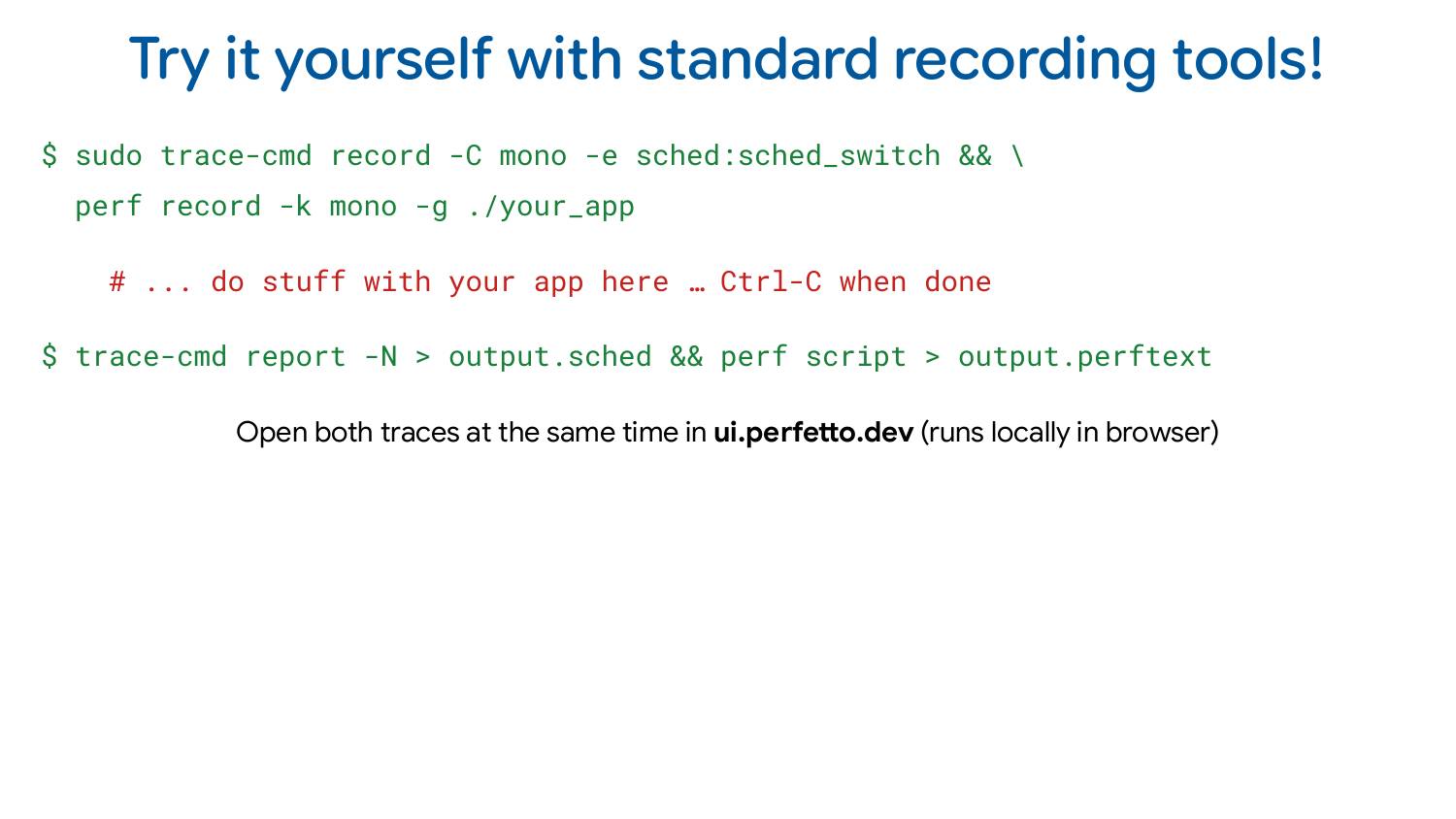
If you want to try this yourself, you can use the demo program I’ve provided. But even better: record traces on your own programs. Open scheduler traces and perf at the same time. Instrument your program, convert it to Perfetto format, and visualize everything together.
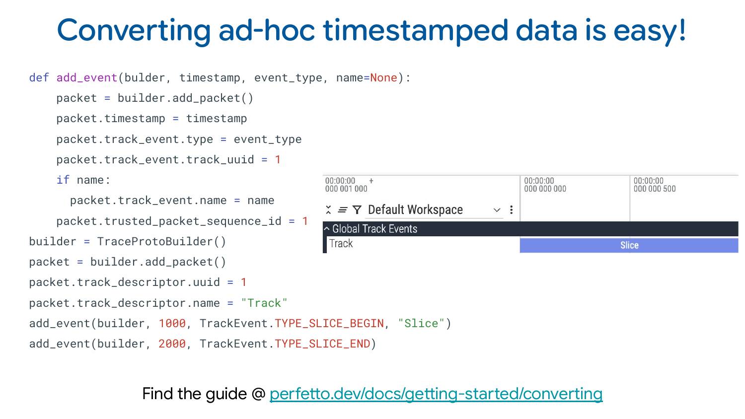
If you want to convert ad-hoc timestamped data to Perfetto, we wrote a comprehensive tutorial with Python snippets for everything you might want to visualize. It covers all the features I showed and how to write Python code to generate them. We have a library for writing these traces: besides this one library, you don’t need to install anything else. You can go ahead and convert your own data to Perfetto.
We’re very happy to accept contributions and review pull requests pretty quickly. We’ve had a lot of open-source contributors over the years and have been quite lucky with some very high-quality contributions. If you want to contribute yourself or have a feature you feel is missing, send it our way.

Demo repo: github.com/LalitMaganti/fractal-renderer-vk
Learn more: docs.perfetto.dev
Perfetto UI: ui.perfetto.dev
Contact: [email protected]
If you enjoyed this post, you can subscribe to my weekly roundup of recent posts, or follow via RSS.

