.png)

23 Jun, 2025
While trying to get some deep learning research reps in, I thought of doing some archaeology by trying to reproduce some older deep learning papers.
Then, I recalled (back in my fast.ai course days) Jeremy Howard talking about U-Net and the impression it had on me — possibly the first time I was exposed to the idea of skip connections.
So I read the paper and wondered — is it possible to reproduce their results only from what’s on the paper, and maybe even critically examine some of the claims they make?
The full code is available on GitHub if you’re curious, but I thought it’d be better to walk you through my adventure. Let’s go!
Background
U-Net: Convolutional Networks for Biomedical Image Segmentation came out in 2015, and though they did release their code (which uses the Caffe deep learning framework), I did not look at it, on purpose. It’s not because I can’t read C++ to save my life —it’s part of the challenge, reproduce U-Net only from the paper. Let’s use our own eyes to read the words and look at the pretty pictures!
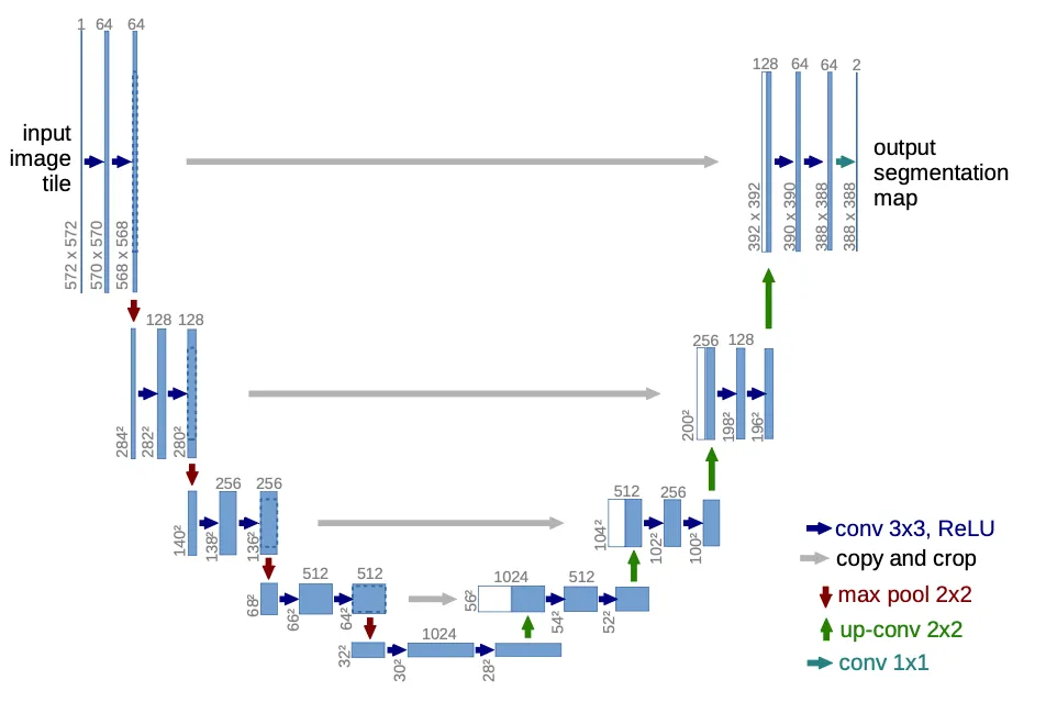
As the title of the paper suggests, U-Net uses convolutional networks to perform image segmentation, which means that it takes an image as input with things in it, and it tries to predict a mask that differentiates the things from the background (or from each other, if it’s multi-class).
It first puts an input image through a contraction path, where the resolution gets smaller but it gets more channels, and then back up through an expansion path, where the opposite happens, ending up with a reasonably large image (but smaller than the input! more on that below) and a single channel (black and white).
A first look at the data
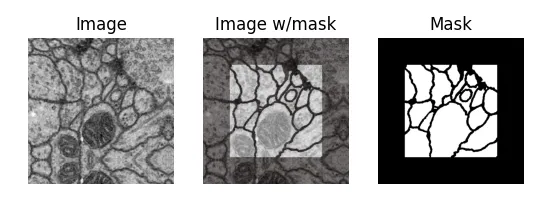
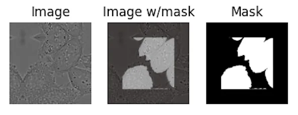
Here’s a sample from the first dataset (which we call EM, for electron microscopy). It represents a cross-section of cells, and the mask differentiates cell bodies (white) from their membranes (black):
But why is the mask cropped, you may ask? Because of how convolutions walk over an input image, even though their receptive field (what they see) is the entire input image, the output feature maps are a tad bit smaller (unless you use padding).
After many down and up-convolutions, the output of the network will be smaller than the input, and our dataset must account for that — for an input image of 512x512, we can only predict a 324x324 output mask, which is necessarily a center-cropped version of the original full-size mask in the dataset.
The way I found out about this is the hard way, of course. When I first saw the EM dataset, which consists of input images and output masks all of 512x512 px, I naively tried to just resize down the output mask to fit the output of the network, and it didn’t learn at all.
Looking around, I saw that some people suggested to pad the expansion path with zeroes to make the residual connections fit (more on that later), which seemed to work. However, the paper mentioned none of that padding, so I thought something’s fishy.
The penny dropped when the paper mentined their overlap-tiling strategy. To be able to process arbitrarily large images regardless of how much GPU VRAM you have, we necessarily need to process images one fixed-size tile at a time.
And if for any input tile we can only predict a center-cropped mask, we’d never learn to predict the masks in the corners! What a waste of good, valuable data. To solve that, our dataloader just needs to first select a random output mask tile (even if it’s at the top left corner), and then make up the original input image that would predict that tile. If the mask tile was in some corner, we’ll just make up the surrounding context by reflecting the original image. A bit hand-wavy, but hey, that’s deep learning for you!
Even though the architecture picture is pretty self-explanatory, I found a couple caveats worth mentioning:
It assumes an input of 572x572 px, which I did use to sanity-check the feature map sizes after every convolutional layer and pooling operation. However, the EM dataset’s input is 512x512px.
The paper mentions a dropout layer “at the end of the contraction path”, though it’s not pictured. I decided to put it right before the first up-convolution, but it’s not clear where they actually put it.
Model Implementation
This is the entire model code:
Let’s look at the forward pass with a bit more detail. The contraction path is a series of Conv layers (each of which is two 3x3 Conv2Ds with ReLU activations) with max pooling in-between, which halves their size.
As we go down the contraction path, notice that we are saving the Conv activations (before max pooling) in a residuals list. As per the architecture diagram, we’ll need to concat those in parallel to their counterparts in the expansion path. Again, since the counterparts will be of smaller resolution, the residuals will need to be center-cropped.
At the end of the contraction path, we do a dropout and we go back up through the expansion path, concatenating the contracted channels with the expanded ones. This concatenation is effectively a high-bandwidth residual connection for the gradients to flow back. Finally, an out convolution gets us our final predicted mask with a single channel (black and white).
Loss Function
The loss function is just cross entropy (or equivalently log softmax + negative log-likelihood), but there is a twist.
On the EM dataset, they introduced a weighted loss with a synthesized “weight map” that uses morphological operations on the original mask to highlight the borders between cells:
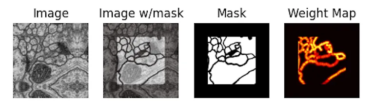
This way, the loss is higher around the cell borders, so the network needs to work harder to get those right.
Coming from the Holy Church of Gradient Descent, this looks like a cursed hack to me, so I put it into my list of assumptions / claims to verify.
Training Regime
For training, they use Stochastic Gradient Descent with a momentum of 0.99, though they don’t mention a learning rate (I set it at 1e-03). I thought “why not Adam?” so another one for the bag of things to verify.
The tile size they set at 512, which is basically no tiling at all.
Data Augmentation
Since the datasets are very, very small (30 training images in the EM dataset!), the authors of the paper rightly put a lot of effort into data augmentation, settling on a combination of:
Tiling: for a given image, as long as the tiles are smaller than the image, there are several tiles. The authors do claim though that, to maximize GPU utilization, they favor larger tiles over larger batch sizes. At face value it makes sense from a GPU utilization standpoint, but because I wasn’t sure of how it might affect the final loss, that goes into my bag of claims to verify.
Elastic Deformations: This one’s fun! They warp the images with realistic deformations you might see in cells, so that you get more variety and the network doesn’t overfit to the same-shaped cells.
Dropout at the end of the contraction path: just for good measure.
It’s important to note that those 30 training images are very, very highly correlated too, since they are consecutive slices within one single 3D volume! So it makes sense to deploy every data augmentation trick in the book.
Expected results
So, if we’re trying to reproduce the paper, what are the results we’re trying to match? As it turns out, the authors trained their architecture to participate in 3 segmentation challenges:
EM Segmentation Challenge 2015 (with the EM dataset, generously uploaded to GitHub by Hoang Pham). Here, they are evaluated on Warping Error (0.000353), Rand Error (0.0382) and Pixel Error (0.0611), defined in the paper.
ISBI cell tracking challenge 2015 (PhC-U373 dataset, available here): they get an Intersection Over Union (IOU) of 0.9203.
ISBI cell tracking challenge 2015 (DIC-HeLa dataset, available here): they get an Intersection Over Union (IOU) of 0.7756.
As it turns out, the test sets for these are publicly available, but the test labels are not. One is supposed to send the predicted probability maps to the organizers, and get back an evaluation result. Ain’t nobody got time for that unfortunately (probably least of all the organizers), so we’ll have to take the authors’ word for it.
If we want to be able to make heads or tails of anything, we’ll have to settle on a lesser metric: loss on a validation set, which we’ll set at 20% of the training set. As I’ve mentioned, the datasets are highly, highly correlated, so there’s guaranteed leakage, but it is literally the best we can do with what we have, short of hand-labeling the test set myself.
Experiments
All experiments are trained for 4K update steps, with batch size 4 and 512x512 tiles (so, 1M pixels seen per update), on 80% of the training set. We report training loss, validation loss and IOU on the validation set. We also torch.compile the model for extra vroom vroom.
After running the baselines, I dump the bag of things to verify and the questions that interest me are:
Authors claim that larger tiles are better than larger batch sizes. How does tile size vs batch size compare, keeping pixels seen constant?
[For the EM dataset only] Weight Maps seem like an awkward inductive bias. Do they really help?
Would Adam work better than SGD here?
Datasets
We’ve already introduced the EM dataset with the synthetic weight maps:
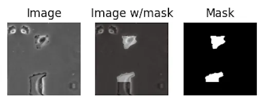
For reference, the other 2 datasets are PhC-U373 (you can see the reflected bottom part in this one!):
And DIC-HeLa:
Baselines
First, I wanted to set a baseline for each of the 3 datasets as close as possible to what the authors did.
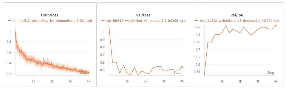
EM Dataset
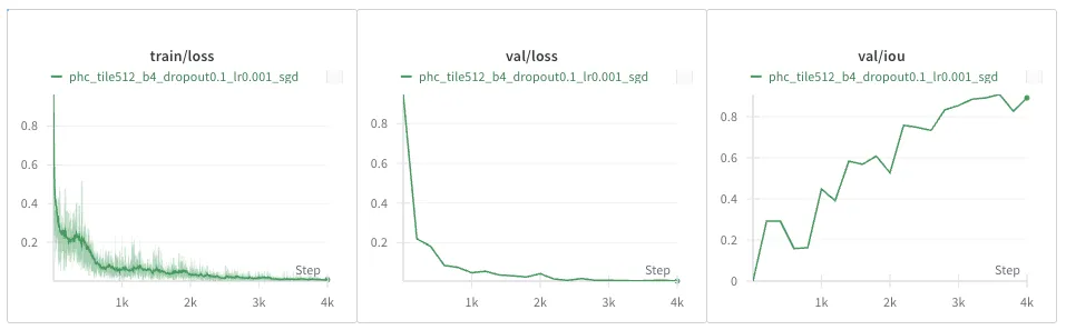
PhC-U373 Dataset
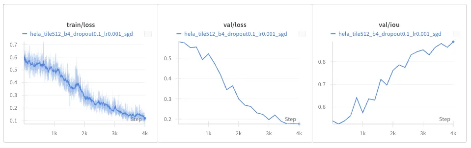
DIC-HeLa Dataset
Question #1: Larger tiles or larger batch size?
Fixing pixels seen per update at 1M, let’s compare batch size 4 + 512x512 tiles against batch size 16 + 256x256 tiles.
EM Dataset
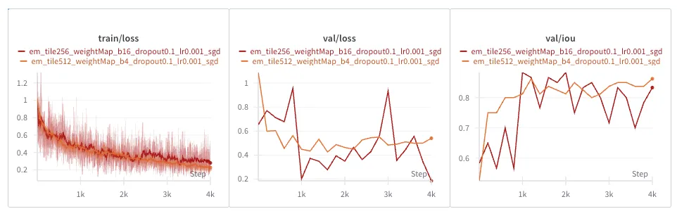
As you might have expected, training is way noisier with smaller tiles, and so is validation loss and IOU.
PhC-U373 Dataset
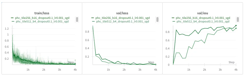
Interestingly, smaller tiles do seem a bit noisier, and it converges slower loss-wise, but the IOU seems higher. Could that be, though, that if masks are sparser in this dataset, there are more smaller tiles that happen to be blank, in which case the IOU looks artificially better earlier?
DIC-HeLa Dataset
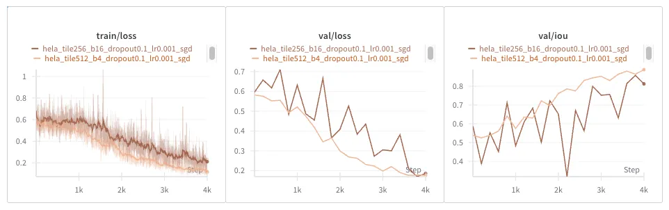
Same result as with the EM dataset: everything is noisier.
Conclusions and thoughts
Why is everything noisier? We need to keep in mind that the input tiles are 256x256, but the output masks end up being only 68x68 pixels. The final loss is the average of each individual pixels’ loss, so you might think at first, there’s fewer pixels, thus we get a noisier loss. But we compensate with a larger batch size, so in the end each update is the average of 1M pixel losses, no matter the setting.
Does this tell us that there is more variation across samples in our dataset than across tiles?
I end up convinced that larger tiles are more favorable, just like the authors claim, but I’m still not sure why they lead to smoother training dynamics.
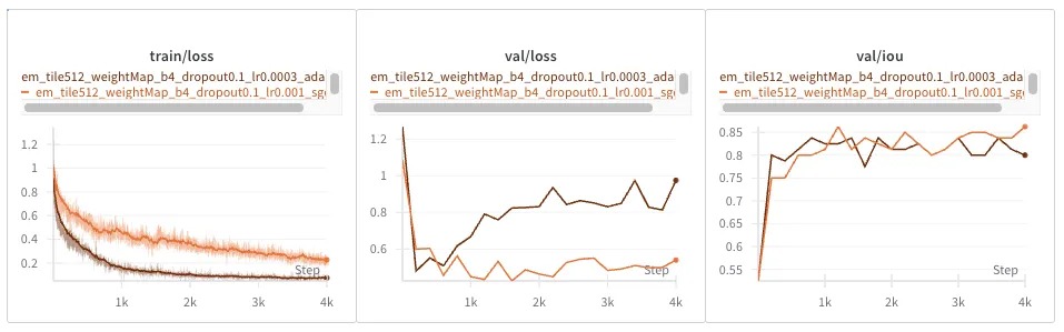
Question #2: Do synthetic Weight Maps in the EM dataset really help?
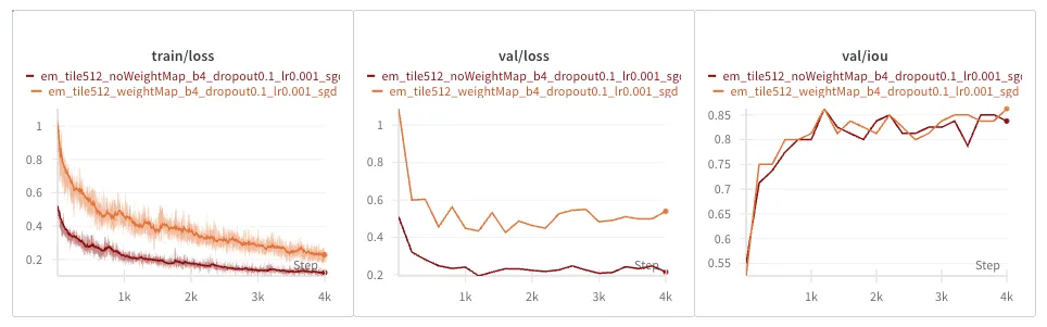
Train and validation loss look way lower without weight maps, but the reason is because the loss function is different! The weight-map weighted loss is necessarily higher, because we’re scaling up border-adjacent pixel losses.
However, the IOU metric tells us a clearer story: there is no noticeable difference between having and not having this weighted loss.
The weight maps turn out to be just a hacky inductive bias. My faith in the Holy Church of Gradient Descent remains intact, for now anyways.
Question #3: Would Adam converge faster than SGD?
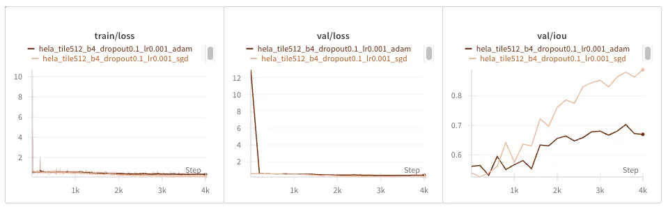
EM Dataset

Adam converges faster in training loss, but seems to overfit faster too, looking at a seemingly diverging validation loss. IOU seems unaffected.
PhC-U373 Dataset
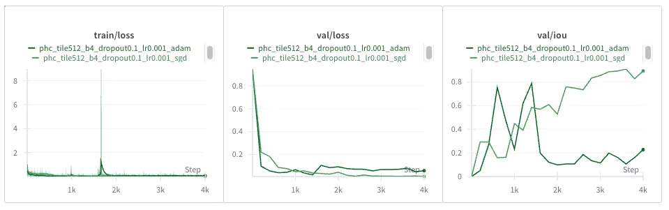
Adam really drops the ball here, with a massive loss spike and learning who knows what, by the looks of the IOU completely diverging. Let’s try reducing the learning rate from 1e-03 to 3e-04:
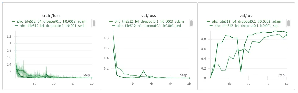
Much better, though somewhat of a loss spike remains in the same spot. It does recover from it quickly and gets the best IOU from 2K steps onwards!
DIC-HeLa Dataset
Looks like we need to bring down the learning rate again from 1e-03 to 3e-04:
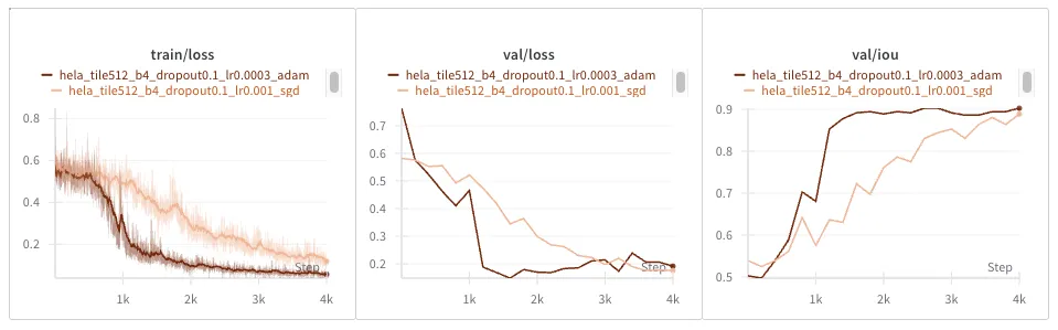
Much nicer! Losses and IOU converge much faster too.
Conclusions / thoughts
It seems that Adam converges much faster as long as we start with a lower learning rate.
Let’s try re-running the EM dataset with the lower learning rate, for good measure:
Seems to similarly overfit. The EM dataset is much smaller than the others, so perhaps that is not surprising.
Conclusion
I’ve had a lot of fun doing this, as well as experienced first-hand the crisis of reproducibility in deep learning.
If, like myself, you’re interested in getting better at this, and exercising your critical thinking skills, I recommend you to try this too.
It’s especially exciting when it comes to older papers, because they can be a bit more obscure, leaving more to figure out yourself, and at the same time they’re easier to reproduce on today’s consumer hardware.
And if you’re interested in reading about my next adventure in reproducing older papers, watch this space!