.png)
 2 hours ago
1
2 hours ago
1

Creating good-looking user interfaces has always been a struggle for me. If you’re in the same camp, this might help.
I recently redesigned Lighthouse, and during that process built a system that helped me create much better designs than I ever did before.
This system is about achieving the best possible design with the least amount of effort. There’s no need to know about the psychological impact of colors, which fonts are best for which purpose, golden ratios, etc. This is expert-level design knowledge that is just distracting if you’re not on that level. The key is to focus on the few important aspects, and not try to optimize every tiny detail.
Hallmarks of bad design
For a long time I could tell when a design was good and that my own designs were bad, but I could never specify why my designs were bad. Now I can summarize it in two words: alignment and consistency.
Let me show you.
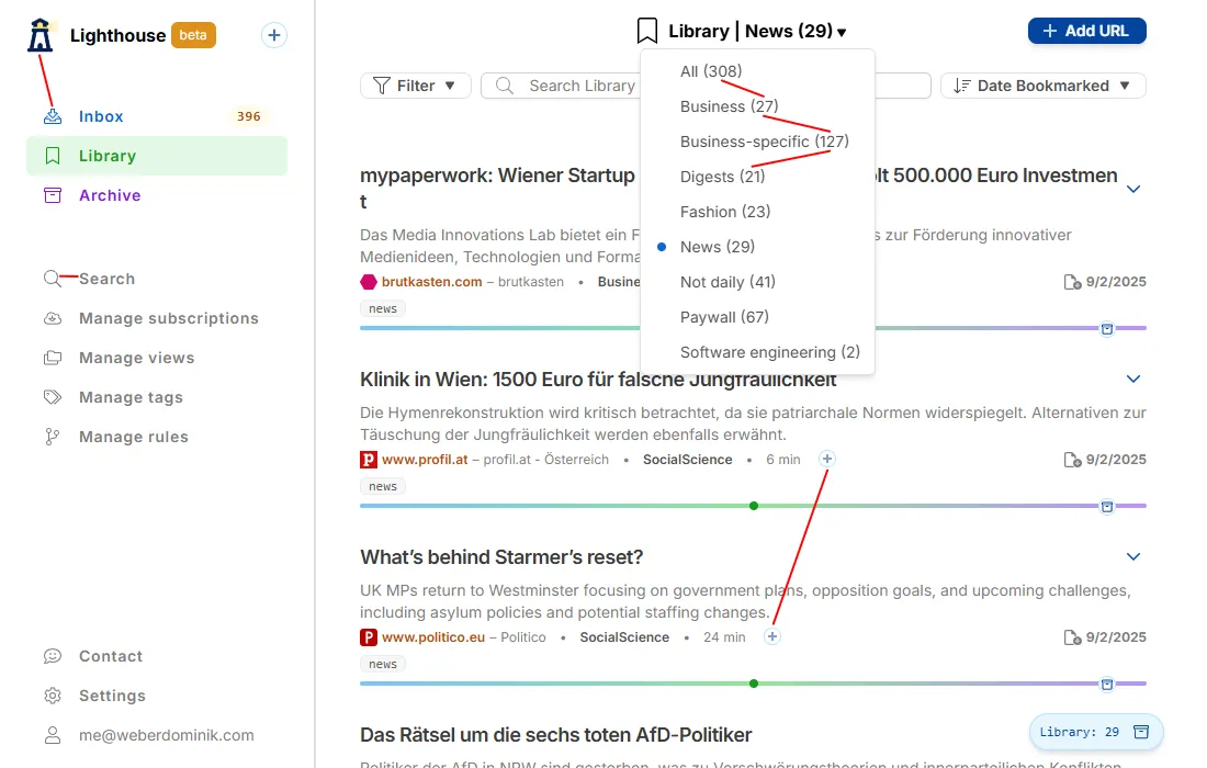
This is the previous UI of Lighthouse, before the redesign. A couple issues I see:
- Icons in the navigation sidebar are not aligned
- The logo is further on the left than the other icons.
- Icon weight mismatch in the navigation sidebar
- The icons are thin, compared to the text, which is bold.
- This one is very subtle, I’d never have thought of it, but once you see the difference it’s so obvious.
- “show summary” buttons
- The position of the “plus” button in the items is inconsistent, sometimes it’s more on the right, other times more on the left, depending on the text that comes before it.
- Alignment of item counts
- Item counts are shown in parenthesis right after the view name, consequently they start in different positions. And that makes it much harder to compare counts of different views (e.g. finding the ones with more than 100 items).
They all are either about positions being off (alignment) or elements looking differently than the ones next to them (consistency). These issues are subtle, if no one tells you what to look for they’re difficult to recognize.
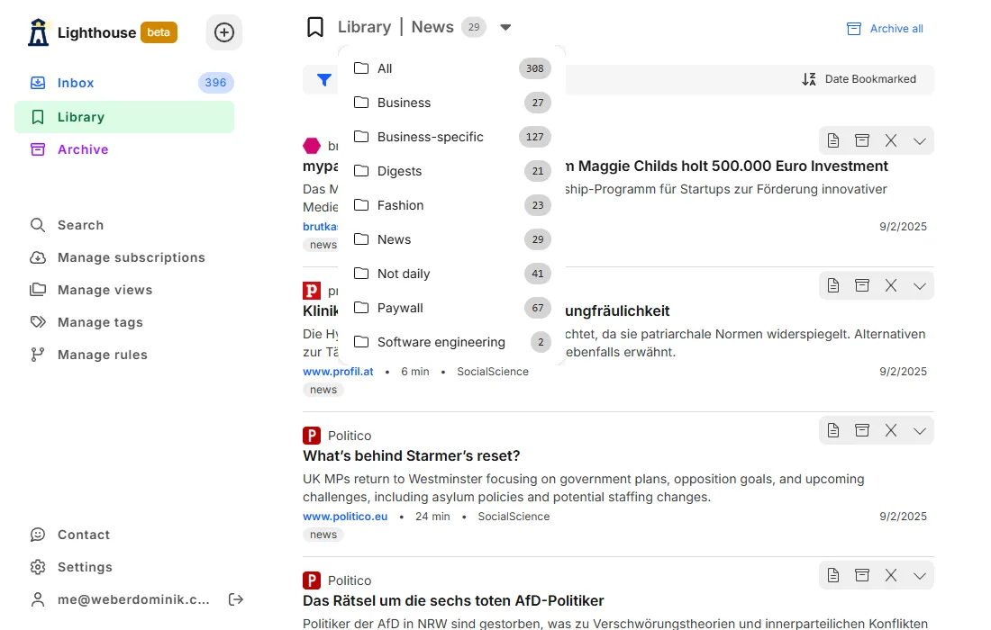
Below is the same page in the new design. You have to look quite closely to see the differences, but it looks much smoother, less grating. And it feels much calmer while using it.
In some way the difference is tiny. For Lighthouse I’m probably the only one who noticed that it’s calmer. But it’s also huge in a less obvious way, much more enjoyable to use now, even though there are no new features.
I want to mention one more hallmark of bad design. This one is harder to show with screenshots, so I’ll leave them out for now.
It’s inconsistency between pages. When similar UI elements look, feel, and work differently than others. Take the example of filtering items. Different item types have different properties to filter by. It might make sense to implement a separate filter component for every item, to optimize the UI for each item type. Without proper care this might result in a look and feel that’s different on every page. It isn’t obvious while testing one page, but users have to adapt ever so slightly depending on which screen they see. These slight differences make the UI feel worse.
While it’s best to optimize the UI for every page and still keep the look and feel consistent, in many cases that’s a lot of work, especially having to keep in mind how the UX is on other pages while implementing the functionality of the current one.
The tradeoff is to either focus on local perfection and sacrifice overall consistency, or keep it overall consistent and sacrifice local perfection. In my opinion the latter is better.
Component libraries
It takes an immense amount of effort to implement the functionality of a component library and make sure all components work well together, from a design (colors, sizes, etc.) and behavior (animations, states like disabled, etc.) perspective.
It’s best to build on top of a good component library, and not develop your own. For Lighthouse I use HeroUI. I also backed Web Awesome’s Kickstarter campaign, and would’ve loved to use it, but at the time of the redesign it wasn’t ready yet.
How to use them
For using component libraries I have 2 rules:
- Use the components of the library as much as possible, and don’t adapt them
- Decide which parts to use
Use the components of the library as much as possible, and don’t adapt them
In the past I tried to optimize the user experience for every little part of the interface. To do that I created my own components or adapted library components to fit that specific case better.
The result was a UI that had no consistency at all, every part looked and felt different than the others. I simply don’t have the design skills (or the time) to create a smooth UI with adaptations for every situation.
Now I’m in a different camp. I use the components the library provides as much as possible, even if they don’t fit perfectly, even if I’d like to have something different. This makes the UI consistent across all pages and elements.
Before I optimized the small parts and forgot about the larger picture. Now I focus on the larger picture and ignore little imperfections.
Decide which parts to use
HeroUI offers a couple different styles, and other component libraries do the same. For example the button component:

Using all of them would be too much for most applications. In Lighthouse, I decided to use only 3 variants, and treat them as primary, secondary, tertiary.
- Primary = solid
- Secondary = flat
- Tertiary = light
Other components, like Listbox, have the same style options. For those I decided to use only flat.
These decisions keep the overall UI consistent and have the added benefit to simplify the design process.
Similar decisions can be done for component sizes, spacing, colors, shadows, etc. The more you decide beforehand the more consistent the UI, and the simpler and faster the design process will be.
How to choose them
The component library you use has the biggest impact on the design of the product. For choosing the right one, I have 3 rules:
- Use a library that includes all components you’ll need
- Use a library that you find appealing design-wise
- Don’t use copy-paste libraries (less important)
Use a library that includes all components you’ll need
This is my most important rule. A lot of work is required to make the components of the library consistent in design and behavior, and work well with all the other components. If I have to add a component myself, then most likely it won’t work as smoothly with the library as built-in ones.
DatePicker is the component I miss the most in component libraries.
There are many excellent libraries that have all the components one could wish, so there are very few reasons why one would choose an incomplete one.
Keep in mind that it’s not necessary to choose the library with the most components. If you don’t need a component, there’s no point to look for it. DataTable for example is not required for Lighthouse, so I didn’t consider it in the selection process.
Use a library that you find appealing design-wise
From the libraries that survived the initial selection process, choose the one you find the most appealing design-wise.
Besides the obvious (why would you choose a library with worse design?), I’d argue that whatever you create will anyway gravitate towards your design taste. The library you choose should be closest to it, and more often than not it’ll be the one you like best.
Don’t overthink the library choice.
A professional designer might choose a specific look depending on what the product is. Some are more playful, others more serious. There is skeumorphic, brutalism, flat, and many other styles. But without deep design experience this is just noise, and might make the product worse in the long run.
Don’t use copy-paste libraries
This is more of a personal preference, because previously I used one and it didn’t work out at all.
The whole allure of copy-paste libraries is that you can adapt components to your liking. And if you have the code right there, that’s also quite tempting when the components don’t work exactly as you want them to. But as mentioned above, changing components leads to inconsistencies in the UI that are hard to get rid of. And if you don’t change the components, there’s no reason to even add them.
Even if you could make changes without adding inconsistencies, to get upstream improvements you then have to continuously rebase your changes to the source. That’s just more work with questionable payoff.
Copy-paste libraries are probably best for teams that have a designer and want to have a starting point for their own component library and design system.
Design rules
By using a component library, a lot of the small-scale design is already done for you. However, some elements you have to create yourself. Most commonly text (body text, headlines, etc.) and icons. And you of course have to combine the components into pages to create the full user experience. For that I have a couple specific rules.
Use only 2 font weights
There is important text (e.g. headlines, bold inline text) and less important text (e.g. body text). Regardless of which ones you choose, one is slightly bolder than the other. Use them accordingly.
This makes it much easier to keep the UI consistent.
Use only 2 text colors
The same goes for colors. By using a component library, colors are already handled for the most part. What’s left are the colors for the texts.
Here the same distinction applies. More important text gets a slightly darker color than less important text. In dark mode it’s reversed.
If you use tailwind, this could be text-gray-700 and text-gray-900.
Adapt icon weights to content next to it
I mentioned this one before. But it’s so subtle it doesn’t hurt to mention it again.
In the first version, the icons are too thin, they don’t match the text. In the second one it matches and looks much better.
Consider the purpose of elements
Don’t just put information in the UI because it exists in the backend. It’s not necessary that the UI shows everything. The same thing applies to functionality. Just because it’s simple to implement doesn’t mean it should be shown to the user.
Less is more is a good principle here.
Thinking about what a user wants to achieve, and what they need to get there, helps create less cluttered user interfaces. With fewer elements in the UI, users can decide faster what they need to achieve their goal. This is a win win. Less work and better UI.
A note on dark mode
Dark mode was one of the most requested features for Lighthouse. I refrained a long time from adding it because it adds additional work to every UI task. For every change I must ensure it works in light and dark mode. It may not sound much, but it adds up.
With HeroUI setting up dark mode is straightforward, and with a bit of additional setup I don’t have to think about it at all anymore. It just works. Dark mode without additional work, that I take anytime.
Showing the setup is beyond the scope of this article. I’ll add the link here as soon as it’s published.
Project-specific rules
I focus a lot on keeping a consistent user interface across the whole product. For this purpose I created an additional document of design rules. This is where I define everything that appears on multiple places.
From small things
Loading states
- Loading states use skeleton loaders, except buttons an other interactive elements which use the default loader
Button
- Variants
- Primary: solid
- Secondary: flat
- Tertiary: light
- Icon weights
- regular in all cases except
- tertiary button, then light
- tertiary icon only button, then solid
- secondary button in button group, then light
To large things
Actions
- If possible, the UI should update immediately, and the action done in the background
- If not possible, the UI should show a loading indicator until the action is complete
- If it’s a button that was pressed, then the loading indicator should be in that button
Forms
- Edit directly, no save button click required
- If buttons are required (e.g. subscribe page), they are left-aligned
- Always in a Card component
- Multiple sections are separated with LighthouseCard and multiple CardHeader and CardBody elements within the card
- Labels are always on top of the input element
- Additional info (e.g. preview) can appear below the card, as a second card
This is one document that defines how most of the UI of Lighthouse works. It’s a living document and will change over time, usually when I discover new generic rules.
Having it written down removes many of the small decisions. It makes the UI better and less work.
Resources / books
There are a lot of design books, and many that are targeted for developers. I read a ton of them, here are the 3 that I found most valuable:
Practical UI
This book is incredible. No fluff, no unnecessary deep design talk, just incredibly useful introductions to the most important topics of web design. Many of the rules (e.g. the icons) are from that book.
Refactoring UI
This one is similar to Practical UI. Many immediately usable design tips while building a foundational understanding of UI design.
If you have the time, read both. It helps getting different perspectives.
https://www.refactoringui.com/

Designing interfaces
This book introduces you to many UI design patterns. These are foundational patterns used in most products and websites. For example dropdowns, navigation menu, and so on.
Even though you probably already know them, the book is still valuable. It explains what each pattern can be used for, where it works well, where it doesn’t, and what to consider when using a specific pattern.
The less experience you have with UI design, the more value this book will provide.
https://www.oreilly.com/library/view/designing-interfaces-3rd/9781492051954/
Summary
Designing a beautiful user interface is difficult, but by adhering to a couple rules it becomes much simpler.
-
Use a component library
-
Use the components of the library as much as possible
- Prefer slight imperfections with library components over perfection with custom components
-
Don’t adapt library components
-
Choose a component library that provides all components your product needs
-
Choose a component library based on your style preferences
-
Keep the UI as consistent as possible
- Use similar components and patterns for similar interactions
- Use only 2 font weights
- Use only 2 text colors
- Adapt icon weights to content next to it
-
Consider the purpose of elements
-
Create a document of project-specific design rules
If you’d want to summarize these rules into one sentence, it’d be:
Prefer global UI consistency over local optimizations.