.png)
 4 months ago
10
4 months ago
10

In this (long) part of the customizable select series, it’s all about gamification. In this article, I’d like to highlight one of my demos, where I aimed to recreate a piece of UI found in the Monster Hunter games. To re-create this behavior, I had to think in terms of keyboard navigation first. This demo requires quite a lot of CSS, as well as some scripting, and in the end, I do want to highlight some accessibility concerns. This is an experiment on how far we can take it when styling select elements.
This is a long one… and I still wasn’t able to cover everything. So I can understand if you want to jump to some sections.
- Setting up the HTML
- CSS setup
- Adding the gamification with JavaScript
- Accessibility: context is everything here
- Conclusion
For those that just want to play around with it, here is that final result already 😉
The idea: Monster Hunter games
I am a big fan of the Monster Hunter games, with “Monster Hunter Wilds” being the last in the series. I started this demo while waiting for that last entry to be released, so visually it has more of a Monster Hunter Wold vibe (the previous version). If you are clueless about what I’m going on about, here is a video that shows the UI in the game:
I also added a little screenshot for easy reference:
Where we left off…
In the previous parts, we’ve covered basic styling, radial positioning, and sticky options. This time, we’re going horizontal and focusing on keystrokes and making it draggable. It’s a different idea, but I think the result turned out really cool. It’s quite a long demo so I won’t be going over every border or style in detail. Instead, I’d like to highlight a few parts on how this actually works.
Setting up our HTML
Let’s start with the structure. It’s a bit more complex than our previous demos because we need scroll arrows and an extra frame, more about those later on.
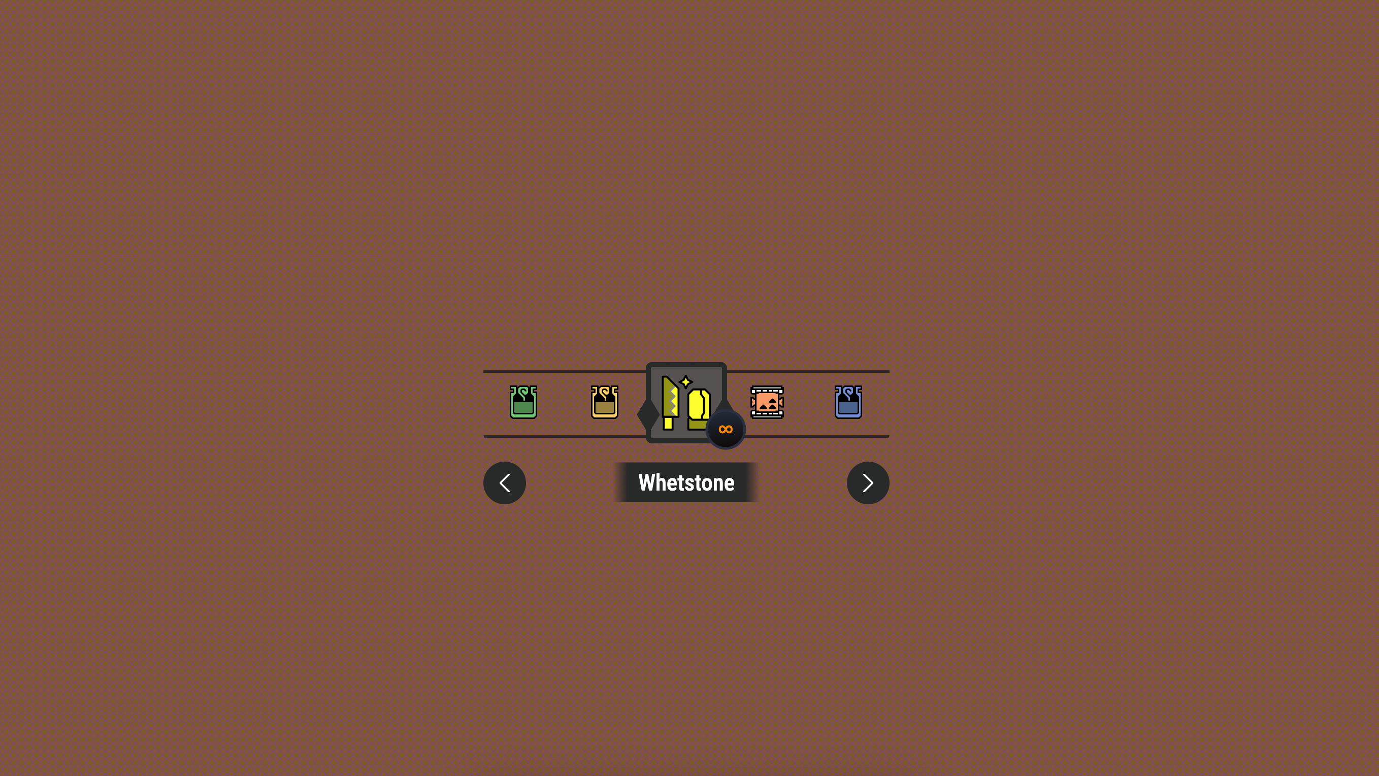
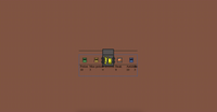
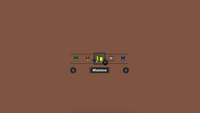
<select aria-label="Monster Hunter items"> <button class="trigger"> <selectedcontent></selectedcontent> </button> <div class="frame"></div> <div class="items" id="itemlist"> <button class="arrow arrow-left" type="button"> </button> <option> <div class="item"> <svg class="icon" aria-hidden="true"> <use xlink:href="#potion" /> </svg> <div class="title">Potion</div> <div class="amount">10</div> </div> </option> <button class="arrow arrow-right" type="button"> </button> </div> </select>The options
The options consist out of a few elements that we’re going to position differently. Each of the options will hold an icon with the image of an item, a .title containing a name and an .amount containing how many items are left of the type.
There are few extra divs to found here, more info on them below but for a fast read, here is a run down of why certain elements are added:
- The .frame is used because we want the items to be visually dragged behind the frame, the item in the frame is the focussed item which will be selected
- The extra .items element is what we’ll need to set up our scroll-snapping
- The arrows are for single pointer modality
We are taking things a bit further here with the .frame element and the scroll arrows. Notice that I’m adding the type="button" on the scroll arrows as well as I don’t want the opt-in to think of this as a trigger button. The arrows are added because I wanted to make this accessible as possible by at least offering a single pointer modality. More on the accessibility part of things later on because it does raise a few questions.
Basic CSS setup and not so progressive enhancement…
For this demo I didn’t really go the full progressive enhancement route. Don’t get me wrong, it’s still a fully functional select, it’s just not styled because I thought the CSS was already getting complicated enough. I still added a feature query tho.
First of all, let’s set some variables we’ll be using throughout this demo. They are pretty much self-explanatory, just your colors, borders, and sizes.
:root { --base-icon-size: 64px; --icon-size-wrap: 50px; --btn-bg: rgba(70 70 70 / 0.9); --border-color: #282929; --border-width: 4px; }Sizes to note:
- The --base-icon-size will be the size of an option
- The --icon-size-wrap will be the actual size of an icon.
Next up, it’s time to set our opt-in. The following part of the CSS setup will be wrapped in a feature query:
@supports (appearance: base-select) { select, ::picker(select) { appearance: base-select; } }Ok, let’s start with some of that basic select styling:
select { position: relative; display: flex; padding: 0; justify-content: center; anchor-name: --my-select; background: none; border: none; &::picker-icon { display: none; } }A few things are going on here. The first thing to notice is that the select is relatively positioned. The reason for this is that we’ll be placing some pseudo-elements on it later on. However, compared to my other demos, where I position the picker on top of the select, for this one, I am setting my custom anchor-name to the select element. We will be hanging a lot more items on the select, such as the .title and .amount, which is why we need that bit of extra control.
We’re also hiding the ::picker-icon again.
The borders and selectedcontent on open state
In the example UI, we see a bunch of borders. To create this kind of behavior, I wanted to add those to the open state of the select. Feel free to visit the example in detail to get the full styling of it. Another important thing that we wanted to do is that we don’t see the SVG in our <selectedcontent> when the select is :open, so we’ll make that one invisible as well.
select { &:open { selectedcontent svg { opacity: 0; } &::before, &::after { } } }Creating the frame
This was the trickiest part to figure out. I wanted items to scroll under a frame, like they’re behind glass. The solution was to create two identical-looking elements, one of those will be our button holding the <selected> content, which I gave the .trigger class for convenience, the other one is the dedicated .frame element:
.trigger, .frame { inline-size: var(--base-icon-size); aspect-ratio: 1; border: var(--border-width) solid var(--border-color); border-radius: 5px; &::before, &::after { position: absolute; inset-block-start: 40%; inset-inline: -17px auto; inline-size: 30px; aspect-ratio: 1; background: var(--border-color); clip-path: polygon(50% 0%, 80% 50%, 50% 100%, 20% 50%); content: ""; } &::after { inset-inline: auto -17px; } }But, there is more, we’re going full anchoring in this demo by setting an anchor-name for the trigger button (--button) and for the frame (--frame). While also providing a bit of positioning. We also want a visible overflow on the trigger because we’re going to position some of the text in our <selectedcontent> outside of our <button>.
.trigger { anchor-name: --button; overflow: visible; } .frame { position: absolute; top: 0; left: 50%; z-index: 2; transform: translateX(-50%); anchor-name: --frame; pointer-events: none; }The .trigger button is what we’ll see when the select is closed. The .frame sits on top with pointer-events: none so that we can drag through it. Those little diamond shapes hanging on the frame are made with pseudo-elements using a clip-path to give a bit more that MH World feeling.
Styling the picker and options
First thing we need to do is set the ::picker(select) to be anchored to the --button in this case and remove some of those UA-styles
::picker(select) { position-anchor: --button; left: anchor(center); top: calc(var(--base-icon-size) / -1); transform: translateX(-50%); padding: 0; background: transparent; border: 0; }Maybe not a bad idea to take a look at what we have now:
Ok, it still looks a bit messy, but we can see a few things happening: we see our double frames, our borders, and our texts. We almost got the complete setup. We have a bit of an offset for the frame, that is because we are using the icon size to calculate the top, this should be fixed when we position the text inside of our options.
Setting up the horizontal scrolling
We are once again using the --base-icon-size variable to calculate the width of our flex container. We are setting a scroll-snap on the x-axis and will remove the scrollbar for this example:
.items { display: flex; max-width: calc(var(--base-icon-size) * 5); padding: 0 calc(var(--base-icon-size) * 2); overflow-x: auto; scroll-snap-type: x mandatory; scroll-behavior: smooth; scrollbar-width: none; }That padding is also super important, it lets the first and last items scroll to the center. Without it, they’d get stuck at the edges.
Styling our options
Without completely showing every style of the options. In essence, we decide to set the option to have a relative position and hide the checkmark.
option { position: relative; &::checkmark { display: none; } }Scroll-state queries for snapped position
The SVGs inside start small and scale up when they are snapped, just as in the example. This is a great idea for scroll-state queries. I have written a small guide to scroll-state queries in the past, but for this demo, this is the gist of it:
First, we set the SVG in the option to have a smaller size overall:
option svg { scale: 0.6; transition: scale 0.2s ease-out; }If your browser supports scroll-state container queries, we can detect when an item snaps:
option { @supports (container-type: scroll-state) { container-type: scroll-state; } svg { @supports (container-type: scroll-state) { @container scroll-state(snapped: inline) { scale: 1; } } } }This is pretty experimental stuff, but when it works, it’s really smooth. The item scales up automatically when it snaps to center.
That’s it for our picker and options styling. This is what we have so far
We got some scrolling here, it’s great! But we still have to handle the text in those options.
Adding the title and amount displays
Using anchor positioning again, we can place the title and amount relative to our select:
.title { position: fixed; position-anchor: --my-select; top: anchor(bottom); left: anchor(center); transform: translate(-50%, 15px); }The amount gets positioned in the corner:
.amount { position: fixed; position-anchor: --my-select; top: anchor(bottom); right: anchor(center); }Adding the arrows
It’s a great idea to add some arrows in here to scroll the pane (more on the JS side of things later on). The styling of the arrows is very straightforward and just uses absolute positioning based on its select container.
.arrow { position: absolute; }And with some added presentation styles in general, we already have our design in order:
Now all that’s left for us is to add that game functionality. Because as it stands now, it’s not really usable.
Let’s recap how this works so far:
- We can open the select and use our left / right arrow to navigate the options
- We actually broke select behavior a bit because of this and our up and down arrow keys do not work anymore… this is why we need some JS.
Adding our gamification behavior with JavaScript
First, let’s set up the variables we’ll need to track everything:
let isDragging = false; let dragStartX = 0; let scrollStartX = 0; let focussedElement; const leftArrow = document.querySelector(".arrow-left"); const rightArrow = document.querySelector(".arrow-right");The isDragging boolean helps us know when someone is actively dragging. The dragStartX and scrollStartX variables store where the drag started - both the mouse position and the current scroll position. We’ll need these to calculate how far to scroll as the user drags.
The focussedElement variable is crucial for keyboard navigation, it keeps track of which item should be selected when the user presses Enter.
Handling the drag behavior
The drag functionality is split into three functions:
function handleDragStart(event) { event.preventDefault(); isDragging = true; itemlist.classList.add("dragging"); dragStartX = event.pageX - itemlist.offsetLeft; scrollStartX = itemlist.scrollLeft; }When the user starts dragging, we prevent the browser’s default drag behavior (which would try to drag the element itself). We set our dragging flag to true and added a .dragging class to the container. This class disables scroll-snap in our CSS, so dragging feels smooth instead of snappy.
For this, in our CSS the following is added:
.items { &.dragging { scroll-snap-type: none; cursor: ew-resize; scroll-behavior: auto; } }The event.pageX - itemlist.offsetLeft calculation gives us the mouse position relative to our scroll container, and itemlist.scrollLeft tells us where we currently are in the scroll.
function handleDragMove(event) { if (!isDragging) return; event.preventDefault(); const currentX = event.pageX - itemlist.offsetLeft; const scrollDistance = (currentX - dragStartX) * 2; r itemlist.scrollLeft = scrollStartX - scrollDistance; }During the drag, we calculate how far the mouse has moved from the start position. The * 2 multiplier makes the scrolling feel faster and more responsive - without it, you’d have to drag really far to scroll a little bit.
function handleDragEnd() { isDragging = false; itemlist.classList.remove("dragging"); updateArrowVisibility(); }When the drag ends, we clean up: set the flag to false, remove the dragging class (which re-enables scroll-snap), and update the arrow visibility.
let isDragging = false; let dragStartX = 0; let scrollStartX = 0; function handleDragStart(event) { event.preventDefault(); isDragging = true; itemlist.classList.add("dragging"); dragStartX = event.pageX - itemlist.offsetLeft; scrollStartX = itemlist.scrollLeft; } function handleDragMove(event) { if (!isDragging) return; event.preventDefault(); const currentX = event.pageX - itemlist.offsetLeft; const scrollDistance = (currentX - dragStartX) * 2; itemlist.scrollLeft = scrollStartX - scrollDistance; }When dragging, we add a class that disables scroll-snap so it feels natural. When you let go, snap kicks back in.
Arrow key navigation
Since we broke the natural behavior of arrow keys in a select when using the up/down keys, we are going to re-add them using JavaScript:
function handleArrowKey(event) { if (event.key === "ArrowUp") { event.preventDefault(); itemlist.scrollLeft -= 40; } else if (event.key === "ArrowDown") { event.preventDefault(); itemlist.scrollLeft += 40; } else { return; } }The magic of scrollsnapchange
Here’s where things get really interesting, or rather, the magic of this demo starts. There’s a new event called scrollsnapchange that fires when an item snaps into position:
itemlist.addEventListener("scrollsnapchange", (event) => { if (!isDragging) { event.snapTargetInline.focus(); focussedElement = event.snapTargetInline; delayedUpdateArrowVisibility(); } });When an item snaps to center, event.snapTargetInline gives us that specific element. We set focus on it so that if the user presses Enter, that item gets selected. We also store it in focussedElement for later use.
The if (!isDragging) check is important - we don’t want to mess with focus while someone is actively dragging around.
Handling clicks outside the picker
function handleOutsideClick(event) { if (!event.target.closest("#itemlist")) { if (focussedElement) { focussedElement.selected = true; } } }Since we do not trigger the selection of an item on click but rather based on the center of the frame, we had to add this. If someone clicks outside the item list, we automatically select whatever item is currently focused.
Managing the scroll arrows
The arrow buttons need to be disabled when you can’t scroll further in that direction:
function updateArrowVisibility() { const isAtStart = itemlist.scrollLeft === 0; const isAtEnd = itemlist.scrollWidth - itemlist.clientWidth <= itemlist.scrollLeft; leftArrow.disabled = isAtStart; rightArrow.disabled = isAtEnd; leftArrow.classList.toggle("disabled", isAtStart); rightArrow.classList.toggle("disabled", isAtEnd); }We check if we’re at the very beginning (scrollLeft === 0) or at the end (when scrollLeft equals the maximum possible scroll distance). Then we disable the appropriate arrows and add a .disabled state.
The delaying trick (lazy haxorz)
Ok, this is a bit lazy on my part, I agree…
When someone clicks an arrow or scrolls, we temporarily disable both arrows for 300ms. This prevents rapid clicking while the smooth scroll animation is happening. The 300ms sort of matches our CSS scroll-behavior: smooth timing, this is not an exact science…
function delayedUpdateArrowVisibility() { leftArrow.disabled = true; rightArrow.disabled = true; setTimeout(updateArrowVisibility, 300); }Centering focused elements
This function makes sure that when you open the ::picker(select), the focused item scrolls to the center. We calculate the center point of both the container and the focused element, then scroll by the difference.
function scrollToFocusedElement() { const focussedOption = document.activeElement.tagName === "OPTION"; if (!focussedOption) return; const focussedElement = document.activeElement; const container = focussedElement.closest("#itemlist"); if (!container) return; const containerRect = container.getBoundingClientRect(); const focussedElementRect = focussedElement.getBoundingClientRect(); const containerCenterX = (containerRect.left + containerRect.right) / 2; const focussedElementCenterX = (focussedElementRect.left + focussedElementRect.right) / 2; const offset = focussedElementCenterX - containerCenterX; container.scrollBy({ left: offset, behavior: "smooth" }); }Wiring it all up
Finally, we attach all our event listeners:
itemlist.addEventListener("mousedown", handleDragStart); itemlist.addEventListener("mousemove", handleDragMove); itemlist.addEventListener("mouseup", handleDragEnd); itemlist.addEventListener("mouseleave", handleDragEnd); itemlist.addEventListener("keydown", handleArrowKey); document.addEventListener("click", handleOutsideClick); leftArrow.addEventListener("click", () => scrollItemList("left", 40)); rightArrow.addEventListener("click", () => scrollItemList("right", 40));Accessibility: context is everything here
This is all about context, right? From a screen-reader perspective, I noticed that everything is still okay-ish and that there are enough ways to navigate the element. That being said, this is not the behavior a user would expect from a select, using the snap for selecting an item.
So yes, this UI can make sense in a browser game, because in games, UI needs to be learned a bit. But for your everyday website, this might not be your accessible option as it might cause your users a bit of frustration. Context is everything!
Conclusion
This demo definitely pushes the boundaries of what people expect from a select element. While it works great with keyboard navigation and screen readers, it’s not your typical form control. I’d recommend being careful about when you use something like this. It’s cool, but it might confuse users who expect a normal dropdown.
That said, I had a blast building it, and I think it shows how creative we can get with these new CSS features. The combination of customizable select, anchor positioning, and scroll-snap creates possibilities I wouldn’t have imagined a few years ago.
Here is that final result again: