A collection of beautiful hover effects for images using canvas. Built with TypeScript and optimized for performance.
Click the image to view the demo video on YouTube
Check out our live demo to see all the effects in action:
Vercel Demo
You can quickly figure out what values works best and directly plug those in your implementation :D.
- 🖼️ Multiple Effects: Choose from ASCII art, zoom, particle dust, pixel art, Minecraft-style, and Lego effects
- 🎨 Canvas-based: Smooth, performant animations using the Canvas API
- 📱 Responsive: Works with any image size
- 🎮 Interactive: Dynamic effects that respond to mouse movement
- 🔧 Customizable: Configure effect parameters in real-time
- 🚀 Lightweight: Minimal dependencies, focused on performance
- 📦 Tree-shakable: Only import the effects you need
# Using npm
npm install hover-effects-ts
# Using yarn
yarn add hover-effects-ts
# Using pnpm
pnpm add hover-effects-ts
Add the effect to your image with just a few lines of code:
<img src="your-image.jpg" alt="Your Image" id="my-image">
<script type="module">
import { applyHoverEffect } from 'hover-effects-ts';
// Get your image element
const image = document.getElementById('my-image');
// Apply a cool ASCII effect
applyHoverEffect(image, {
effect: 'ascii',
size: 16,
radius: 100
});
</script>
You can easily apply effects to multiple images at once:
// Select all images with a specific class
const images = document.querySelectorAll('.hover-image');
// Apply the same effect to all of them
applyHoverEffect(images, {
effect: 'zoom',
scale: 1.2,
radius: 100
});
You can also target elements using a CSS selector:
// Apply effect to all images with a specific class
applyHoverEffect('.gallery-image', {
effect: 'minecraft',
blockSize: 8,
radius: 130
});
For a comprehensive guide on using hover effects correctly, check out the examples directory, which includes:
-
Interactive Usage Guide - A complete example showing proper initialization and configuration:
-
examples/usage-guide.html - Interactive demo with UI controls
-
examples/usage-guide.js - Implementation with best practices
-
Key Implementation Patterns:
- Waiting for images to load before applying effects
- Using UI control values for initialization
- Properly updating effects with setter methods
- Debugging and troubleshooting techniques
Run the examples locally after installing:
# Clone the repository
git clone https://github.com/hsrambo07/hover-effects
cd hover-effects
# Install dependencies
npm install
# Build the library
npm run build
# Open the example in your browser
open examples/usage-guide.html
📦 Import Only What You Need
To reduce your bundle size, you can import only the specific effects you need:
// Import only the effects you'll use
import { AsciiHover } from 'hover-effects-ts';
// Create the effect directly
const effect = new AsciiHover({
size: 16,
radius: 100
});
// Attach it to your image
effect.attach(document.querySelector('img'));
// Clean up when done
effect.destroy();
All effects support dynamic parameter updates:
// Create an effect
const effect = applyHoverEffect('#my-image', {
effect: 'ascii',
size: 16,
radius: 100
});
// Connect to UI sliders
document.getElementById('size-slider').addEventListener('input', (e) => {
effect.setSize(parseInt(e.target.value));
});
document.getElementById('radius-slider').addEventListener('input', (e) => {
effect.setRadius(parseInt(e.target.value));
});
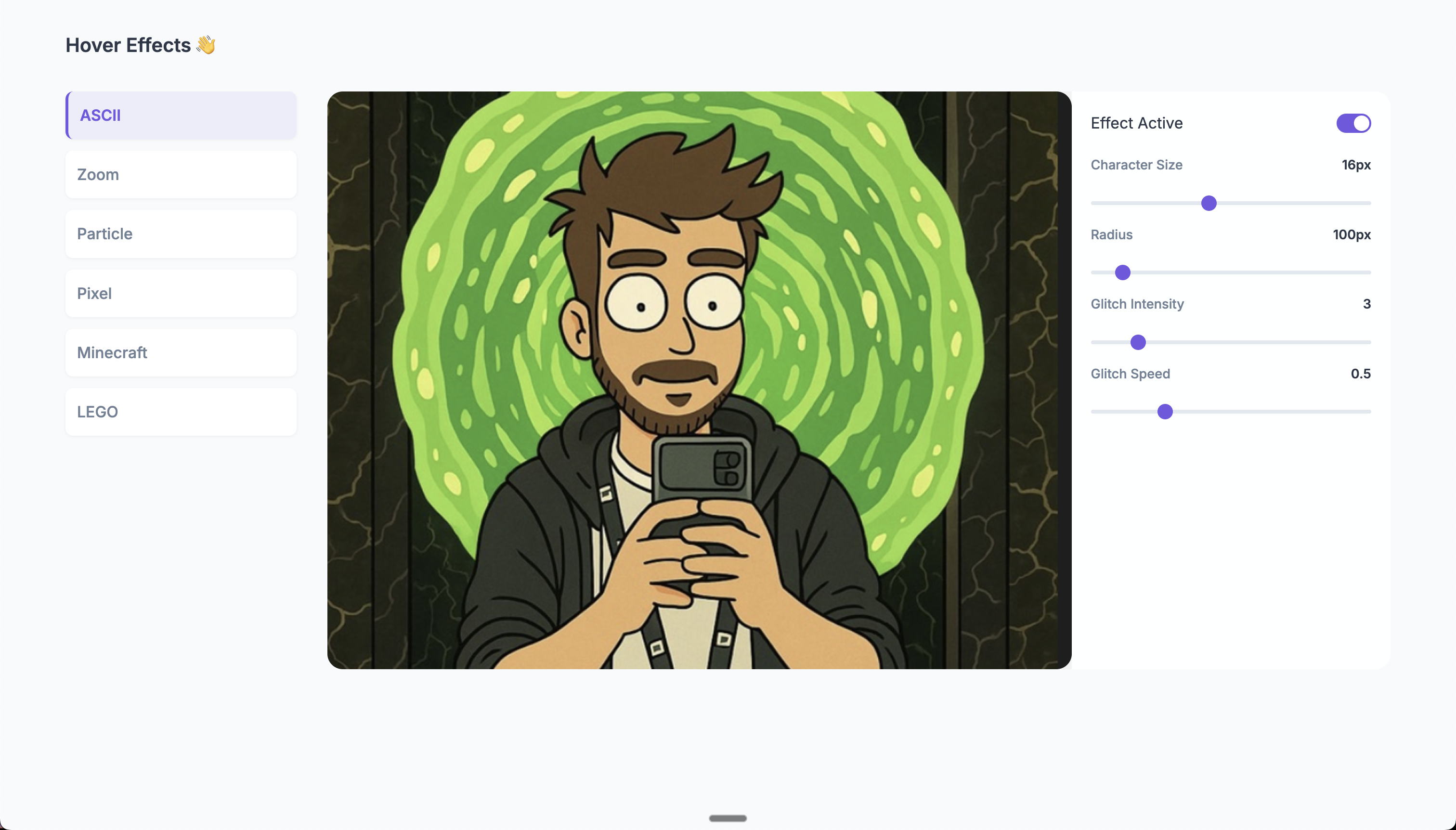
Transforms your image into dynamic ASCII characters when hovering.
📺 Demo: See the ASCII effect in action on YouTube
applyHoverEffect('#my-image', {
effect: 'ascii',
size: 16, // Character size in pixels (range: 6-30, default: 16)
radius: 100, // Effect radius in pixels (range: 30-800, default: 100)
glitchIntensity: 3, // Intensity of the glitch effect (range: 0-20, default: 3)
glitchSpeed: 0.5, // Speed of the glitch effect (range: 0.1-20, default: 5)
chars: ['█', '@', '%', '#', '*', '+', '=', '-', ':', '.', ' '] // Optional custom characters
});
Available controls:
-
setSize(size) - Changes the character size (6-30px)
-
setRadius(radius) - Changes the effect radius (30-800px)
-
setGlitchIntensity(intensity) - Adjusts glitch intensity (0-20)
-
setGlitchSpeed(speed) - Adjusts glitch animation speed (0.1-20)
-
setChars(chars) - Sets custom character set
Creates a magnifying glass effect when hovering.
📺 Demo: See the zoom effect in action on YouTube
applyHoverEffect('#my-image', {
effect: 'zoom',
scale: 1.2, // Zoom scale (range: 1.1-2.0, default: 1.2)
radius: 100 // Effect radius in pixels (range: 50-200, default: 100)
});
Available controls:
-
setScale(scale) - Changes the zoom magnification level (1.1-2.0)
-
setRadius(radius) - Changes the zoom lens radius (50-200px)
Breaks the image into pixel particles that scatter when hovering.
📺 Demo: See the particle effect in action on YouTube
applyHoverEffect('#my-image', {
effect: 'particle-dust',
spacing: 4, // Particle spacing in pixels (range: 2-10, default: 4)
maxDrift: 28, // Maximum particle drift distance (range: 10-50, default: 28)
radius: 110 // Effect radius in pixels (range: 50-200, default: 110)
});
Available controls:
-
setSpacing(spacing) - Changes particle density (2-10px)
-
setMaxDrift(maxDrift) - Adjusts how far particles drift (10-50px)
-
setRadius(radius) - Changes the effect radius (50-200px)
Creates a pixelated effect when hovering.
📺 Demo: See the pixel effect in action on YouTube
applyHoverEffect('#my-image', {
effect: 'pixel',
blockSize: 16, // Pixel size in pixels (range: 4-32, default: 16)
radius: 130 // Effect radius in pixels (range: 50-200, default: 130)
});
Available controls:
-
setBlockSize(blockSize) - Changes the pixel size (4-32px)
-
setRadius(radius) - Changes the effect radius (50-200px)
Creates a 3D voxel-like effect similar to Minecraft blocks.
📺 Demo: See the Minecraft effect in action on YouTube
applyHoverEffect('#my-image', {
effect: 'minecraft',
blockSize: 28, // Block size in pixels (range: 4-32, default: 28)
radius: 130 // Effect radius in pixels (range: 50-200, default: 130)
});
Available controls:
-
setBlockSize(blockSize) - Changes the block size (4-32px)
-
setRadius(radius) - Changes the effect radius (50-200px)
Transforms the image into LEGO-like blocks when hovering.
📺 Demo: See the LEGO effect in action on YouTube
applyHoverEffect('#my-image', {
effect: 'lego',
blockSize: 16, // Lego brick size in pixels (range: 8-40, default: 16)
radius: 140, // Effect radius in pixels (range: 80-200, default: 140)
gap: 2, // Gap between bricks (range: 1-5, default: 2)
studScale: 0.33, // Scale of the studs on top of bricks (range: 0.2-0.7, default: 0.33)
depth: 0.25, // 3D effect depth (range: 0.1-0.4, default: 0.25)
softEdge: 90, // Softness of edge transition (range: 30-150, default: 90)
fadeExp: 1.4 // Fade exponent for smooth transitions (range: 1.0-3.0, default: 1.4)
});
Available controls:
-
setBlockSize(blockSize) - Changes the brick size (8-40px)
-
setRadius(radius) - Changes the effect radius (80-200px)
-
setGap(gap) - Adjusts spacing between bricks (1-5px)
-
setStudScale(scale) - Changes the stud size on top of bricks (0.2-0.7)
-
setDepth(depth) - Adjusts the 3D depth effect (0.1-0.4)
-
setSoftEdge(edge) - Controls the edge softness (30-150px)
-
setFadeExp(exp) - Adjusts the fade exponent for transitions (1.0-3.0)
To keep your hover effects running smoothly:
-
Image Size: Use appropriately sized images. Very large images may impact performance.
-
Effect Parameters:
- For ASCII effect, larger character sizes improve performance
- For Particle effect, larger spacing values reduce the number of particles
- For Pixel/Minecraft effects, larger block sizes improve performance
-
Radius: Smaller effect radii generally perform better
-
Clean Up: Always call destroy() when removing effects to prevent memory leaks
For best results when initializing effects:
-
Load Images First: Ensure images are fully loaded before applying effects
const img = document.getElementById('my-image');
img.onload = () => {
const effect = applyHoverEffect(img, { effect: 'minecraft', blockSize: 28 });
};
-
Get UI Controls Values: If using sliders or other UI controls, initialize with their actual values
const sizeSlider = document.getElementById('size-slider');
const radiusSlider = document.getElementById('radius-slider');
const effect = applyHoverEffect('#my-image', {
effect: 'pixel',
blockSize: parseInt(sizeSlider.value),
radius: parseInt(radiusSlider.value)
});
-
Safely Update Effects: Use setter methods for real-time updates without re-initialization
// Better than destroying and recreating the effect
sizeSlider.addEventListener('input', (e) => {
effect.setBlockSize(parseInt(e.target.value));
});
If you encounter issues with effects:
-
Check Browser Console: Enable console logging for detailed initialization info
-
Monitor Effect State: Create a debug button to log the internal state
const debugBtn = document.getElementById('debug-btn');
debugBtn.addEventListener('click', () => {
console.log('Effect state:', {
blockSize: effect.getBlockSize?.() || 'N/A',
radius: effect.getRadius?.() || 'N/A',
samples: effect._getSamples?.()?.length || 'N/A'
});
});
-
Canvas Inspection: Use browser dev tools to examine the canvas element and its properties
The library is supported in all modern browsers:
- ✅ Chrome 60+
- ✅ Firefox 55+
- ✅ Safari 11+
- ✅ Edge 79+
import React, { useEffect, useRef } from 'react';
import { applyHoverEffect } from 'hover-effects-ts';
function HoverImage({ src, alt, effect }) {
const imgRef = useRef(null);
const effectRef = useRef(null);
useEffect(() => {
if (imgRef.current) {
// Apply the effect
effectRef.current = applyHoverEffect(imgRef.current, effect);
// Clean up on unmount
return () => {
if (effectRef.current) {
effectRef.current.destroy();
}
};
}
}, [effect]);
return <img ref={imgRef} src={src} alt={alt} />;
}
// Usage
function App() {
return (
<HoverImage
src="/your-image.jpg"
alt="Interactive Image"
effect={{
effect: 'ascii',
size: 16,
radius: 100
}}
/>
);
}
MIT License - feel free to use this in your projects!
- Updated demo links to use YouTube instead of Twitter
- Added YouTube video thumbnail
- Improved documentation with consistent demo references
- Removed Twitter embed code
- Fixed ASCII effect radius parameter not working correctly
- Improved mouse position tracking and coordinate system handling
- Enhanced canvas positioning and scaling for consistent effect behavior
- Added debug information for troubleshooting
- Removed colored ASCII feature to improve performance
- Fixed TypeScript errors and improved type safety
- Added better null checks in particle dust effect
- Fixed Minecraft effect not respecting the provided blockSize parameter
- Fixed Pixel effect initialization with custom blockSize values
- Improved setBlockSize method implementation for both effects
- Added better error handling and safety checks for array bounds
- Enhanced debugging support to monitor effect states
- Ensured consistent behavior between Pixel and Minecraft effects
- Added real-time control ranges for all effects
- Improved performance with optimized rendering
- Fixed canvas scaling issues on high-DPI displays
- Added TypeScript strict mode support
- Improved error handling and type safety
-
BREAKING CHANGE: Unified API for applyHoverEffect
- Added real-time parameter update support via setter methods
- Improved ASCII effect with better coloring and transparency
- Added LEGO effect with customizable studs and 3D appearance
- Fixed transparency issues in all effects
- Improved performance and rendering quality
- Added Particle Dust effect
- Fixed CORS issues with external images
- Improved error handling for different image types
- Added Minecraft and Pixel effects
- Fixed performance issues when using multiple effects
- Improved reusability with better cleanup methods
- Initial release with ASCII and Zoom effects
- Basic hover interaction support
.png)
 1 week ago
5
1 week ago
5


