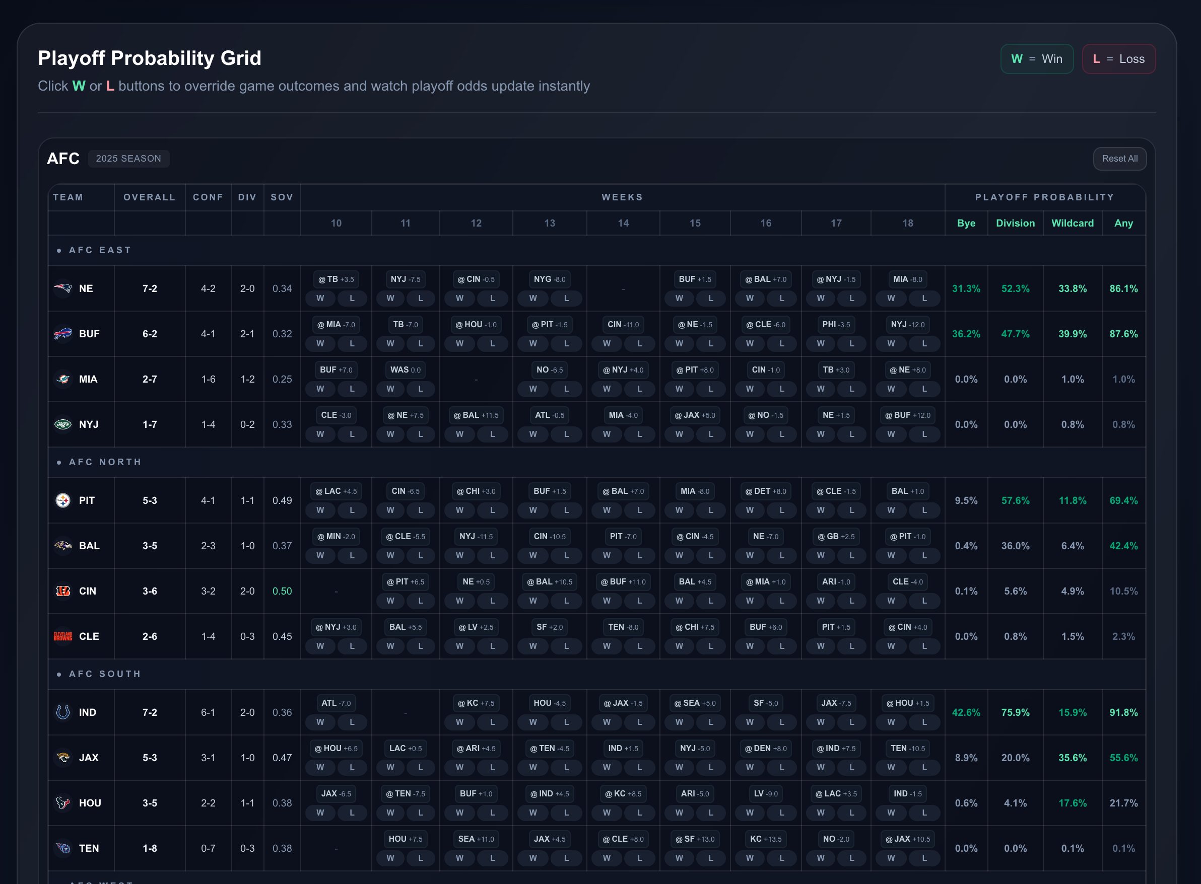
A dark-themed React component library built with TypeScript and Storybook, featuring a minimalist cyberpunk aesthetic with sharp corners and thin borders. Based entirely off of Steve Lauda design work.
- 🌑 Dark Theme - Optimized for dark mode applications
- 📦 45+ Components - Comprehensive UI component collection organized by category
- 🎨 Edgy Design - Sharp corners and thin borders for a distinctive look
- 🚀 Zero Runtime Dependencies - Lightweight and performant
- 📝 TypeScript Support - Full type definitions included
- 📚 Storybook Documentation - Interactive component playground
- 🎯 Organized Structure - Components grouped into logical categories
npm install snake-eater-ui
import { Button, Card, Alert } from 'snake-eater-ui';
import 'snake-eater-ui/dist/styles.css';
function App() {
return (
<Card>
<Alert variant="success">Welcome to Snake Eater UI!</Alert>
<Button variant="primary">Get Started</Button>
</Card>
);
}
- Button - Primary interactive element with multiple variants
- IconButton - Compact button for icon-only actions
- Badge - Status indicators and labels
- Stat - Statistical data presentation
- Table - Data tables with sorting and selection
- Alert - Contextual feedback messages
- Loading - Loading indicators
- Modal - Overlay dialogs
- Progress - Progress indicators
- Skeleton - Loading placeholders
- Toast - Temporary notifications
- Tooltip - Contextual hints
- Checkbox - Multi-selection control
- ColorPicker - Color selection tool
- Input - Text input fields
- RadioButton - Single selection control
- Select - Dropdown selection
- Slider - Range selection
- Textarea - Multi-line text input
- Toggle - On/off switch
- Accordion - Collapsible content panels
- Card - Content containers with decorative corners
- Divider - Visual separation with multiple styles
- Filter - Filter controls with count badges
- Grid - CSS Grid layout system
- SubCard - Nested content containers with accent corners
- Breadcrumb - Navigation hierarchy
- Link - Text links with hover effects
- Menu - Dropdown navigation menus
- Tabs - Tabbed navigation
- Heading - Section headers (h1-h6)
- Text - Body text with variants
- List - Styled lists with custom markers
--color-bg-base: #0b0b0d; /* Base background */
--color-bg-card: #1f1d20; /* Card background */
--color-bg-elevated: #2a282b; /* Elevated elements */
--color-text-primary: #bdbdbd; /* Primary text */
--color-text-secondary: #8a8a8a; /* Secondary text */
--color-text-muted: #5a5a5a; /* Muted text */
--color-danger: #ff5555; /* Error states */
--color-success: #50fa7b; /* Success states */
--color-warning: #f1fa8c; /* Warning states */
- Node.js 16+
- npm 7+
# Clone the repository
git clone https://github.com/yourusername/snake-eater-ui.git
cd snake-eater-ui
# Install dependencies
npm install
# Start Storybook
npm run storybook
# Development
npm run storybook # Start Storybook dev server
npm run dev # Alias for storybook
# Building
npm run build # Build static Storybook
npm run build-storybook # Alias for build
# Testing
npm test # Run all tests
npm test Button # Run specific component tests
snake-eater-ui/
├── .storybook/ # Storybook configuration
├── stories/ # Component library
│ ├── Component.tsx # Component implementation
│ ├── Component.stories.tsx # Storybook stories
│ └── component.css # Component styles
├── package.json
└── tsconfig.json
Contributions are welcome! Please follow these guidelines:
- TypeScript First - All components must be written in TypeScript
- Storybook Stories - Every component needs comprehensive stories
- Accessibility - Ensure keyboard navigation and ARIA support
Unlicensed (for now)
Built with:
.png)


