.png)
 2 hours ago
1
2 hours ago
1

Have you heard of the @starting-style at-rule? It’s an interesting new tool that lets us use CSS transitions for enter animations.
For example, let’s suppose we have some UI where elements get added dynamically to the page, and we want them to fade in:
Code Playground
When you click the “Add Element” button, a new purple square is generated and added to the page, and a CSS keyframe animation fades it in over 1 second.
Historically, the big limitation with CSS transitions has been that they only apply when a targeted CSS property changes from one value to another. If we want a property to animate when an element is created, we’ve needed to use CSS keyframe animations, like I’m doing in the example above.
The new @starting-style API is a workaround for this limitation. We can provide an alternative set of CSS declarations. When the element is created, it’ll immediately transition from these initial styles.
Check it out:
Code Playground
Each .box element gets initialized with opacity: 0, set within the @starting-style block. Right after the element is created, that declaration is removed, triggering a CSS transition to opacity: 1, set within the main styles.
This is pretty cool… But honestly, I’m a bit skeptical about it. So far, I haven’t really found anything that can’t already be accomplished with @keyframes, which is arguably a more appropriate tool for the job. And there’s a pretty gnarly specificity gotcha here. 😬
In this blog post, we’ll dig into the issue I found with this API and explore some workarounds. In the process, we’ll learn quite a bit about CSS specificity, so even if you’re not particularly interested in @starting-style, I bet this’ll still be worth your while!
Link to this headingThe specificity problem
If you’ve worked with CSS for a while, you probably know about specificity. When our CSS contains rules that conflict with each other, the browser has a system to work out which CSS should actually be applied.
For example, consider this setup:
This snippet contains two rules, and they both match that <button> element. Each rule sets the background-color property to a different value. The button can’t simultaneously be both transparent and blue. How does the browser decide which value to apply?
According to the specificity rules, class selectors like .primary-button are more specific than tag selectors like button. This means that they emerge victorious from this confrontation, and our button would be painted blue.
In addition to the hierarchy of specificity (tag → class → id), there are also different groups of CSS, with different priority levels. This is technically a distinct concept from specificity, but it feels to me like a zoomed-out version of the same thing.
For example, every browser comes with a built-in set of CSS styles (“user-agent” styles). This is why headings are bold by default, and why the <blockquote> element looks different than a <p> element. Instead of doing specificity math for each built-in style, the browser treats them as an entirely separate collection of CSS. They get applied first, and any CSS we write, no matter its specificity, will overwrite it.
Another example is the !important flag. Any CSS with this flag will be moved to its own high-priority collection of styles, automatically winning over any styles without !important, no matter their specificity.
What about keyframe animations? These styles are also a distinct collection. That’s why we can do stuff like this:
This is interesting, when we think about it. Our fadeFromTransparent animation changes the opacity property, and we’re doing it from within a tag selector (h1). But we’re also setting opacity to 1 in an ID selector (#title). By the rules of specificity, that opacity: 1; should overwrite the fade-in animation!
This works because the CSS declarations within keyframe animations are promoted to their own collection. This collection has the second-highest priority, just below !important. This means that our keyframe animations will almost always work. We don’t have to worry about any of this stuff when we use CSS keyframes.
But the same can’t be said for @starting-style! Unlike keyframe animations, the styles inside the @starting-style block aren’t promoted. This means that the standard specificity rules apply.
As a result, our enter animation won’t run in cases like this:
Code Playground
When this heading is created, the browser runs its specificity calculations. Since #title is more specific than h1, the element is initialized with an opacity of 1, not 0.
CSS transitions are only triggered when the applied styles change. In this setup, the opacity value is never actually set to 0, so there is no transition. The heading is painted immediately at full opacity.
Admittedly, this is a pretty contrived example, and most modern CSS approaches (Tailwind, styled-components, CSS Modules, BEM, etc) will protect you from these sorts of specificity issues. But even if you use one of these approaches, this gotcha can still getcha.
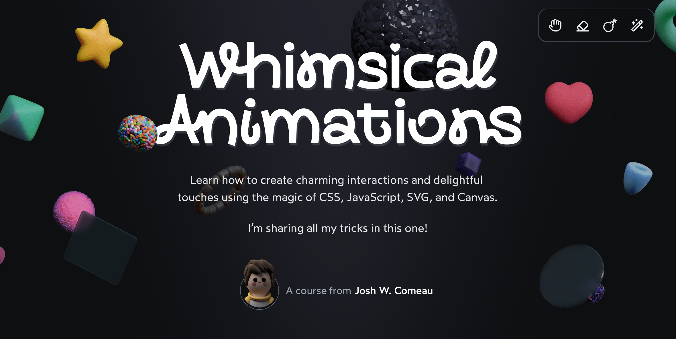
Let’s look at a real-world example I ran into recently. In my upcoming course on whimsical animations(opens in new tab), we build this particle effect:
When the user clicks the “Like” button, it generates 15-20 particles. They all start from the very center of the button and then expand outwards in a random direction by a random amount. This motion is accomplished using CSS transforms. So, for example, a particle might go from transform: translate(0px, 0px) (perfectly centered) to transform: translate(42px, -55px) (up and to the right).
When I tried to use @starting-style for this, it didn’t work. I spent a good few minutes completely baffled by it.
This particle effect is deceptively complex, and the full implementation is far too big to fit within this blog post, but I’ve done my best to pluck out the bare essentials, so that we can see this issue in action:
Code Playground
Try clicking the button, and notice that the particles don’t “pop”. They appear immediately in their final position, instead of animating from their starting position. Here’s what the expected result should be:
If we examine the code, we see that we’re setting the initial position in CSS with @starting-style. The ending position is dynamically generated for each particle, and set within /index.js:
The problem, once again, is related to specificity. When we set a style in JavaScript like this, it gets applied as an inline style, which is much more specific than the initial position, set in a CSS class (.particle). As a result, the starting styles never actually get applied to the particles.
This is a real-world example of the sort of subtle issue I ran into when I tried to use @starting-style in my own work. I consider myself reasonably adept at navigating specificity issues, but even still, this stuff really catches me off-guard!
Link to this headingSolutions
So, that’s the problem. Thanks for bearing with me through that rather lengthy explanation. 😅
Let’s talk about how we can address it.
Link to this heading1. The nuclear option
One option to solve this problem is to increase the priority of the @starting-style declaration using !important:
As we briefly saw earlier, !important promotes the given CSS declaration to the highest-priority group, superseding all specificity calculations.
This works great, but whenever I use !important, it feels a bit like making a deal with the devil. It solves my problem today, but at a significant potential maintenance cost. It reduces the number of options available to us in the future, when we run into other specificity issues.
Granted, in this particular case, it’s not quite so bad, since the starting styles are removed automatically right after the element is created. But it still doesn’t feel like a great solution.
Link to this heading2: CSS custom properties
A clever solution to this problem is to change how the final transform declaration is applied, using custom properties:
In our JavaScript file, we create two new CSS custom properties (also known as CSS variables), --x and --y. We can then reference these values in our .particle class styles!
As a result, our two transform declarations have the same specificity, and since the @starting-style is placed underneath the end transform declaration, everything works the way we’d expect.
In my opinion, this solution is very elegant. It sidesteps the core specificity issue in a very graceful way. But I don’t want my code to be elegant and graceful! I want my code to be as simple and basic as possible, so that it can be easily understood by the least-experienced members of my team, and so that I don’t have to burn a bunch of calories to figure out what’s going on when I revisit this code down the line.
Link to this heading3: Using keyframes instead
Instead of escalating things with !important or using a clever custom-property approach, we can always fall back on trusty CSS keyframes!
Code Playground
Look at that! This approach works great. It only requires a couple lines of very basic CSS, and will be very easy to maintain. Plus, this approach will will work in virtually all browsers. @starting-style has pretty good browser support, but it’ll be many, many years until it’s as universal as keyframe animations.
I think the appeal of @starting-style is that developers are already super comfortable with transitions, while CSS keyframes feel less flexible and less intuitive. But with modern CSS, I would argue that CSS keyframes are just as flexible as transitions, and even more powerful! In my opinion, keyframe animations are super underrated.
I recently wrote about the cool things that we can do with keyframe animations. You can learn more here:
Link to this headingSyntactic sugar?
It seems to me that @starting-style doesn’t really open any new doors in terms of the sorts of animations we can create on the web. So far, all of the examples I’ve seen could be accomplished using CSS keyframe animations. And as we’ve seen in this blog post, it often winds up being simpler with keyframes!
This makes me think that maybe I’m missing something. Lots of the examples I see online combine @starting-style with other modern CSS features, like transition-behavior: allow-discrete and interpolate-size: allow-keywords. But as far as I can tell, all of that stuff works equally well with keyframe animations. 🤔
If you know of something that can be accomplished exclusively using @starting-style, please let me know! You can shoot me an email or share it with me on Bluesky(opens in new tab).
And either way, a big “thank you” to all of the people who were involved in creating this and so many other modern CSS features. The pace of development has been unreal these last few years, and I can only imagine how much hard work goes into this. I’m very grateful for all of the new tools you’ve given us. ❤️
Link to this headingAn exciting announcement
If you’re familiar with my work, you know I care a lot about animations and interactions. I think they’re one of the most important ingredients when it comes to making polished products that feel great to use.
For the past year, I’ve been working on something special. It’s an interactive online course called Whimsical Animations(opens in new tab).
This course launches in “Early Access” on Wednesday, September 24th. You’ll be able to start learning this week!
My goal with this course is to share everything I’ve learned about how to design and build next-level animations. If you’ve ever wondered how I did something on this blog (or in my other projects), there’s a very good chance that you’ll learn about it in my course.
Registration is only open for 1 week. On September 30th, the doors will close, and you won’t be able to register until the course’s full release sometime in 2026. This “Early Access” registration week also comes with a 50% discount!
You can learn more here:
Last updated on
September 22nd, 2025

![Easy Color Theory: A Beginner's Guide [video]](https://www.youtube.com/img/desktop/supported_browsers/opera.png)
