.png)

Sep 20, 2025 - 24 min read
Hey there! So it’s been about a year since my first blog post, so things are going about as slowly as predicted. The first one was about the origins of Photofield, a self-hosted photo gallery I’ve been building off and on again. It seems like writing about it is easier if you’re just in the middle of something, in the moment, and this is one of those moments, so let’s dive in.
If you want to skip 10 mins of exposition, skip right ahead to Pareto Front for pretty charts, but don’t ask me for directions if you get lost.
Contents
- The What Map Tile What What?
- The Motivation
- Why don’t you just do it in the backend
- There’s a better way
- Stand back, I’m going to try SCIENCE! 🔬
- Pareto Front
- Interactive Data Explorer
- Conclusion
- Annex
The What Map Tile What What?
Alright, so a little bit of background first. As we covered in the last post, the photos are rendered in a bit of an unusual way. Instead of loading the thumbnails in the browser, we’re rendering tiles of photos on-the-fly and then loading that in the browser.
If you’ve been paying attention, you will note that this is very similar to how a world map works. So naturally, one day you put the two and two together and you put the photo tiles on top of map tiles. And thus, the admittedly quite unfinished Map view was born.
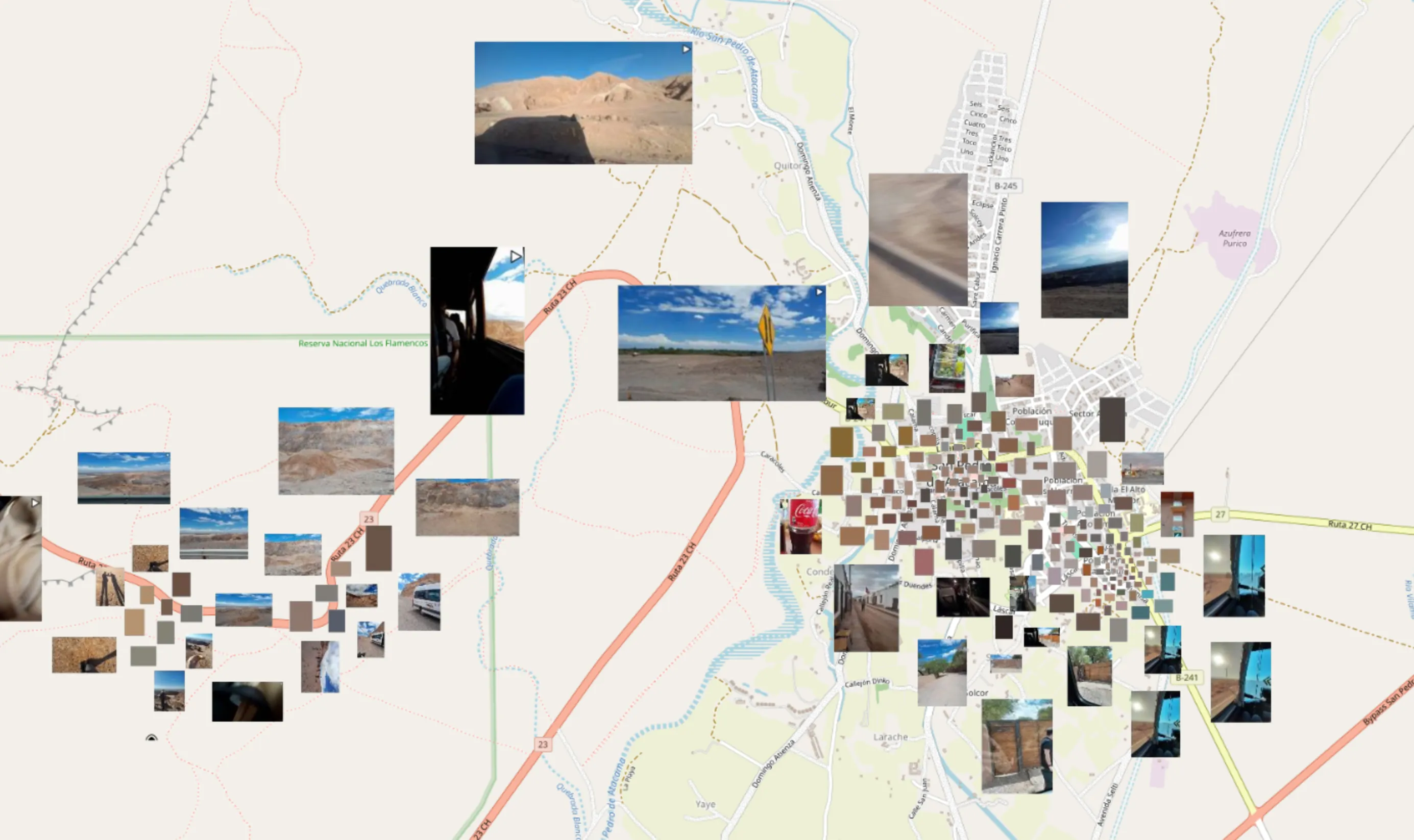 Photofield map view showing some photos taken in the Atacama Desert.
Now there are some cool things going on there. I’m sure you might have some questions, like where is that, why photos be that way, how is algorithms, etc. What an interesting blog post that would be, right? Haha! We’re not doing that today. Today, as everyday, we go on an adventure of tangents instead.
The Motivation
Why THE HELL is this so laggy on my brand and shiny new laptop from the future?
— Me, recently
I got a new laptop recently, and because I hate myself, I’m now running Fedora on AMD. I’m mostly kidding, because it’s been pretty good actually. There are definitely… uhh.. weird things that happen at random points in time however. One of those weird things is that while the main scrolly timeline / album view runs fairly smoothly on it, the aforementioned Map view is most decidedly not.
WTF, is it like an OpenStreetMap thing? How can one view be super smooth and the other one so laggy, they’re both just showing photo tiles… ooooooooooohhhh.
— Me, shortly afterwards
We need to go one level deeper.
How does the map view work?
As I said, this isn’t really about the map view, but there is one big notable difference / hack between the normal scrollable view and the map view. That is, of course, that the map view has a map in the background. I mean yeah, that’s obvious, but what I mean is that it has a map in the background. In other words, the photo tiles need to have a transparent background.
I’m hearing you say “oh well, duh, just use PNG1 then”. Thanks wise guy, but as you might already know, PNGs are great in many cases, but they are about on the opposite side of the room from fast and optimized for photos. So yeah, you can use PNGs, but then it’ll be both slow to encode, and take about ten times more bandwidth. Not really what I wanted.
No, we need to go deeper.
So how do we hack it then?
Let’s render two images! One with the actual photos and another one as a transparency mask. Since we’re generating everything on-the-fly anyway, it shouldn’t be a big deal.
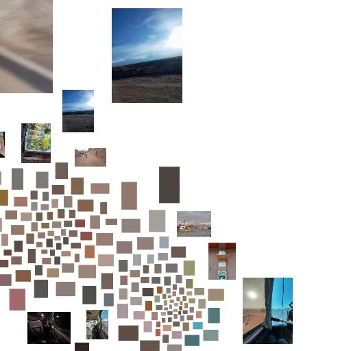 An example normal JPEG tile with photos and a white background
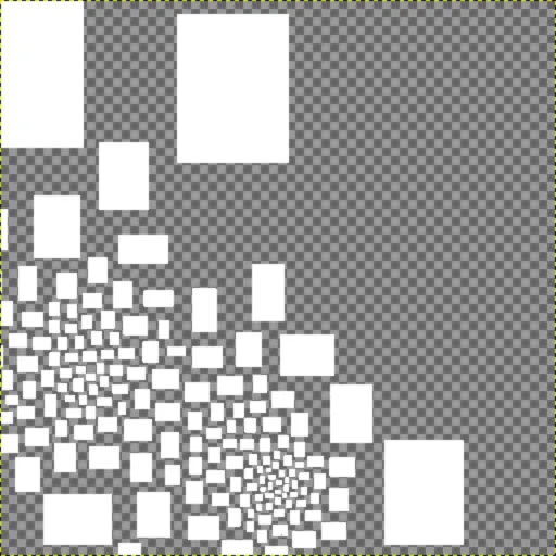 A transparency mask tile for the photo tile above, presented with a checkerboard background here so that you can actually see it.
Then let’s mess about with the OpenLayers RenderEvent prerender and postrender hooks to composite the tiles in a certain way to only keep the “photo” part of the tile and none of the background.
if (this.geo) {
main.on("prerender", event => {
const ctx = event.context;
// Fill in the transparent holes with the photos
ctx.globalCompositeOperation = "destination-over";
});
main.on("postrender", event => {
const ctx = event.context;
// Restore the default
ctx.globalCompositeOperation = "source-over";
});
}
Something like that, but with some more jumping through hoops
Look, I don’t know what was going through my head at the time. But to be fair, it worked great until it didn’t! Wait, but why didn’t it?
What is the problem, little laptop?
Let’s run the Firefox performance profiler to see what’s up.
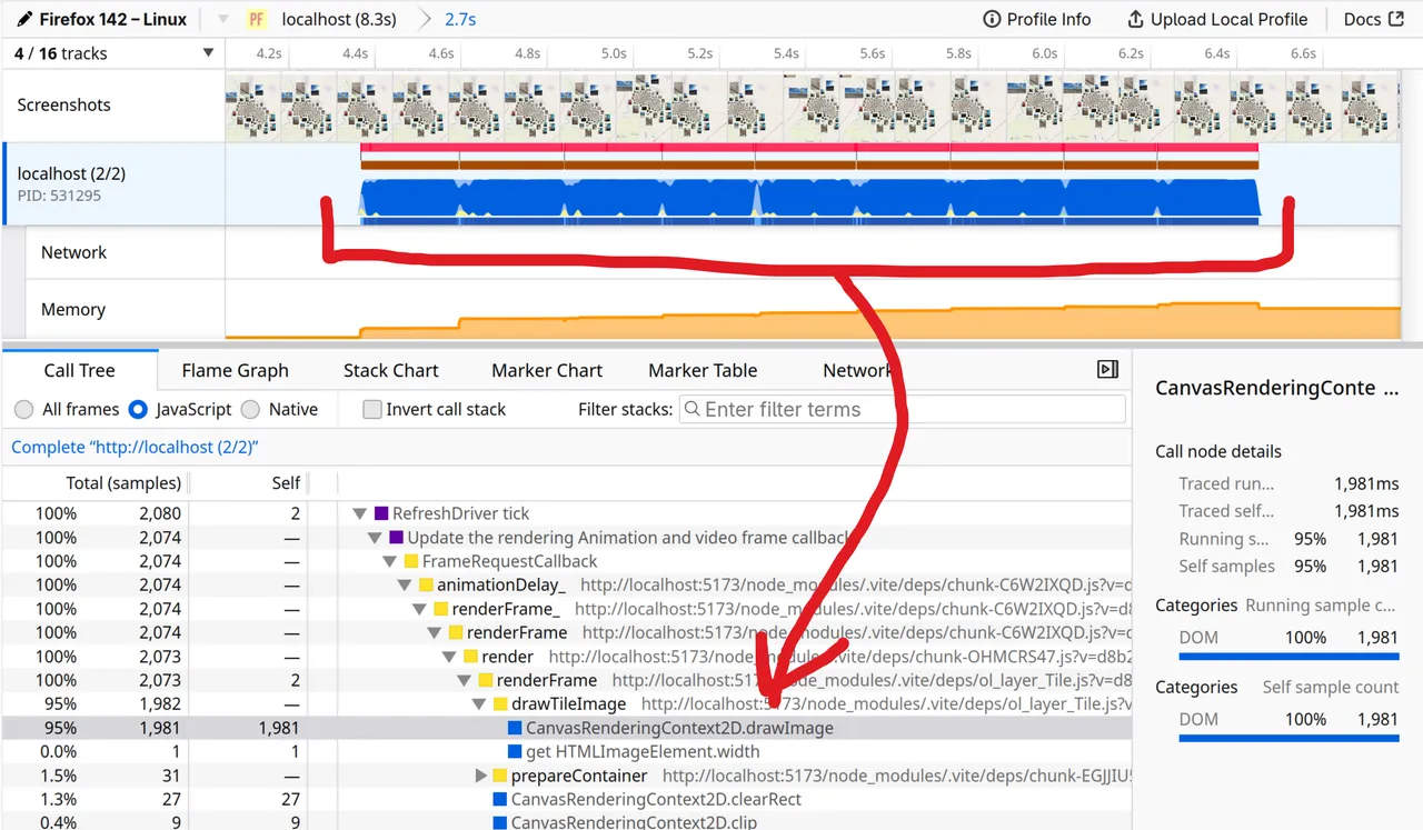 Firefox profiler showing time is mostly spent in Context2D.drawImage.
Looks like 95% of the time is spent in CanvasRenderingContext2D.drawImage. Cool, I guess? At least it’s not random JavaScript junk? But what is going on???
Looking at the Flame Graph including Native frames reveals that…
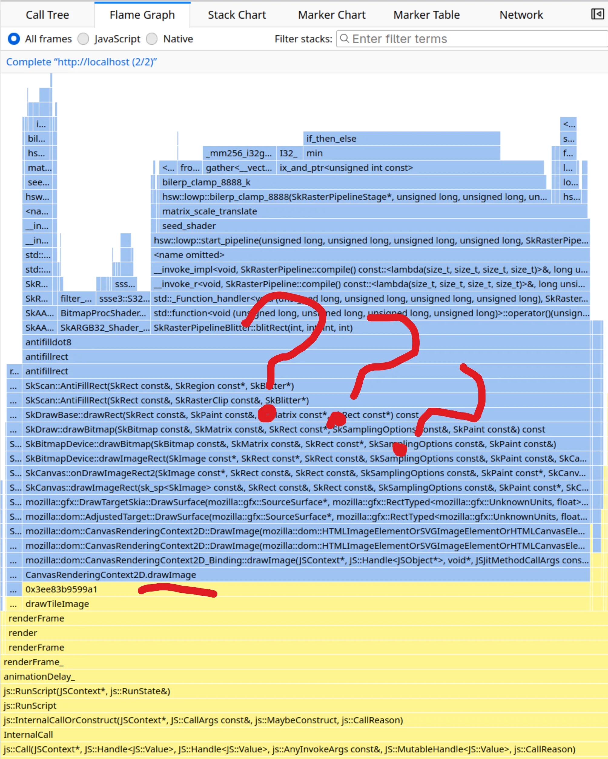 Unintelligible C++ drawing stack.
Yes, it’s indeed slow uhh… somewhere there in that C++ code over there. Something something Skia slow path something. I’m not really going to debug that much further as I have other sidetracks to track. But if I want to fix this for myself, I gotta remove the compositing hooks.
Why don’t you just do it in the backend
Well, through the magic of buying two of them implementing it with AI just to see how it works, it’s totally feasible to fetch the map tiles from OpenStreetMap on the server side, then composite the photos on top of the map tiles and serve just the one baked tile to the frontend. But this approach somewhat annoying, because…
- You need to add and maintain an extra tile cache in the server to avoid hitting OpenStreetMap too much
- You need to juggle both loading the map tile and the photo rendering asynchronously, then composite them just before sending it out to the client (or have either blocking the other)
- If you want to change or tweak the photo rendering even slightly (e.g. by putting a border around it for selection, or adding debug stats, or…) you need to re-render the map tile along with it and the browser cache won’t help you there
- You’d have to pipe map attribution all the way through the server to comply2
- Probably more stuff and problems etc.
So all in all, kind of a workable idea, but ehhh, maybe there’s a better way.
There’s a better way
If you remember from How does the map view work? just above, if we just had an image format that supported transparency and wasn’t as horribly expensive to encode and serve as PNG, it would kinda solve the whole problem, no?
Which image formats do browsers support nowadays anyway? As always, MDN has a great Image file type and format guide. Summarizing it in a table below, we’re looking at something like this:
| JPEG XL | ✅️ | ❌️ | ✅️ | ❓️ |
| GIF | ☑️ | ✅️ | ❌️ | ➖️ |
| JPEG | ❌️ | ✅️ | ✅️ | ✅️ |
| PNG | ✅️ | ✅️ | ❌️ | ❌️❓️ |
| AVIF | ✅️ | ✅️ | ✅️ | ❓️ |
| WebP | ✅️ | ✅️ | ✅️ | ❓️ |
Ok, so it was me that added JPEG XL on top, because it is legitimately cool, but unfortunately Google needs to get their shit together and add it to Chrome for it to go anywhere. But I digress…
So, we don’t have a lot of options left, basically AVIF and WebP, and maybe PNG if we can encode it quickly somehow… But how do I test this? Should I just go for AVIF as it’s the hot new shit on the block? But I tried encoding an image with it once and some say it’s still encoding to this very day. Is this foreshadowing? How many questions can I put in the same paragraph?
Stand back, I’m going to try SCIENCE! 🔬
Let’s make an action plan.
- Find encoding libraries for Go (server language of choice)
- Implement Accept header w/ params as per RFC 9110 12.5.1. Accept to specify the image format3
- Create an evaluation script that runs through a grid of example real-world tiles & encoder configurations
- Record file size, request latency, format, and number of concurrent workers in a CSV file
- SCIENCE!
Now with some movie magic, all of that is done already, so we get to just see what was done and the results!
Encoding libraries
In the following table you can see the libraries I found and evaluated. They are mostly CGo-free as cgo is not Go, but I added one for comparison regardless.
Eval script
In case you’re interested, here’s roughly how the evaluation script looks like.
#!/bin/bash
set -euo pipefail
go build -o tilebench .
SCENE="${1}"
ZOOM=19; MIN_X=162810; MIN_Y=296430; EDGE=20;
MAX_X=$((MIN_X + EDGE)); MAX_Y=$((MIN_Y + EDGE));
WORKERS=(1 2 4 8 16 32)
FORMATS=(
"image/jpeg;quality=100"
"image/jpeg;quality=90"
"image/jpeg;quality=80"
"image/jpeg;quality=70"
"image/jpeg;quality=60"
"image/jpeg;quality=50"
"image/png"
"image/avif;quality=50"
"image/avif;quality=60"
"image/avif;quality=70"
"image/avif;quality=80"
"image/avif;quality=90"
"image/avif;quality=100"
"image/webp;encoder=hugo"
"image/webp;encoder=chai;quality=100"
"image/webp;encoder=chai;quality=90"
"image/webp;encoder=chai;quality=80"
"image/webp;encoder=chai;quality=70"
"image/webp;encoder=chai;quality=60"
"image/webp;encoder=chai;quality=50"
"image/webp;encoder=jackdyn;quality=100"
"image/webp;encoder=jackdyn;quality=90"
"image/webp;encoder=jackdyn;quality=80"
"image/webp;encoder=jackdyn;quality=70"
"image/webp;encoder=jackdyn;quality=60"
"image/webp;encoder=jackdyn;quality=50"
"image/webp;encoder=jacktra;quality=100"
"image/webp;encoder=jacktra;quality=90"
"image/webp;encoder=jacktra;quality=80"
"image/webp;encoder=jacktra;quality=70"
"image/webp;encoder=jacktra;quality=60"
"image/webp;encoder=jacktra;quality=50"
)
echo "x,y,size,latency,format,workers,error" > tilebench.csv
for workers in "${WORKERS[@]}"; do
for format in "${FORMATS[@]}"; do
./tilebench -scene $SCENE -zoom $ZOOM -min-x $MIN_X -max-x $MAX_X -min-y $MIN_Y -max-y $MAX_Y -workers $workers -accept $format -csv >> tilebench.csv
done
done
I loaded up the Atacama scene from above, grabbed its id and found a good range of tiles to use. Then I ran the script as ./bench.sh <id> for it to run through all the combinations.
tilebench is a bunch of lines of random vibed code to do the boring parts of calling the API, measuring latency, etc etc. What you need to know is that we’re testing across different image formats, encoding libraries, quality levels (where permitted), and number of workers4. Let’s see the results!
CSV results
Uhh ok, so let’s say we get 85k lines like this, but what now?
x,y,size,latency,format,workers,error
162810,296430,54900,10.98,image/jpeg;quality=100,1,
162810,296431,4689,3.41,image/jpeg;quality=100,1,
162810,296432,4689,3.20,image/jpeg;quality=100,1,
162810,296433,14798,4.55,image/jpeg;quality=100,1,
162810,296434,24065,5.33,image/jpeg;quality=100,1,
162810,296435,17954,4.27,image/jpeg;quality=100,1,
...
Write a bunch of Python Jupyter code? Uh no, I ain’t no Data Scientist, I don’t have time for that.
Data Preview VS Code Extension
Luckily, there’s this pretty neat Data Preview extension where you can click a button and drag a few labels around and get a nice visualization like this.
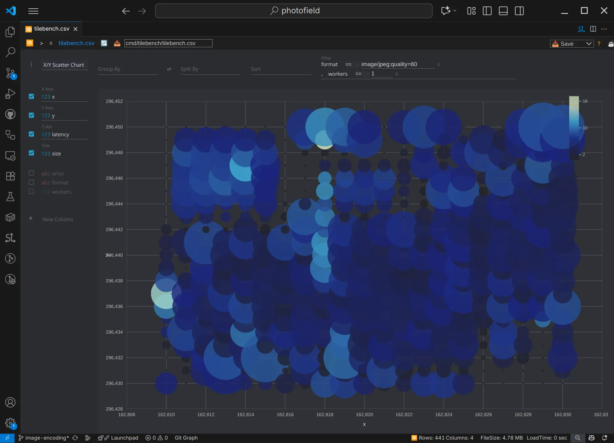 X/Y scatter plot showing with X tile position on the X axis, Y on the Y axis, and file size as circle size and latency as color. You can see the location of the photos (a big one top left, smaller ones in the center) just the file size of the tiles!
It’s a pretty cool way to explore data, and we can go one step further, and use the library it’s using - Perspective, which is even neater. Though you do need a little bit of elbow grease up front to use it effectively.
Perspective
Every now and then I remember that the aforementioned Perspective exists, and then wonder why I never see it anywhere. It’s a data visualization library from the future originally developed and open sourced by folks working at J.P. Morgan. It has some quirks, but you can essentially dump some data into it and filter / group / visualize it all in-browser with no big pre/post-processing steps.
Maybe it’s too quirky? For example, it features a complete multi-panel layout system and editor with this WASM processing jet engine, but you need to combine a few examples to be able to load in previously saved panels. 🤷
Below is the same data visualized the same way as in the Data Preview extensions, except that it has a different color scheme and slightly different surrounding UI.
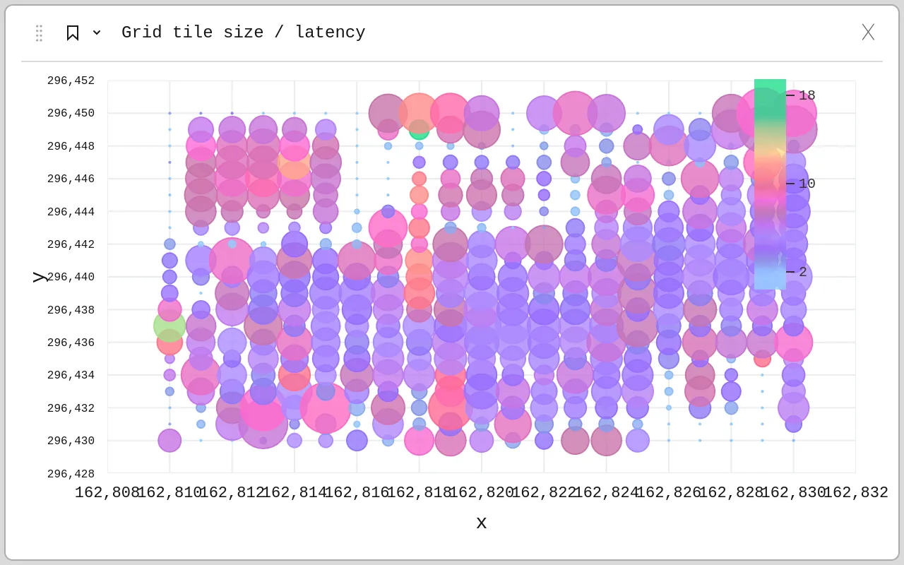 Same as above, but purplier.
Multi-objective optimization
There is really just one thing we are optimizing for: roundtrip request-to-render time.
In other words, how long does it take for the user to see photos they want (“render”) after loading the page or scrolling to a new point in the page (“request”). However, we can break this time down to many different factors:
 Timing diagram showing roundtrip time consisting of image encoding time and receive (download) time, among others.
We’ll focus only on tencodet_{encode} and treceivet_{receive} in our case as they tend to be the biggest contributors to the overall time.
tencodet_{encode} is the time it takes for the image encoder to encode the image after it is drawn. We can use the request latency i.e. troundtript_{roundtrip} as a proxy for this time as on a local network this time dominates any other time.
treceivet_{receive} is the time it takes for the images to download. We can use the tile size as a proxy for this time to keep it agnostic of the network we are on.
This means that we are trying to reach two objectives at the same time:
- Tile size should be as small as possible to save on bandwidth and/or processing time, minimizing treceivet_{receive}
- Request latency should be as low as possible, minimizing tencodet_{encode}
Hang on, the title of this section looks suspiciously out of place, as if… maybe… I pulled it directly from Wikipedia?
Multi-objective optimization or Pareto optimization […] is […] concerned with mathematical optimization problems involving more than one objective function to be optimized simultaneously.
— Multi-objective optimization - Wikipedia
Ah right, that makes sense! We want to optimize both tile size and request latency. Wait!! What does that say? Pareto optimization⁉️ Hey, now we’re talking! Now we’re getting closer to the title of this post.
Pareto Front
In the Multi-objective optimization (you totally did read that part, right?) we saw that we want to optimize two things: tile size and request latency (as a proxy for encoding time). Now let’s take all the results we generated in the previous section and start plotting them.
Baseline JPEG
If we plot the tile requests we made with the script described above and put the size of the returned image file (in bytes) on the Y axis and the latency (request roundtrip time in milliseconds) of the request on the X axis, we get the following chart. Let’s also filter to just one run (JPEG at 80% with 1 worker) for simplicity.
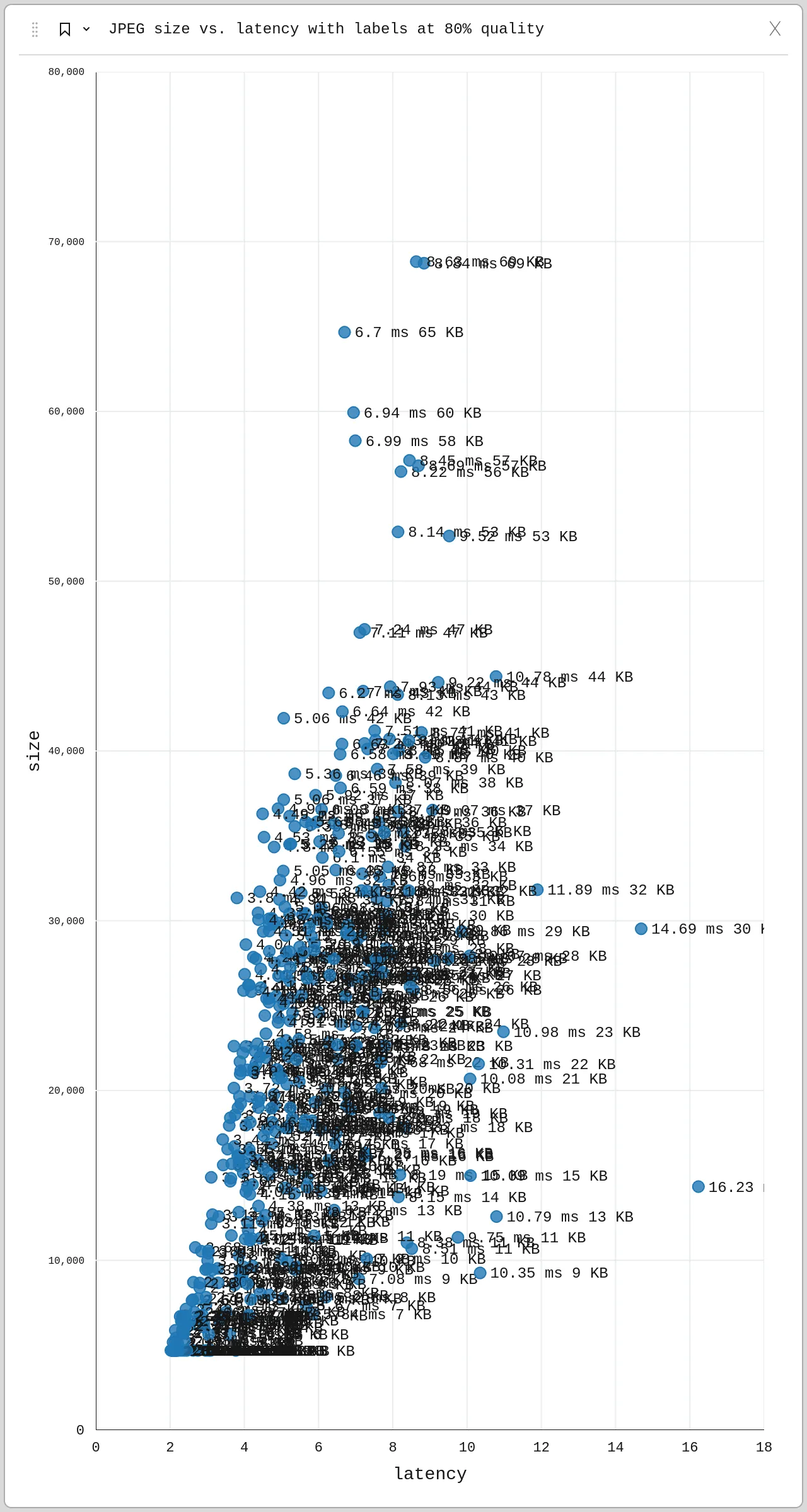 Each point is a JPEG tile request with its latency and file size.
Simplifying it a bit, leaving out the labels, we can see the pattern a bit more clearly.
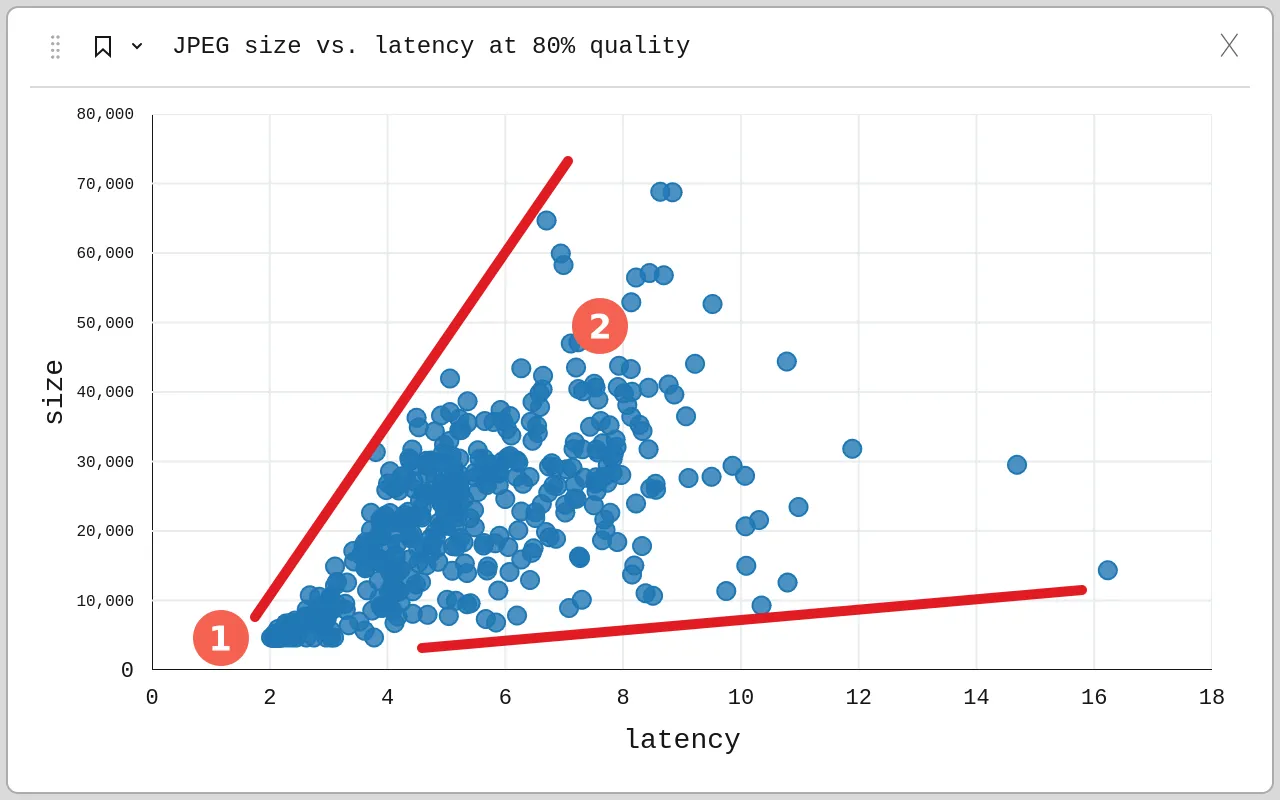 Bigger tiles take longer. Shocking, I know.
Near (1) we can see many white tiles that didn’t contain any photos, so these tiles were all very small in size and generally had a low latency as there was nothing to draw. In (2) we see that the bigger the tiles were, the higher the latency, even though it was generally pretty fast either way (generally < 9 ms).
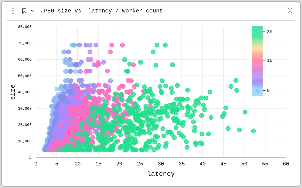 Worker count (tile request concurrency) represented in color, only powers of 2 were tested.
We see the quite a beautiful effect of concurrent requests on latency. The tile size is, as you’d expect, not affected by concurrency. With just one request at a time (cyan), most requests stayed under 9 ms. With 32 workers, some requests took over 50 ms. Of course still not too bad, but (spoiler alert!) JPEG is the fastest encoder we have.
Ahh, speaking of encoders, here is where the fun begins!
All formats, the final frontier!
Let’s plot all the formats now, when they are requested with 8 concurrent requests for a more realistic picture!
 Tile requests (w/ 8 workers) for all formats and quality variants represented by color.
We can now see that there are large differences between the formats and even the encoding qualities in both the size and the latency. Let’s simplify it a bit.
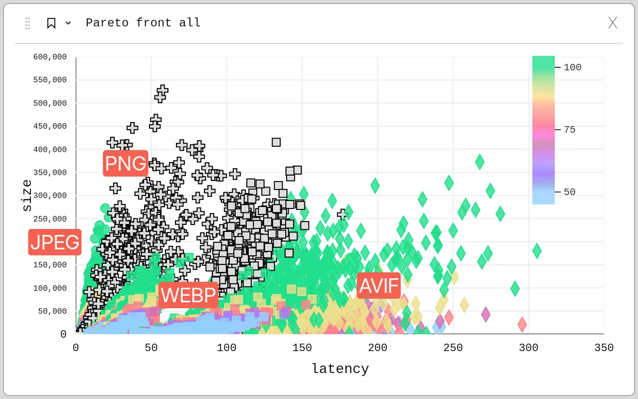
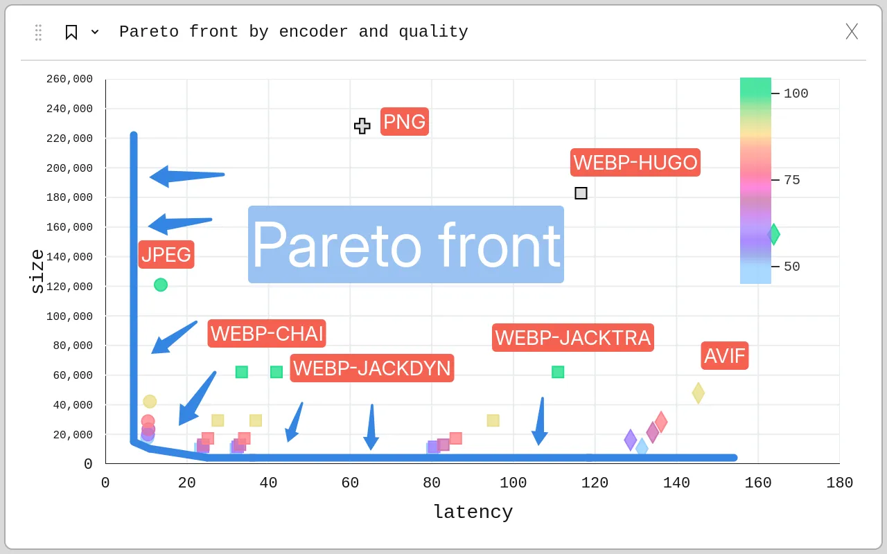 Latency (p755) vs. size (p75) grouped by encoder (8 workers). JPEG is circles, WEBP is squares, PNG is plus sign, AVIF is diamond. Quality level is represented by color (cyan 50%, red 80%, green 100%). The Pareto front is represented as a blue line with arrows pointing in the direction the front moves over time as more efficient formats / encoders are made.
Finally, the long-awaited ✨️ PARETO FRONT ✨️ presents itself! Ideally, we would have an encoder in the bottom left, that is, it would instantly encode images and somehow all of them would take no space at all. As that is impossible, we can only inch closer and closer.
The Pareto front presents solutions that are the most Pareto efficient, or concretely here, that you can’t improve in one objective without compromising on the other. As we see, for this use-case, the PNG and AVIF encoders used here are not Pareto efficient (i.e. they are behind the front), as there exists a different solution — WEBP — that is both faster and produces smaller images.
Formats & encoders with transparency
If we leave out JPEG as it doesn’t support transparency and AVIF as it’s too slow and show all requests by quality instead of aggregating, we see interesting differences between the encoders.
PNG vs. WEBP
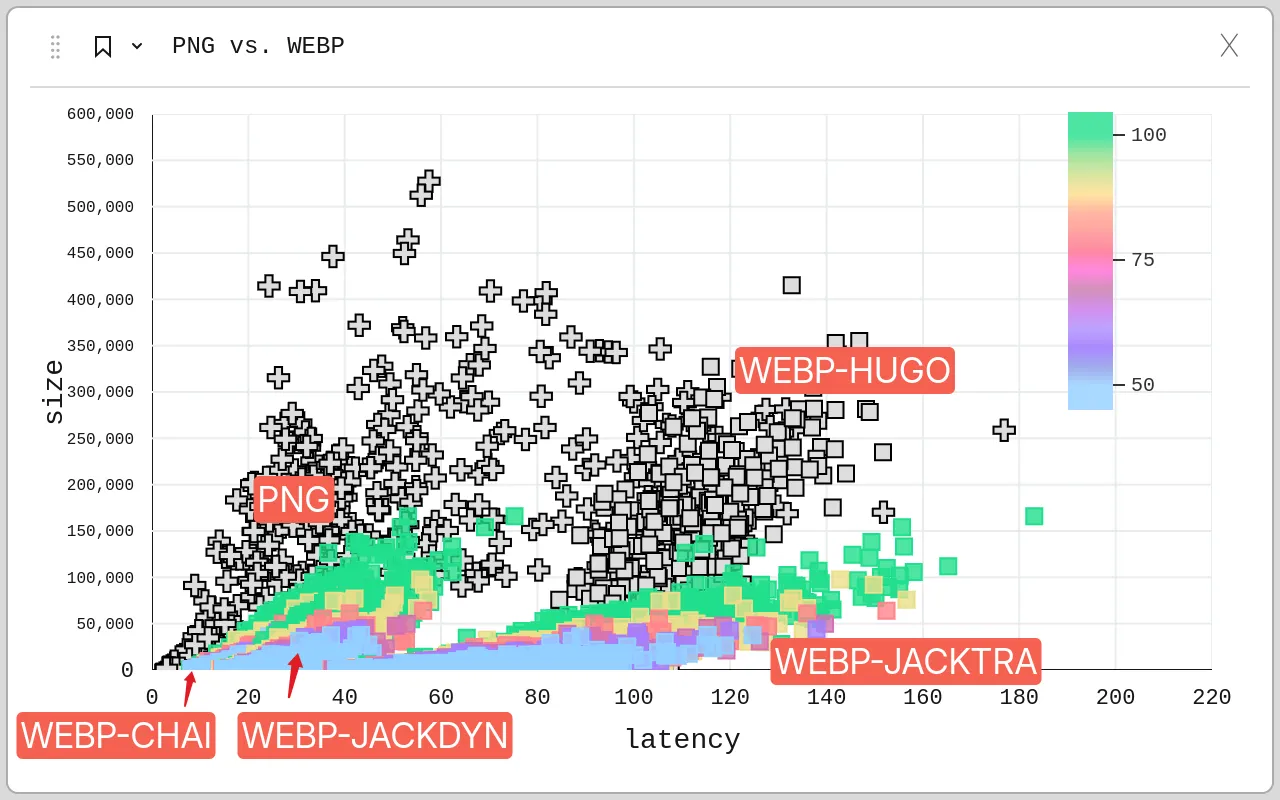 The difference between encoders and quality levels is vast. PNG is plus sign, WEBP encoders are squares. If a WEBP encoder supports quality levels, it’s represented as color from 50% in cyan to 100% in green.
We see that while the png encoder can be pretty fast sometimes, it’s also pretty slow at other times and the file sizes it produces are about equally as variable. webp-hugo seems to work along the same lines, just about twice as slowly.
PNG vs. WEBP in detail
Zooming in to the bottom left, we see a bit more detail.
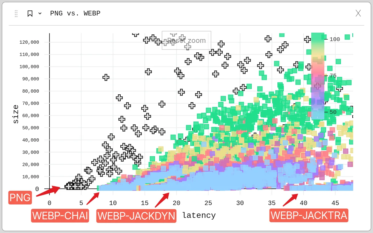 Turns out the PNG encoder is fast when it’s doing absolutely nothing.
Interestingly, the png encoder is one of the fastest encoders… as long as the image is empty. webp-chai uses CGo to bundle libwebp and that seems to be one of the fastest ways to encode transparent images if you don’t mind CGo. webp-jackdyn links to a shared library, so it’s not so far behind, while the C-to-Go transpiled webp-jacktra suffers a bit performance penalty (albeit not as severe as png or avif).
Assuming we don’t want to use CGo, we’re left with webp-jackdyn and webp-jacktra. Aggregating again by quality and comparing against jpeg as the reference, it’s not so bad.
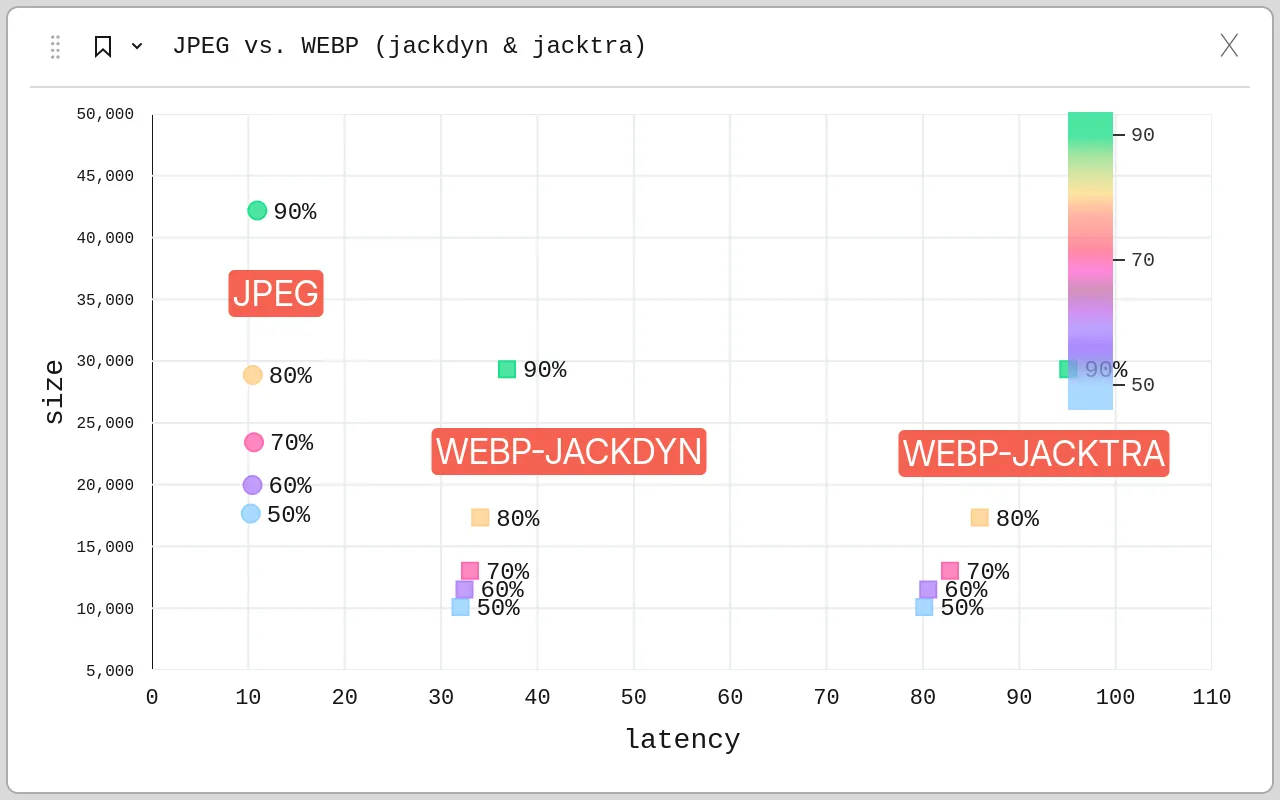 The quality level seems to have a much higher impact on size than it does on latency, especially for transpiled C-to-Go.
While these WEBP encoder implementations have 3-8 times higher latency, they have the advantage of supporting transparency and produce smaller files in almost all cases. WEBP at 80% quality matching in file size JPEG at 50% is pretty crazy as even WEBP at 60% can sometimes look similar to JPEG at 80%.
Interactive Data Explorer
The static charts above are cool and all, but what’s better is if you can play around with the data yourself! I’ve gone through great trials and tribulations to embed it for your please below, so go ahead and gaze yonder.
After loading the few megabytes needed, you can click on the bookmark icon on the top left to switch between presets shown in the static charts plus a few extra ones. Quick tips: drag-and-drop fields in settings, click title to enter settings, right-click to open context menu.
Conclusion
If you have multiple dimensions to optimize on and you aren’t sure which option would be best, sometimes it’s worth it to just evaluate all of them and find out the most pareto-optimized one of the bunch for your specific use-case. Or at least use it as an excuse to draw pretty charts.
As for Photofield, this map change will soon land there as soon as I take the time to clean it up and fix some other bugs that I probably shouldn’t release with. It also opens up the door to enable ultra-low-bandwidth mode by rendering everything with WEBP at low quality while on the go. That might be neat!
Until next time, have a great day!
Send me an email or toot if you have any ideas, comments, or questions.
Annex
There are a few more ways to split and breakdown this data with different charts and stuff, so I thought I could leave them here for your viewing (dis)pleasure.
Size ranking across all encoders and qualities
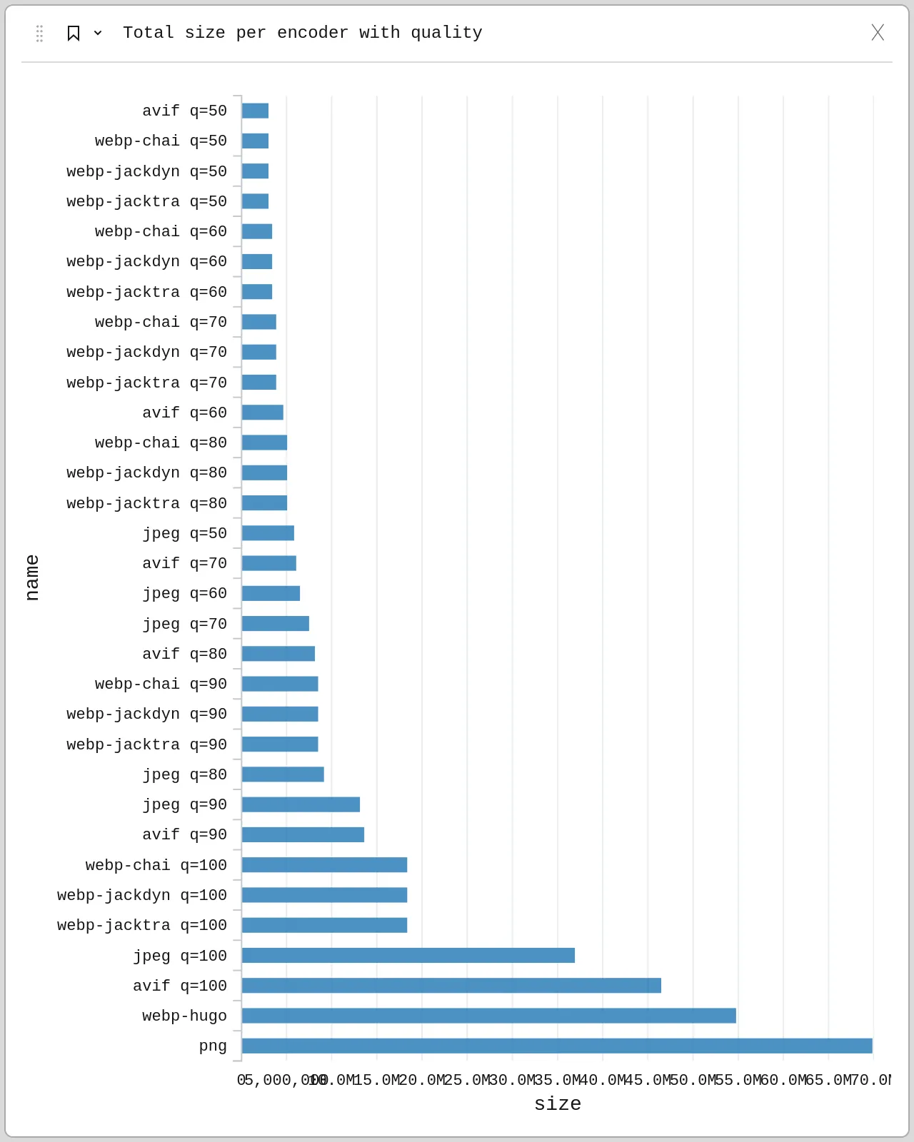 As expected, PNG encodes to the largest files for this photo-based dataset, while AVIF and WEBP dominate the smallest file sizes
Latency breakdown by encoder and quality
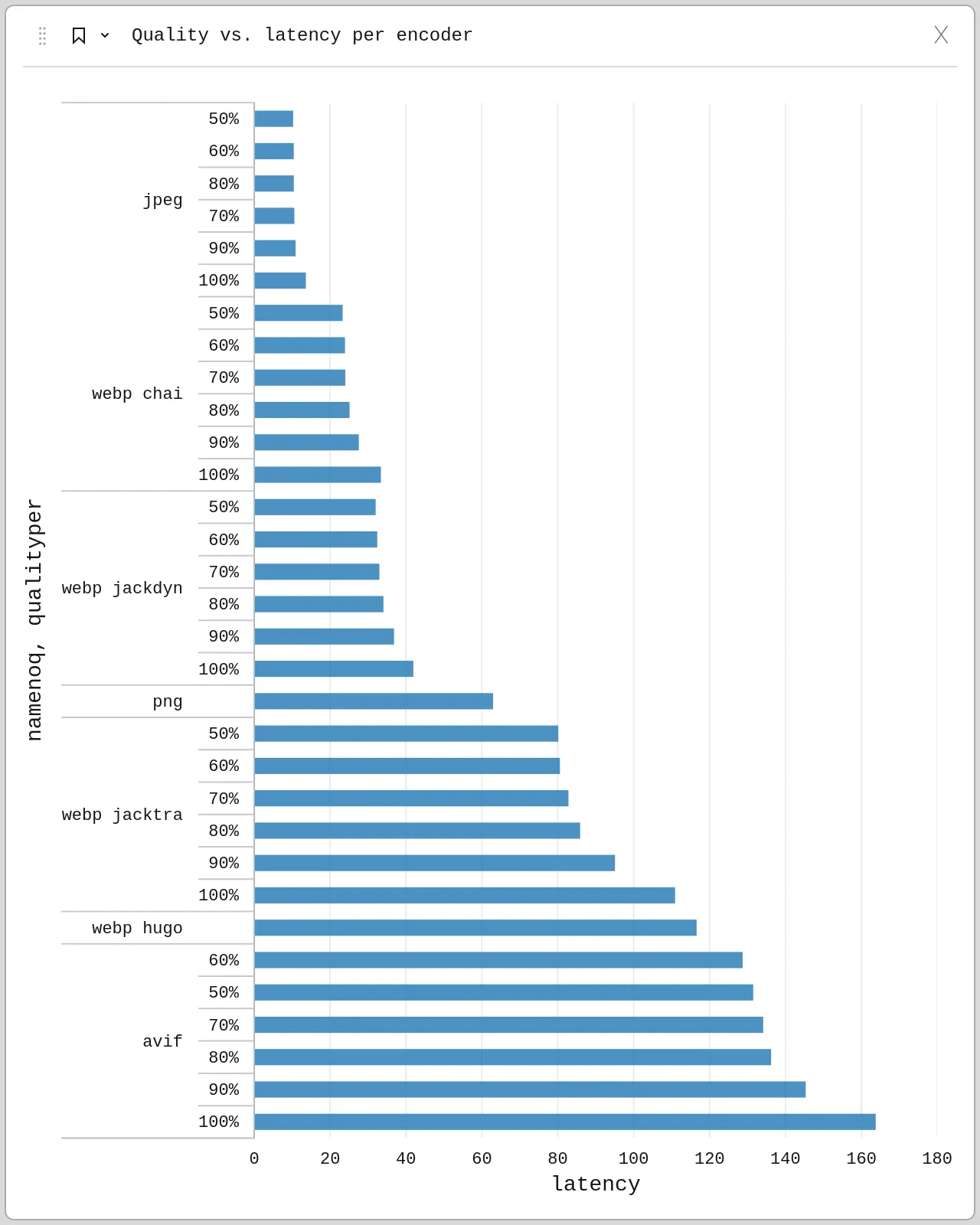 Quality has a small impact on latency for each encoder
Size breakdown by encoder and quality
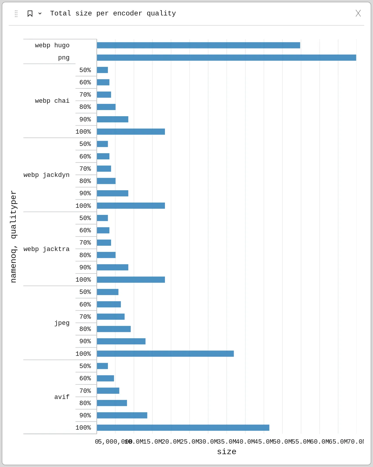 Quality has a high impact on size for each encoder
Size breakdown by quality and encoder
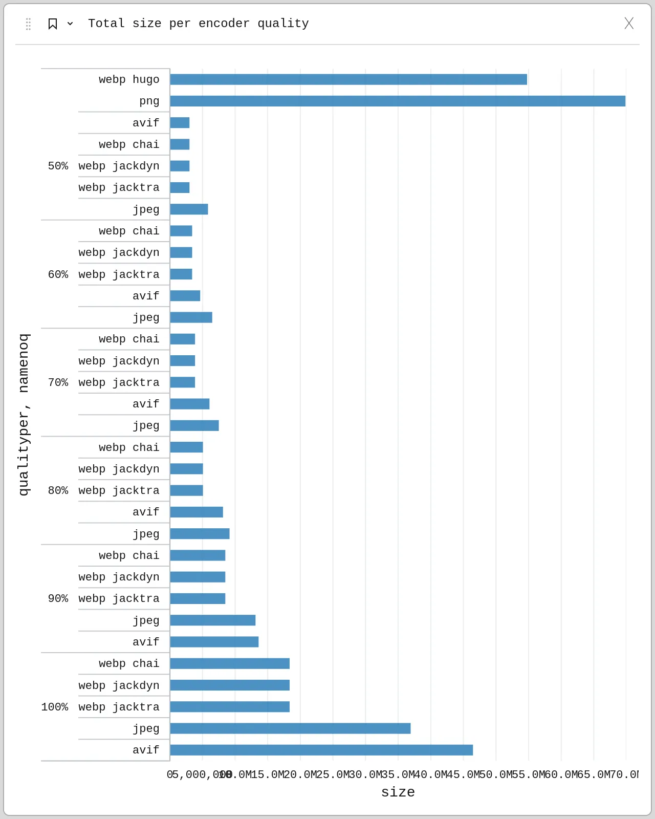 Newer formats like WEBP have much lower file size and overhead, so that even JPEG tiles at 50% take up more space than WEBP tiles at 90%