.png)

June 1, 2025 , Nicholas Khami
Midjourney's learning curve is steep, but climbing it unlocks a superpower for developers and entrepreneurs. Learn how to create stunning, cohesive image sets that actually work for your projects. Go from building style reference galleries to using the describe feature for professional marketing visuals that don't scream "AI-generated."
Getting Your Ladder
I tried to use Midjourney unsuccessfully a few times before, but decided to give it one more try after reading a good tutorial thread on X by @kubadesign. His thread got me most of the way there, but I picked up an additional trick with Midjourney’s describe feature that I think is worth sharing.
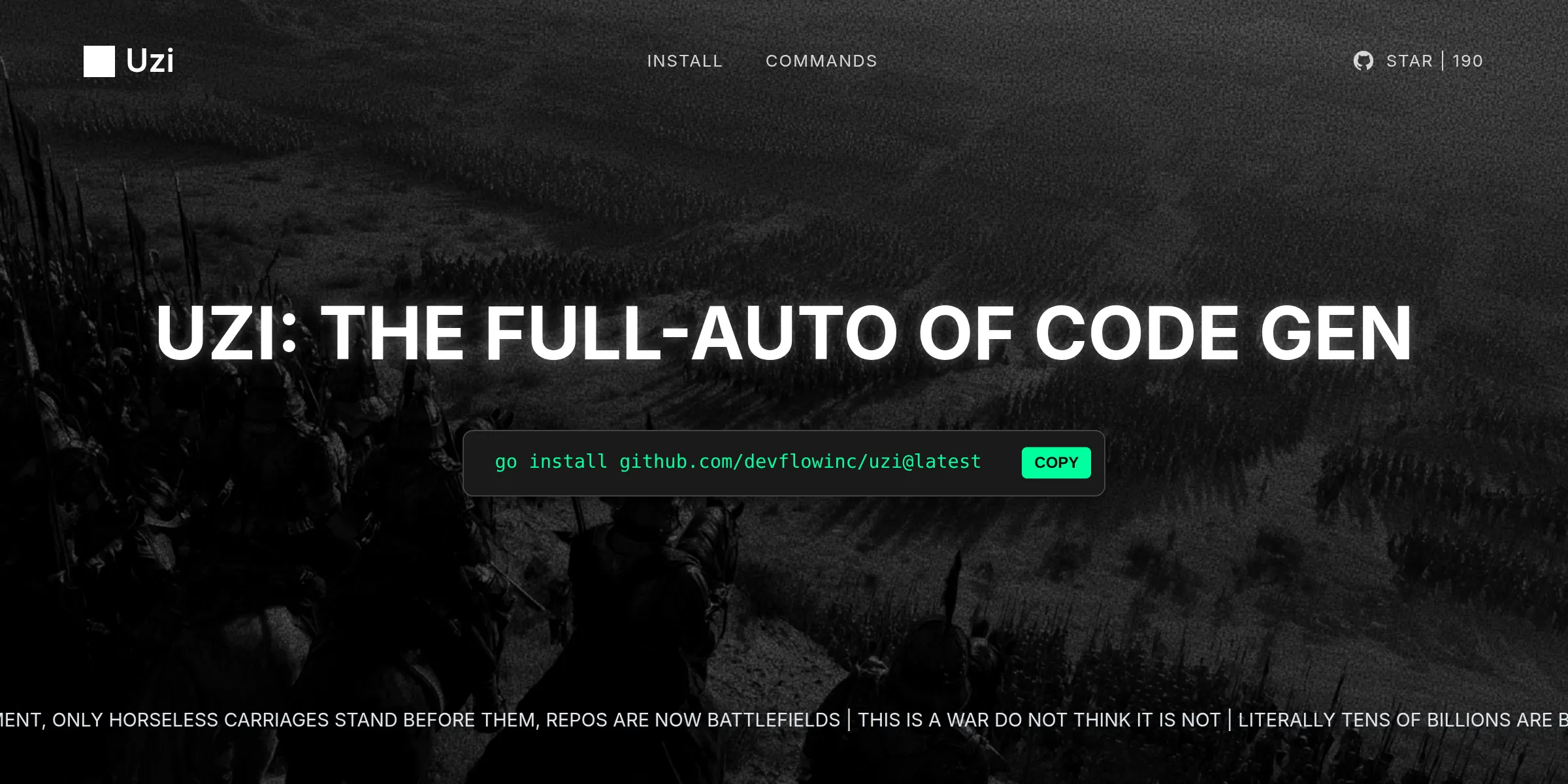
My initial plan was to use these images for uzi.sh, a tool for parallel LLM coding agents. While I ultimately chose a different final image for that project because I only needed one, the learning process was valuable. For this set, I aimed for a red color scheme to evoke action and speed, which you can see in the images below.
Find a Base Image
Following Kuba’s advice, I went to pinterest and found a cool base image that I liked. I went with something that had a lot of red, but also darker colors on the border since I knew that I would need space for text and other elements if I wanted to use these on an actual website.
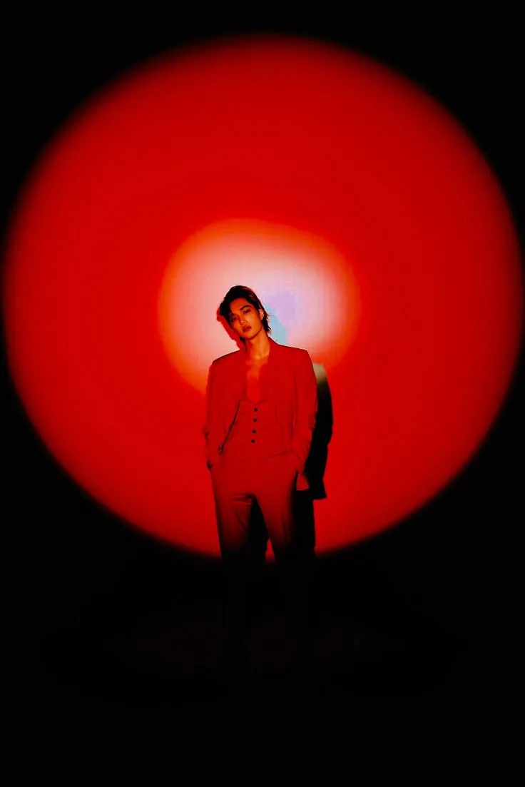
This is the starter image used for the rest of the examples. Source.
Build a Style With Neutral Prompts
You can’t just start by describing the specific kind of image you want and expect to get good results. Style reference images are needed to give Midjourney the boundaries it needs to stick to your desired aesthetic and theme once you get more specific with your exact asks.
It’s unlikely that you’ll be able to find multiple images on the internet which match your desired style exactly, so I recommend using neutral prompts to generate additional images in order to create a cohesive gallery.
My neutral prompt here was Portrait photography of a woman, glow behind, futuristic vibe, flash photography, color film, analog style, imperfect --ar 3:4 --v 7. Essentially, any prompt describing a general subject and its characteristics without getting too specific about style, camera angle, action, or other details should work well.
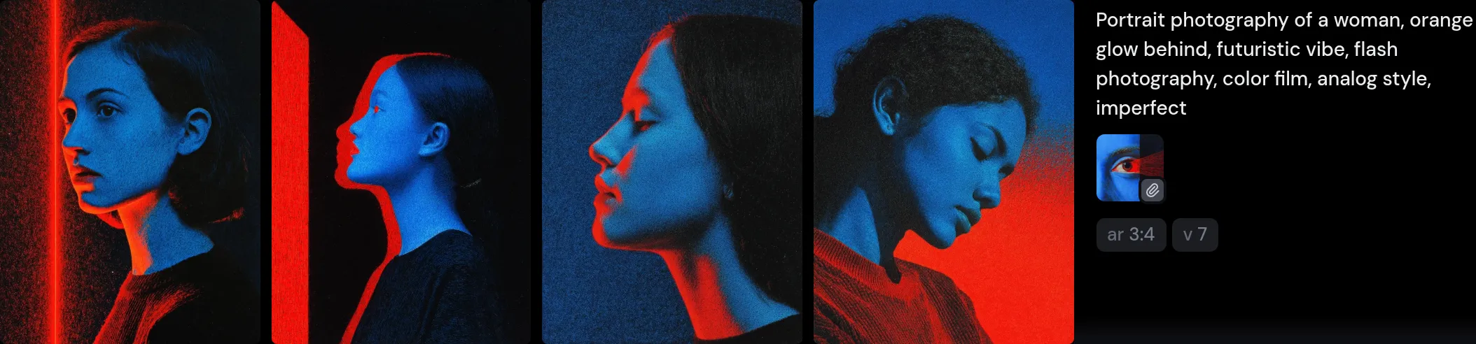
Similar in style to flat blue red eye from Pinterest.
Using Describe to Get More Specific
One of the images I wanted was an eagle diving. However, eagle diving with red glowing background wasn’t getting me the results I wanted. I accidentally discovered the describe feature dragging images around, and instantly realized that it was a cheat code for getting the images I wanted.
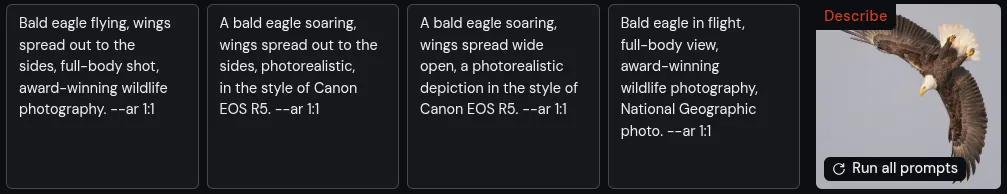
This is the describe prompt used for the eagle image. Source.
You can take any one of these and pair them with the style reference images you generated earlier to get the eagle or any other image you described into the style you want. I could not believe how well this worked.
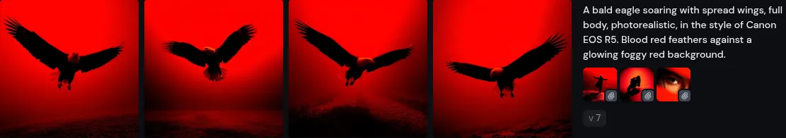
Output from combining the description Midjourney had of the eagle with style references.
Post Processing: Adding Film Grain for Web Design
Midjourney produces images which are too crisp to fit well as background images for the web. I recommend adding grain to them when you put them into your final site to create a more cohesive feel. If done correctly, you’ll end up with a result that looks like the below. CSS is great for this! See a complete guide of how I applied the filter for the uzi.sh site below, full code on Github here.
You first need to add a svg filter definition to your HTML file such that the CSS can reference it later to put the grain on top of the background image. The filter uses feTurbulence to create a fractal noise pattern, and feColorMatrix to adjust the opacity. You can experiment with values like baseFrequency in feTurbulence or the alpha channel (the 0.8 in the feColorMatrix) to finetune the grain’s intensity and texture.
<!-- SVG noise filter definition - this goes in your HTML --> <svg style="display: none"> <filter id="noiseFilter"> <!-- Creates the fractal noise pattern --> <feTurbulence type="fractalNoise" baseFrequency="0.5" numOctaves="3" stitchTiles="stitch" /> <!-- Converts noise to semi-transparent overlay --> <feColorMatrix type="matrix" values="0 0 0 0 0 0 0 0 0 0 0 0 0 0 0 0 0 0 0.8 0" /> </filter> </svg>Once you have the filter defined, you can apply it to a grain overlay element in your CSS. This element will cover the background image and apply the noise effect.
/* The grain overlay element that applies the filter */ .grain-overlay { position: absolute; top: 0; left: 0; width: 100%; height: 100%; z-index: 2; /* Above background image, below content */ pointer-events: none; /* Allows clicks to pass through to elements below */ filter: url(#noiseFilter); /* Applies the SVG filter defined above */ } /* Background image styling for context */ .background-image { position: absolute; top: 0; left: 0; width: 100%; height: 100%; background-image: url("./media/16x9steppecommander.png"); background-size: cover; background-position: center; z-index: 1; /* Below grain overlay */ }Finally, you need to structure your HTML to ensure the layering works correctly. The grain overlay should be positioned above the background image but below any content you want to display.
<!-- HTML structure showing the layering --> <div class="hero"> <!-- Layer 1: Background image (z-index: 1) --> <div class="background-image"></div> <!-- Layer 2: Grain overlay (z-index: 2) --> <div class="grain-overlay" style="filter: url(#noiseFilter)"></div> <!-- Layer 3: Content (z-index: 3) --> <div class="content-center"> <!-- Your content here --> </div> </div>Be Creative!
While there’s ongoing debate about AI generated art, I see Midjourney as just another tool in the toolkit. The key is using it to bring your vision to life, not to replace your creativity.
Take inspiration from what you see, but make it your own. Use AI to bridge the gap between the style you have in your head and what actually shows up on screen. The techniques I’ve shared here are all about developing your unique voice and letting AI help you express it better.
The goal isn’t to generate something generic. It’s to create images that actually work for your projects and feel intentional, not obviously AI generated.


