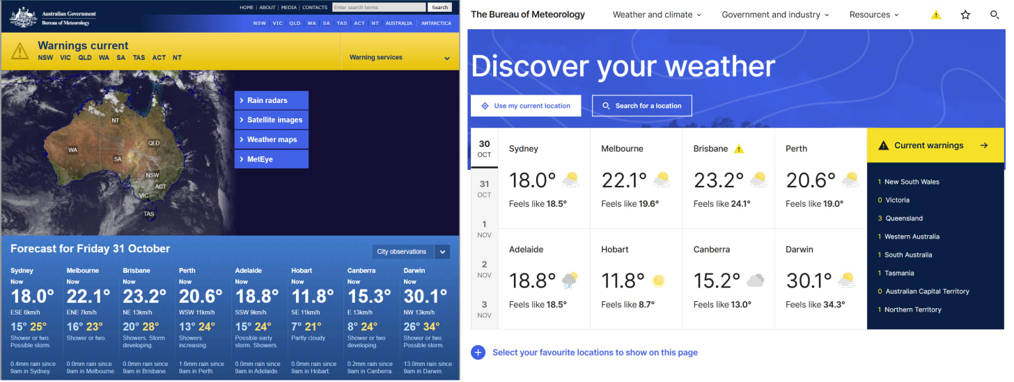
Last week, the Australian Bureau of Meteorology (or BOM) relaunch their website - bom.gov.au - that was a complete refresh and overhaul that was as well received as their last marketing attempt where they asked the public and media to stop calling them the BOM and switch to calling them the Bureau.
Needless to say, the BOM was shocked that didn’t work, and was equally shocked that the new BOM website was also… a complete bomb.
Even their own expert meteorologists admitted that they didn’t know how to use the website, with, and during live TV reports admit falling back to the old site to get weather information. In my opinion, the reason that this website change failed so poorly that the Minister has stepped in and ordered them to fix it is simple… the BOM website isn’t “a website” its “a weather update portal”. But the web marketing team responsible for the development of this tool look at modern clean websites, and said “we’ll do that too” without understanding what users wanted.
It’s inarguable that the new website looks nice, it’s clean it has adequate whitespace and is super readable. A design agency would have prepared the final design and said this aligns with industry best practice, the BOM Head of Marketing would have agreed, and the associated teams would have agreed. They would have said that the large chunky text was easy to click, and the daily weather graphics were clean and reduced the text, and removing menus reduced the amount of clicks people needed to make. A room full of designers would agree it is “user-friendly” and proudly sign-off on the launch.
But I am convinced at no stage was a user ever asked about the design, and at no stage was the question “who is using our website and why” ever asked at all through the process.
Designing products for the web means you sometimes never interact with your users, even when you know them, it can be hard understanding their true motivations. This is made more complicated by the fact that each of us have our own subjective opinions of what is “user-friendly” and in my experience, I have seen arguments about user-friendliness of designs come down to “what the loudest person thinks looks easiest” even if that person will never use the feature themselves.
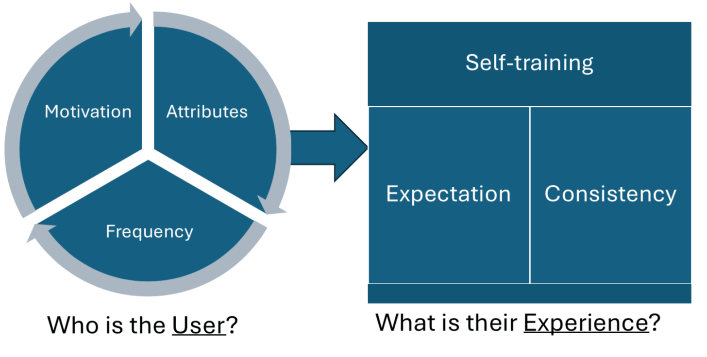
This is why we developed at Aristotle Metadata the MASFEC framework for iteratively through user motivations to understand what to build. This looks at a User and their Motivations, Attributes & Frequency of Use (MAF) and the experience they want with regards to Self-training, industry Expectation & Consistency (SEC). To understand why this rebuild went so wrong, I wanted to use MAFSEC to see how we can understand who uses the BOM site and what they are looking for.
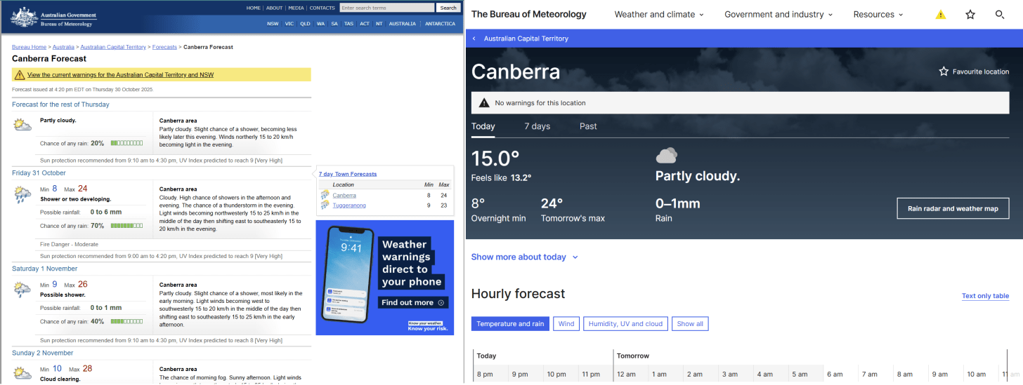
The most likely motivation of any user for the BOM website is to learn about the weather near them. They probably don’t care about the weather at midnight (which is very visible now) but they do want a high-level over view for the next few days - eg. Is Saturday a good day for a picnic? But looking at the new site, I can see the next 24 hours, but I’ve lost so much information compared to the older view that gave a quick forecast over the next few days with both pictures and words.
People who are uninterested in weather either hear it on the news, or they probably just google “weather” and get a reasonable response. A novice user doesn’t need to leave google to get the weather, so users of the BOM website already know about the BOM, which means they probably understand the weather. These are farmers, event planners, or venue managers trying to forecast events. The common attributes of these people is they are aware of or educated in weather terms, or capable of learning them, and are hungry for data.
Frequency for website visits can be variable, but given the uproar users are probably going to the BOM website frequently for short specific updates. They are regularly going, so are expecting some consistency over time.
This is a pretty rich picture of users of the Bureau of Meteorology website - they are a weather buff, they come here often and they want to get weather data. Which leaves us to ask, what kind of tool should we build for them? Well, pretty much the opposite of what the BOM did.
The new website looks great to someone who is unfamiliar with weather info, but offers little in the way of training them to learn more. But users of the BOM website are probably interested in and not scared of jargon. By hiding all of the useful terms behind a slick interface they have been robbed of a chance to Self-train on the site and dive deeper into weather topics.
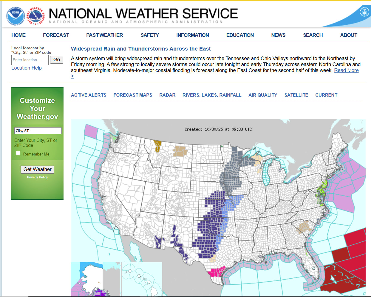
Users like things that are familiar. And someone looking at one weather site is probably looking at others. So if you look across the industry at sites like weather.com, https://www.metoffice.gov.uk, and weather.gov you see a consistent pattern that is data rich and forecast text heavy. All of the above immediately show a map, and if possible a local forecast overview that describes specific events. Users Expections are for a site that is information dense, which is exactly what the old BOM website was - and is the exact opposite of what the BOM website is now.
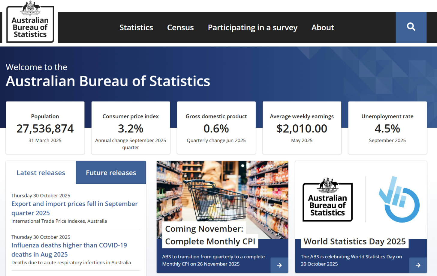
What the new BOM site almost gets right is the Consistency it provides with other government websites. The best direct comparison is the Australian Bureau of Statistics website. But even the ABS recognises that their main audience is data nerds, and has key statistics front and is centre with immediate access to vital economic and social reports.
What this whole sordid tale teaches us is that usability and design are critical to the adoption of any new tool, and that without a clear vision of who is using a tool, a feature or a site, we risk building things that no one is asking for. There is no silver bullet for user experience but what I have found is that the MAFSEC framework has greatly helped identify blind spots in design and ensure that the loud voices of people who will never use a tool, aren’t those deciding what to build.
.png)

