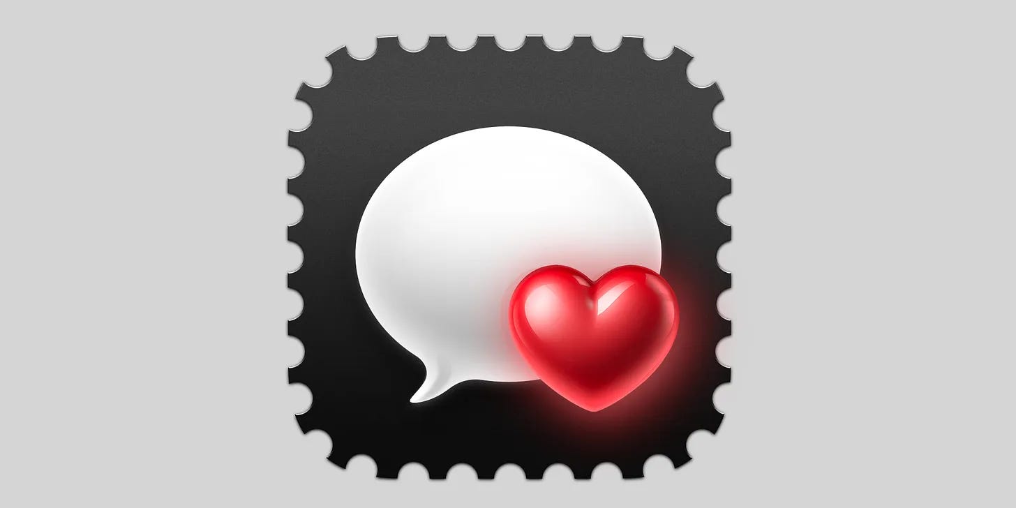
.png)

Flat design is over. The future is colourful and dimensional.
Those aren’t my words. They’re Brian Chesky’s, CEO of Airbnb, after what can only be described as a landmark redesign of the platform. A redesign full of whimsical, animated, 3D icons and warm, tactile surfaces.
It’s always hard to pinpoint when a paradigm shift happens. Usually, you only recognize it in hindsight. iOS 7 in 2013 was one. These past few weeks have felt like another. The pendulum is swinging again.
Some of us worked toward this shift for years, so I’ll just say it:
We’re so back.
I told you so.
But if we’re really entering a new era of visual design, we need better language for it.
I’ve never liked the word skeuomorphism. A skeuomorph is when something digital borrows the concept of something physical—like a trash can icon that looks like a real bin, or a book app that flips pages like paper. But over time, skeuomorphic became a catch-all for any design with depth, texture, or lighting—and that’s a mistake. A bin icon, even as a flat glyph, is still a skeuomorph. It’s metaphor, not material.
I’ve been looking for a better word.
Something that captures the dimensionality we’re beginning to see.
Lately, I’ve been using the word Diamorph.
It’s not meant to be a grand rebrand of design. A completely invented word. A working title for a style that embraces depth, texture, and light. Not to mimic the real world, but to create something that feels native to the screen. Something expressive. Playful.
Diamorph (adj.): dimensional design that embraces depth, light, texture, and hierarchy—native to the screen, expressive by intent.
Diamorphism (n.): a growing tendency toward intentional dimensionality—layered, tactile, digital-first, and full of character.
Maybe it sticks. Maybe it doesn’t. But it’s been helpful for me to give this shift a name while we figure out where it’s heading.
If skeuomorphic design is performative, and flat design is reductive, maybe Diamorph is something else entirely—less about illusion, more about belonging.
Whatever you call it, it’s clear something is shifting. We’ve felt it building for a while: Big Sur icons, the many -phism experiments, playful micro-interactions, richer lighting models—it’s been building in waves. But now it’s breaking through.
And with it, we finally get to move past the tired flat-vs-skeuo binary. It’s time to make space for something new.
I won’t be surprised if WWDC in a couple of weeks introduces some kind of material injection into the digital surfaces Apple controls.
There’s also an interesting side story here, one that might help fuel the adoption of this new paradigm—and yes, you guessed it: AI.
After Airbnb showed off their redesign, the internet exploded with soft, dimensional, highly detailed icon sets prompted into existence using generative AI tools.
Back in the early 2000s, UI design like this had a high skill ceiling. It took years to master lighting, materials, and depth. Now? That level of craft is often just a prompt away.
I could mourn that—or I could celebrate the fact that the style I’ve championed for years is finally within reach for everyone.
In the end, I’ve always worked toward more fun and playful interfaces—and I think we’re about to see a lot more of them.
It’s surprisingly easy to get solid results when generating dimensional icons with AI. These retro consoles I grew up with were created using ChatGPT image prompts, then lightly cleaned up in Photoshop.
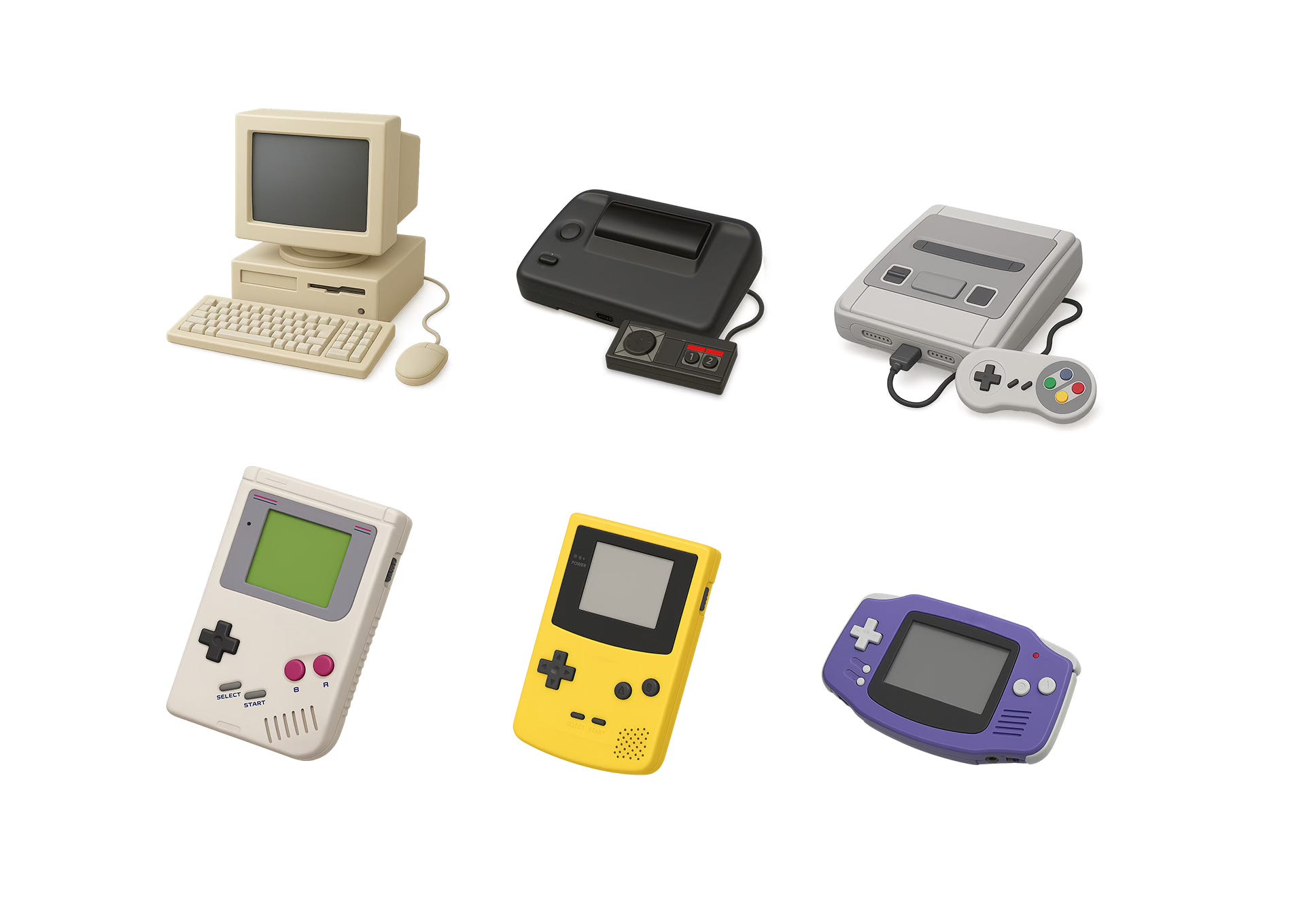
I’ve been crafting this style by hand for nearly two decades. These aren’t perfect, but they’re hitting the “good enough” mark for many use cases.
AI handles materials, lighting, and color surprisingly well. Perspective, proportions, and consistency across a set? Still a challenge. Most require a bit of artifact cleanup and a sanity check. (No, that’s not how a controller connects to a SNES.)
But with transparent backgrounds and a bit of finesse, they’re usable. Sometimes even production-ready. At the very least, they’re a strong base for further refinement.
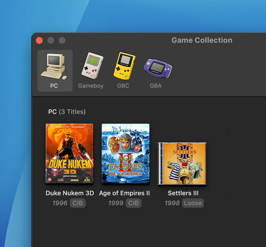
It lowers the barrier to entry for this kind of design. I did a quick mockup of a game-collecting macOS app using these icons.
Like a lot of other artists, I have mixed feelings about the process. But I’ve always been pragmatic about tools. And if I treat AI as just that: a tool, not a shortcut to the final result—then there’s still a lot of room for craft, taste, and care.
In an ideal world, AI is a creativity maximiser. It lowers the bar but raises the ceiling.
I still believe core design skills matter. Maybe more than ever. The fundamentals we learned by doing this by hand: composition, lighting, depth, taste, still apply.
Tools may change, but taste is hard to fake.
We’re standing at the edge of a new visual language: one that’s expressive, emotional, and unapologetically digital. Diamorphic design isn’t a throwback, and it’s not just decoration. It’s a step forward.
And with tools like AI lowering the barrier to entry, we’re about to see more people than ever join the conversation.
Whatever we call it (Diamorph or otherwise), I’m just glad to see interfaces getting weird and wonderful again. We’re not going back. We’re going forward—with depth, with texture, and maybe even with a little joy.
The future is colourful, dimensional—and it’s already happening.
Sponsor
Want to sponsor an edition of my newsletter? If you've got a product, app or service you think my design-focused audience (~40k subscribers, ~30k opens per issue) would genuinely enjoy, this could be your chance to reach them in a meaningful way.
Each sponsorship includes an image, some friendly text, and a clear button to bring readers right to your door.